New Life For Sydney Lee, An Obscure British Printmaker
Who knows why I did a web search last week for the British early 20th-century artist Sydney Lee (1866-1949). I was just hoping to find an update on pricing for his quite amazing, but under-appreciated wood engravings. What I wasn’t expecting was news that a catalog raisonne was soon to be published. As a collector I greatly appreciate the value of reference books. In fact I wouldn’t have bought my first Lees during my first of two trips to England in the mid-1980s if it wasn’t for the reference books I already had. So news of a catalog raisonne that would attempt to illustrate his life’s work as a printmaker would be truly welcome. This is part of the web page I landed on and here’s the link to the page:

So I tried the link to BUY NOW only to discover from my friends at Amazon UK that the book was yet to be published. Then I looked around this website hoping for a way to contact the curator of the Sydney Lee exhibition and book Robert Meyrick, but saw none. Yet its homepage had this photo and short bio:

Fortunately when I googled his name, his email address at his Aberystwyth University in Wales came up. So I messaged him thusly:
Dear Robert,
I’m quite thrilled that your catalog raisonne on Sydney Lee is scheduled to be published next year. As a young collector I made two visits to London (1983, 1985), and part of the fun of these trips was to hunt up British prints, particularly relief prints, from the 1920-1950 period. I had already owned copies of The Studio publications on woodcuts as well as Herbert Furst’s book. So I was well primed to hunt for examples. During this time I believe the Redfern Gallery (often cited in these books) was closed. Ergo the search was going to be one of discovery. Fortunately I met Betty Clark of Studio One Gallery near Oxford during the first visit. Besides a source of wood engravings (particularly by women), she made very useful suggestions about London galleries.
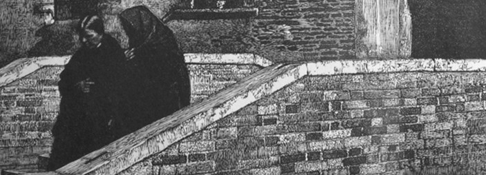
But the best place to find Sydney Lee prints I stumbled upon myself. Just a few doors south of the British Museum was Craddock & Barnard. Not only was I delighted to find some of the Lee prints illustrated in Furst or Salaman, but the prices were truly unexpected–between 8 and 20 pounds. My travel budget went a lot further than I could have hoped. I bought Ponte Paradiso, Coliseum, A Spanish Courtyard and The Merchant of Venice. Back in the States, I found a Lee without a title. It shows a Spanish courtyard in the rainy during market day. (My hunch is that the town was Avila.) The paper appears to have been stained (by tea?) brown before printing. Would you know the title of it? And was staining paper a known Lee technique?

This is the image of the print I asked him about. And this was his response (I’ve inserted images of the prints he talks about):
Dear Scott
Very many thanks for your email. It’s good to hear from another Lee enthusiast. There aren’t many of us – which no doubt accounts for the pitifully low prices that his artworks still achieve. Prices have, of course, risen since the 80s though when compared to his peers and his one-time reputation, they are still inexpensive. I paid $1.99 for one on eBay earlier this year. Like you, as a young collector I chanced upon Lee when I bought his large aquatints The Sleeping Square and Mountain Fortress in 1991 from Goldmark Gallery in Rutland in 1991. They were then £50 each. Over the intervening years I have bought some 70 or so different prints and now catalogued 172 for the book. I also have several of his oil paintings. After his widow’s death in 1952, her executors instructed the piecemeal sale of Lee’s home and studio — no records or archive material survived. He had no children and his brothers and their children were not given the opportunity to retrieve personal effects. My challenge has been in reconstructing a life through his art. Fortunately, 18 months ago, after years of being told there were no surviving family members, I discovered two great nieces. One of those has a portfolio of 300 prints, about 60 of which I had never been able to trace. I’m sure my catalogue is not 100% perfect – more prints will in likelihood turn up – but I had to go to print at some point. When the Royal Academy offered to exhibit my collection and to publish my research, I jumped at it. The exhibition will open there in London on 26 February 2013.
The image you emailed me is “A Wet Morning at Segovia Market” (1908) – it shows the Plaza Mayor. The paper has been watercolour toned, something he did with a number of the editions of his wood engravings – but fortunately not many! When mounted they look light-stained and in poor condition. Except that it’s not a wood engraving – it is engraved on zinc, but printed as a wood engraving.
You have some of the best of his other wood engravings (with snippets from my catalogue):

Ponte Paradiso, 1927
Above the Ponte del Paradiso in Venice, at the entrance to the Calle del Paradiso, stands the fifteenth-century Arco del Paradiso, a triangular Gothic spire decorated on the canal side with a statue of the Virgin of Mercy, a kneeling figure and the Foscari family coat of arms. Lee exhibited a very similar composition in oils, also titled Ponte Paradiso, at the RA [Royal Academy] in 1925 (no. 629).

Spanish Courtyard, 1926
After planning the overall composition, Lee cut the woodblock outdoors to capture in situ the textures and subtle tonal gradation of this sunny hotel courtyard.

Venetian Merchant, 1928
The Ponte della Paglia, Doge’s Palace and Bridge of Sighs in Venice. The Gothic bas-relief sculpture that adorns the eastern corner of the Doge’s Palace depicts the drunkenness of Noah. Lee exhibited an oil painting of this subject titled On the Palace Bridge at the RA in 1924 (no. 255).

Colosseum, c.1926
[He had no commentary on this print.]
Hope this info is of interest. I’ll email you some of his colour woodcuts and aquatints/mezzotints in case you have never seen them.
Best wishes, Robert

Immediately afterwords Robert sent me one-at-a-time 13 images of Lee prints with just the title of each. One was a wood engraving, ten were I what he called aquatint/mezzotints that had the same qualities of light (maybe even more dramatic) as Ponte Paradiso, and two color woodcuts of a very different esthetic, very much influenced by Japanese woodcuts. These are the two shown here, Bridge at Staithes on the left and Boatbuilding, St. Ives on the right. How they fit into Lee’s oeuvre I can only guess. (Before my Lee prints were done, I suspect.) I’ll find out when the book is published.
But why Lee has remained so obscure when other British relief printmakers who were respected in the first half of the 20th century have grown in public esteem? Among the latter were Gertrude Hermes, Blair Hughes-Stanton, Robert Gibbings, John Farleigh, Iain Mcnab, Clifford Webb, Bernard Rice, and Joan Hassall. I bought prints by each of these printmakers during my two England trips in the 80s.
As I said before my first trip there I already owned copies of three British published works on relief prints: The Modern Woodcut by Herbert Furst, 1924; The Woodcut of To-day by Malcolm C. Salaman, 1927; and The New Woodcut, Salaman, 1930. All three books are illustrated with Lee wood engravings. In fact, The Spanish Courtyard appears in The Woodcut of To-day, and Ponte Paradiso is illustrated in The New Woodcut. (No wonder I jumped to purchase each.) Salaman writes in The Woodcut of To-day, “Mr. Sydney Lee must be very nearly the doyen of our practicing wood-engravers, for it is exactly twenty-seven years [c. 1900] since he first cut his first design in wood, and twenty-six years since he first engraved, and his enthusiasm for the medium has never waned. … The Spanish Courtyard is, I venture to think, Mr. Lee’s masterpiece.” Furst waxed less poetic about Lee, who he said “is mainly interesting on account of the artist’s ingenious manipulation of textures. [his italics]” Lee is given his due in Claire Leighton’s Wood Engraving of the 1930’s (published 1936). Once again he’s labeled “the doyen of modern wood engraving.”
So how was Sydney Lee treated in print when there was a revived interest in early 20th-century printmakers in Britain in the 1970s and 1980s? (Interestingly a revival of American printmakers of the same period was happening at the same time.) In 1978 A History of British Wood Engraving by Albert Garrett was published. In 407 pages Sidney Lee is mentioned once in passing as a founding member of The Society of Wood Engravers in 1920. No work by Lee is illustrated; certainly no mention of him as a doyen of the medium. A subsequent Garrett book, British Wood Engraving of the 20th Century, 1980, leaves him out entirely. Not surprisingly, Lee is also absent from Avant-Garde British Printmaking 1914-1960, by Frances Carey and Antony Griffiths, 1990. While his major printmaking occurred in the 20th century, his esthetic seems rooted in the 19th. He was born in 1866 after all. Mastery of the wood engraving medium just wasn’t sufficient for these authors in search of the Modern artist.
But in the 21st century has Sydney Lee’s time come? And will Robert Meyrick be the one to usher it in? Stay tuned.
Trackback URL: https://www.scottponemone.com/new-life-for-sydney-lee-an-obscure-british-printmaker/trackback/
2 comments on “New Life For Sydney Lee, An Obscure British Printmaker”
Leave a Reply to Shaun D'Arcy-Burt Cancel reply
-
Schatz’s “Der Ackermann und der Tod” woodcuts Apr 05, 2024

-
Justin Remo Exits Dogwater Beach Feb 11, 2024

-
Jerome Clock mystery solved Jan 02, 2024

-
Baltimore Chairs: Plain painted wheelbacks Dec 08, 2023

-
Goethe & Graf: Totentanz Oct 31, 2023

-
Gan Kolski: His End is My Beginning Oct 26, 2023

-
Isac Friedlander: Coney Island Aug 09, 2023

-
Linocuts: Making of Athena Jun 15, 2023

-
Anne Desmet: Personal Tower of Babel May 13, 2023

-
Planets Come to Italy Mar 05, 2023

Hello
I came across your article on Lee today and was interested to see the woodcut example of the bridge. It appears to be shown at night or dusk perhaps, in moonlight. I was reminded that I had seen this image before but a version for the daytime with blue sky and bright, warm stone and brick colour. Interesting that artists varied their basic prints in this way to create quite different moods and overall effect.
You may well have seen the woodcut version I refer to but if not, I can e-mail you it to see – send me your e-mail if you like.
Not sure what it is about poor Sydney but in the UK some of the woodcut/print bloggers appear rather unimpressed I’ve noticed with some odd and negative comments at different times when comparisons are made with others of that period.
Thanks for your effort to make more information available, I must look out for the book.
Kind regards
Shaun
Pingback: Anne Desmet: Personal Tower of Babel