Accessions: Short Stories
Introduction
Sometimes an acquisition merits a separate ART I SEE post. That was the case this spring when I acquired the 1939 book Du Noir au Blanc von Schwarz zu Weiss (From Black to White from Black to White) by Flemish artist Frans Masereel. (LINK) Or when in July, 2024, I added a copy of the woodcut portfolio Confessio by German artist Gustav Wolf. (LINK) But more often there’s only a short story to tell about a particular purchase. But slowly, as is the case right now, enough short stories have accumulated to assemble a miscellany of them into a single post. I’ll start with the most curious one of all.
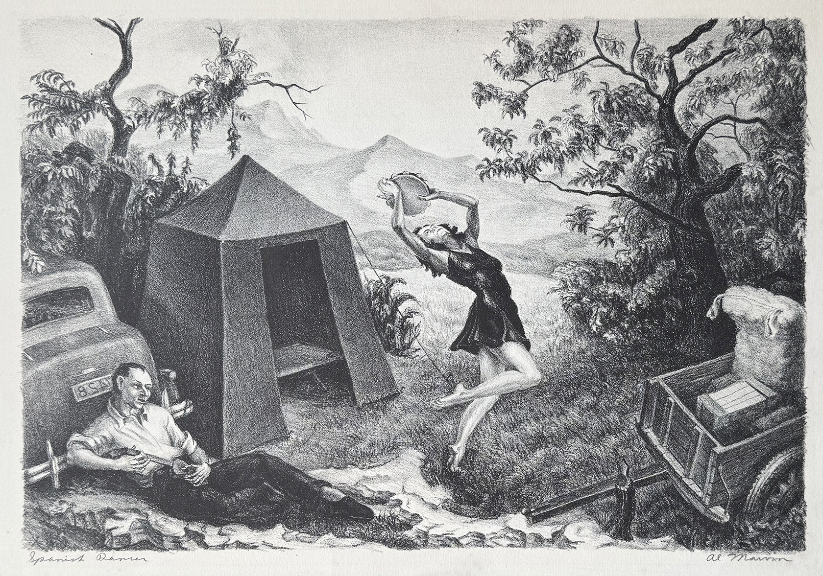
Al Marvin, “Spanish Dancer,” lithograph, 9 1/4″ x 13 3/4″, signed and titled in pencil
Al Marvin’s “Spanish Dancer”
I remember staring at this 1940s lithograph by Albert H. Marvin Jr. when it appears last summer on eBay. Such an odd image. The guy leaning against the trunk of his car and strumming a small string instrument. The woman leaping about shaking a tambourine high above her head. The unhitched trailer with perhaps a mattress standing on end. The pyramidal tent with a cot inside. The mountainous landscape in the distance. Are these folks among the tens of thousands that the Depression displaced? Certainly this can not be just an average campsite. What is the story?
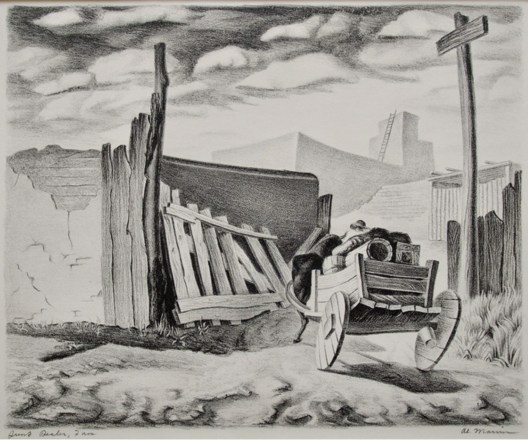
Al Marvin, “Junk Dealer, Taos,” lithograph
I went online to investigate. I found another copy at the National Gallery of Art. It was a gift of well-known collectors Reba and Dave Williams. This time Marvin titled it “Spinach Gypsy.” There is no accompanying bio of the artist.
Then the Peyton Wright Gallery in Santa Fe listed this litho by Marvin entitled “Junk Dealer, Taos.” The listing (not currently visible) came with the rolling text: “Another artist about whom little is known, the scant documentation available on Albert H. Marvin, Jr., indicates that he was a student at the Kansas City Art Institute in the 1930s. While serving in the Air Force during the Second World War he painted a series of murals documenting the history of flight for the officers’ club at the Air Force base in Portland, Oregon. He studied at Reed College in Portland after the war and pursued a career in aeronautics.”
A search on liveauctioneers.com brought up three more lithos by Marvin, that were sold in 2016 by Saco River Auction, Scarborough ME.
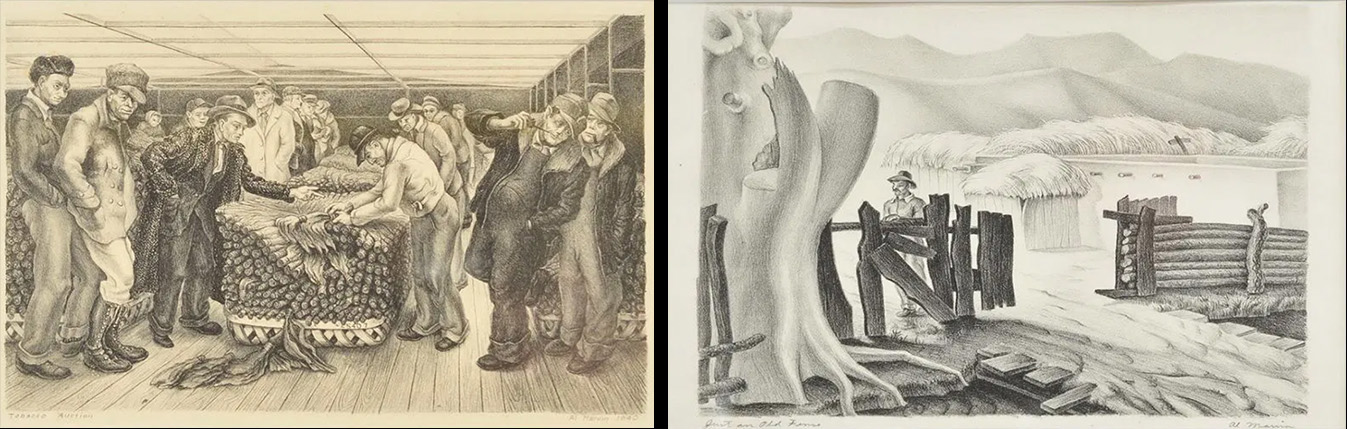 Here are two of them: (L) Tobacco Auction, 1940 12 1/2″x 8 1/2″ and (R) Just on Old Fence, 13 1/2″x 9 1/2″. The auctioneer said Marvin studied with Thomas Hart Benton. That reference got me excited because I had a copy of “Under the Influence: The Students of Thomas Hart Benton” by Marianne Berardi (The Albrecht-Kemper Museum of Art, Saint Joseph, MO, 1993). But no luck: Marvin wasn’t mentioned in it.
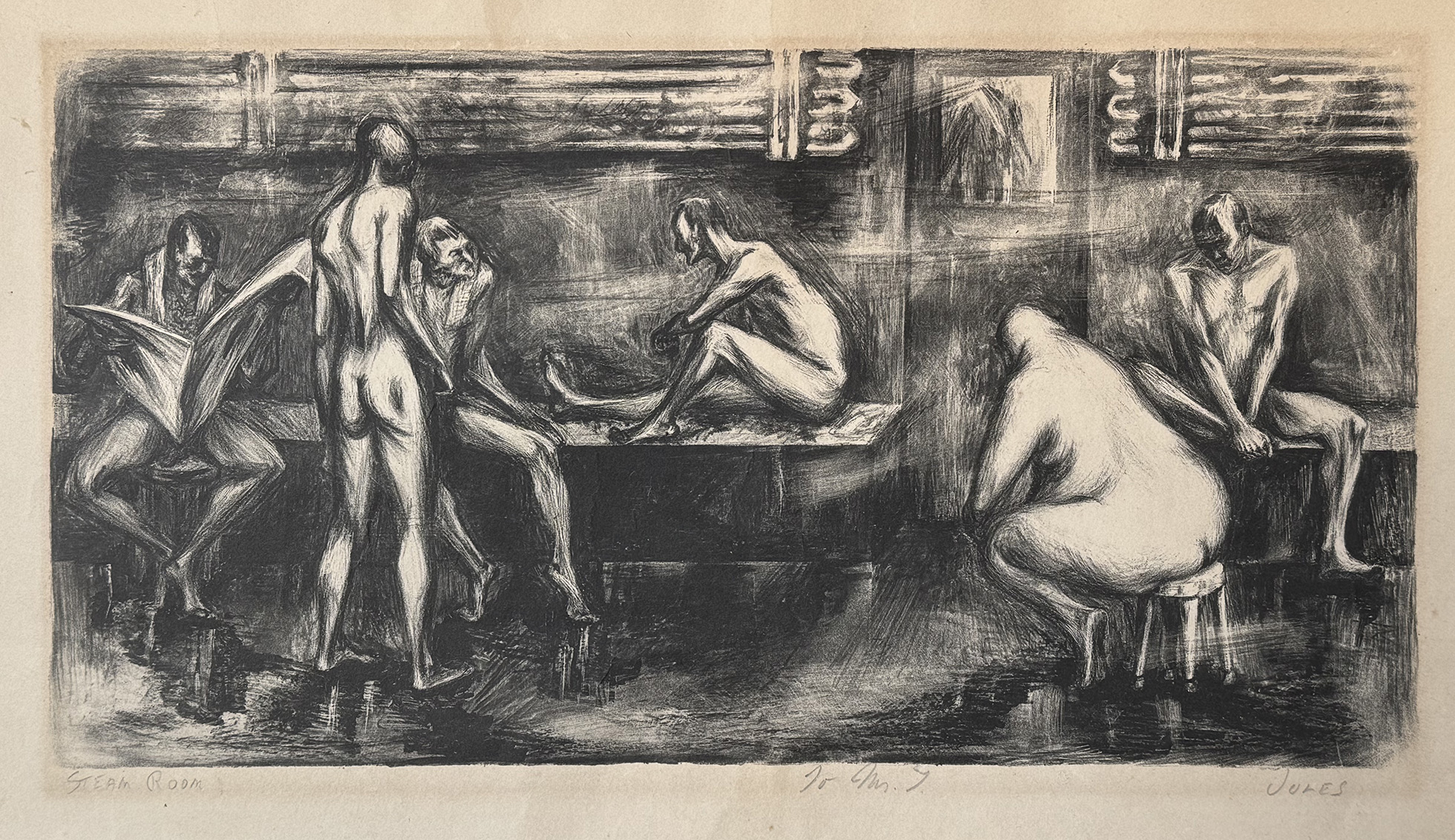
Mervin Jules, “Steam Room,” 1930s, lithograph, 6 3/4” x 12 3/4”
Mervin Meyer Jules’ “Steam Room”
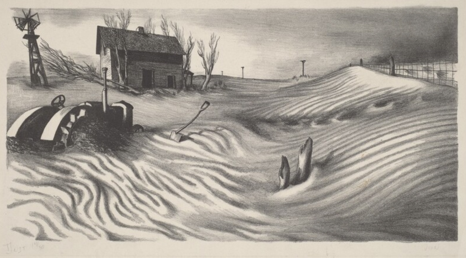
Mervin Jules, “Dust,” lithograph, early 1930s, 7 1/4″ x 13 7/8″, ed. 30
Before I purchased it on eBay in February, 2025, I’ve only seen one other copy by this Baltimore-born artist. In the 1980s I bought it and Voodoo Ritual, a litho by Marion Greenwood, for a friend who was thinking of collecting prints from the 1930s. Mostly I haven’t like prints by Jules (1912-1994), who often focused on classical musicians and circuses. But I did like Steam Room and even tried to track down another copy in Baltimore when I learned that he had a brother living in the Baltimore suburb of Pikesville. I visited him, but he didn’t have a copy. However, he did have a framed copy off Dust, which depicted the devastation of the Duct Bowl, when farmland was blanketed in drapery folds of windblown sand. This print was included in The American Artists’ Congress 1936 exhibition called “American Today.” In the accompanying book, Dust was listed as Plate 61. Unfortunately the brother was unwilling to part with it.
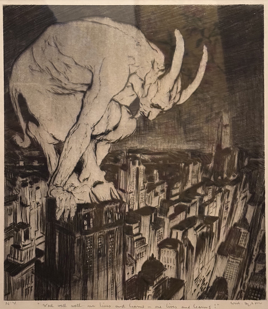
Will Dyson, N.Y. “Well well well one lives and learns – one lives and learns!”, drypoint, 12 7/8″ x 10 7/8″
Willian Henry Dyson’s “N.Y.”
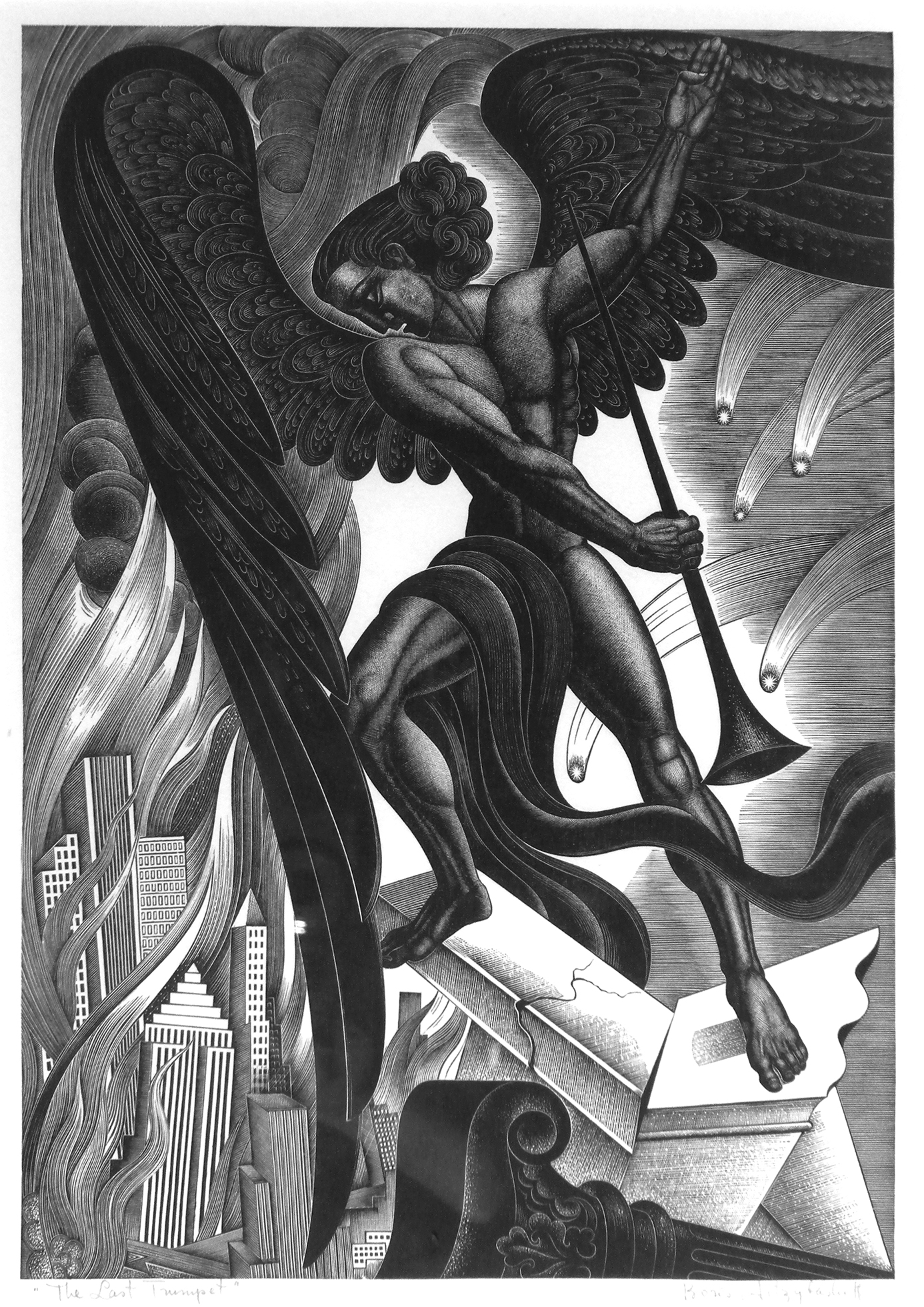
Boris Artzybasheff, “The Last Trumpet,” wood engraving, 1937, 11 3/8” x 7 7/8”, ed. 200
Will Dyson (1880-1938) was an Australian artist and political cartoonist. He moved to London in 1909. According to Wikipedia: “As cartoonist for The Daily Herald newspaper, Dyson became widely known as an illustrator and commentator supporting progressive social reforms in Britain. His cartoons were often controversial, tackling difficult issues such as poverty, inequality and war, and were characterised by their biting wit and artistic impact.” The Wikipedia listing says that Dyson visited the U.S., in 1930 and exhibited his prints in several cities including New York, where the Ferargil Galleries in Manhattan showed his work in April 1930. Perhaps 1930 would be a likely date for this drypoint.
This is my only print by an Australian-born artist. I was immediately attracted to it when it appeared on eBay a year ago. It proved to be a perfect bookend on a wall with Boris Artzybasheff’s marvelous wood engraving The Last Trumpet, which was issued in 1937 by the Woodcut Society of Kansas City.
While I don’t suggest that anyone should focus on eBay for collecting prints, The Last Trumpet was an eBay pick from 2010.
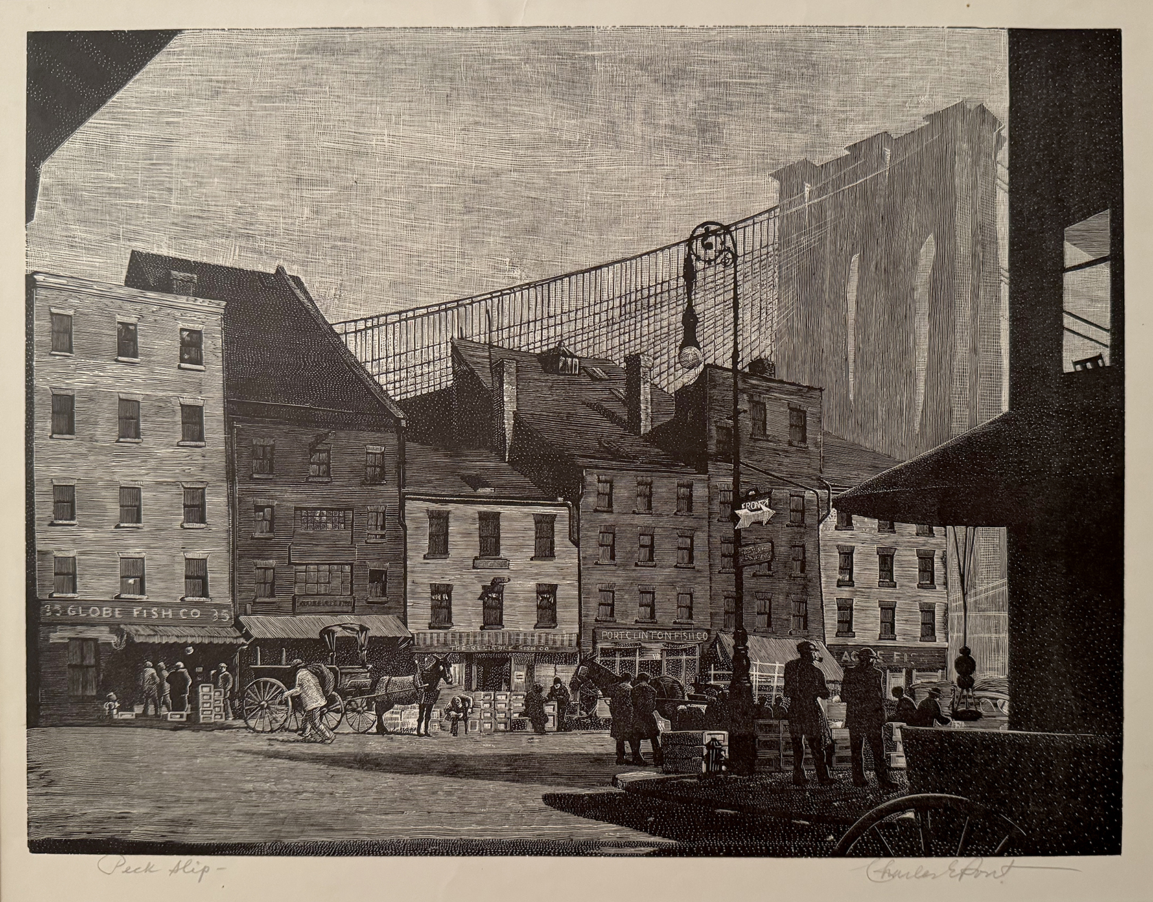
Charles Pond, “Peck Slip,” wood engraving, c. 1936, 8 15/16″ x 11 7/8″
Charles Ernest Pont’s “Peck Slip”
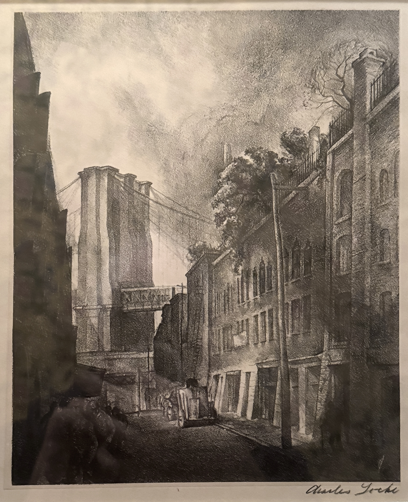
Charles Wheeler Locke (1899-1983), “Brooklyn Bridge,” lithograph with chine colle, 1930, 8 1/4” x 6 11/16″
I don’t know how many times I passed up acquiring a copy of this beautifully crafted wood engraving by Pont (1898-1971) because there was always something else that I deemed more desirable at the time. I finally yielded last March on eBay. According to the seller, the print came from the artist’s own collection via the estate of the artist’s daughter. When a copy of this print was put at auction by Rachel Davis Fine Arts in 2022, the listing said Peck Slip had this exhibition history: “Prints for the People.” A National Exhibition, FAP/WPA. New York, January 4 – 31, 1937; The Tenth Annual Exhibition of American Block Prints, Wichita, KS, 1936; The Sixth International Exhibition of Lithography and Wood Engravings, Art Institute of Chicago, 1937-38; and The National Academy of Design, 1941.
What finally won me over was his sympathetic rendering of 19th-century New York townhouses that were occupied by fish merchants in the 20th century. And what I find most remarkable was Pont’s cutting of the Brooklyn Bridge that both gave it three dimensions and set if off in the distance.
Its purchase created a fitting companion for Charles Locke’s lithographic view of the bridge from the Brooklyn side.
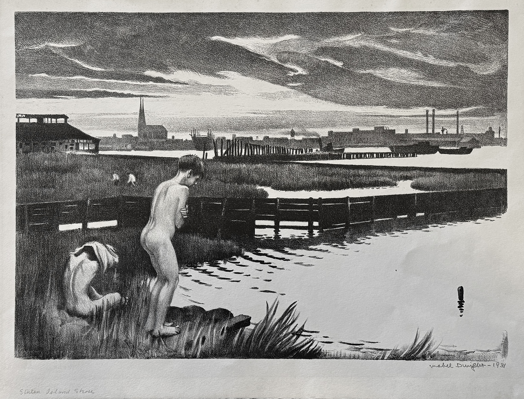
Mabel Dwight, “Staten Island Shore” (Bathers II), lithograph, 1931, ed. 25 printed by George Miller, 9 1/4″ x 13 1/16″ (Robinson & Pirog #51)
Mabel Dwight’s “Staten Island Shore”
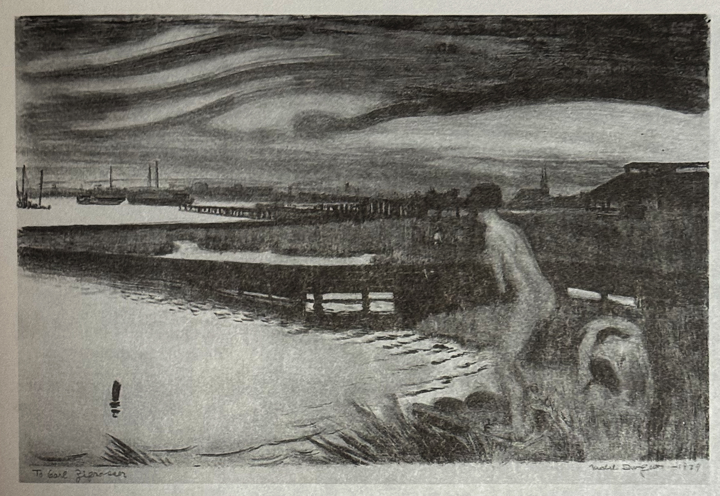
Mabel Dwight, “Bathers,” lithograph, 1929, 9 13/16″ x 14 3/8″, few printed, one known impression (Robinson & Pirog #41)
I’ve been wanting to add another print by Mabel Dwight (1875-1955) since acquiring a copy of her The Brothers in 2000. That image showing a priest turning away from caged orangutans was notable for being a commentary on the sensational Scopes trial of 1925. So I was quite delighted to be the high bidder at an October 2024 online auction that included this copy of Staten Island Shore.
Consulting “Mabel Dwight: A Catalogue Raisonne of the Lithographs” by Susan Barnes Robinson and John Pirog (Smithsonian Institution Press, Washington and London, 1997), I was surprised see that Staten Island Shore from 1931 was her second attempt at this image. Two years prior she made the litho Bathers that’s essentially the same image in reverse. The Robinson and Pirog catalogue entry for State Island Shore mentions that the Weyhe Gallery exhibited a related watercolor (location unknown) in 1932. Should it ever turn up, the original right-left orientation of this image would become known.
That catalogue entry then quoted Dwight (I believe from her essay “How I make a Lithograph,” which was made in the late 1930s at the request of the Federal Art Project): “But not all of the shore is dramatic; it has its lyric passages–salt marches, the water at high tide making little lush gardens of march grass. Decaying piers stretch into the stream and long dingy flat boats, those snails of water ways, float silently back and forth. The Jersey shore opposite is silhouetted jaggedly against the evening sky–church steeples, long low factory buildings, high smoke stacks, water tanks on tall stilts, a phantasmagoria of things that pattern themselves fascinatingly at this hour. And at this time the boys of the neighborhood come to the shore to swim. They shed their clothes in the tall grass and their bodies look pale and lovely in the soft light.”
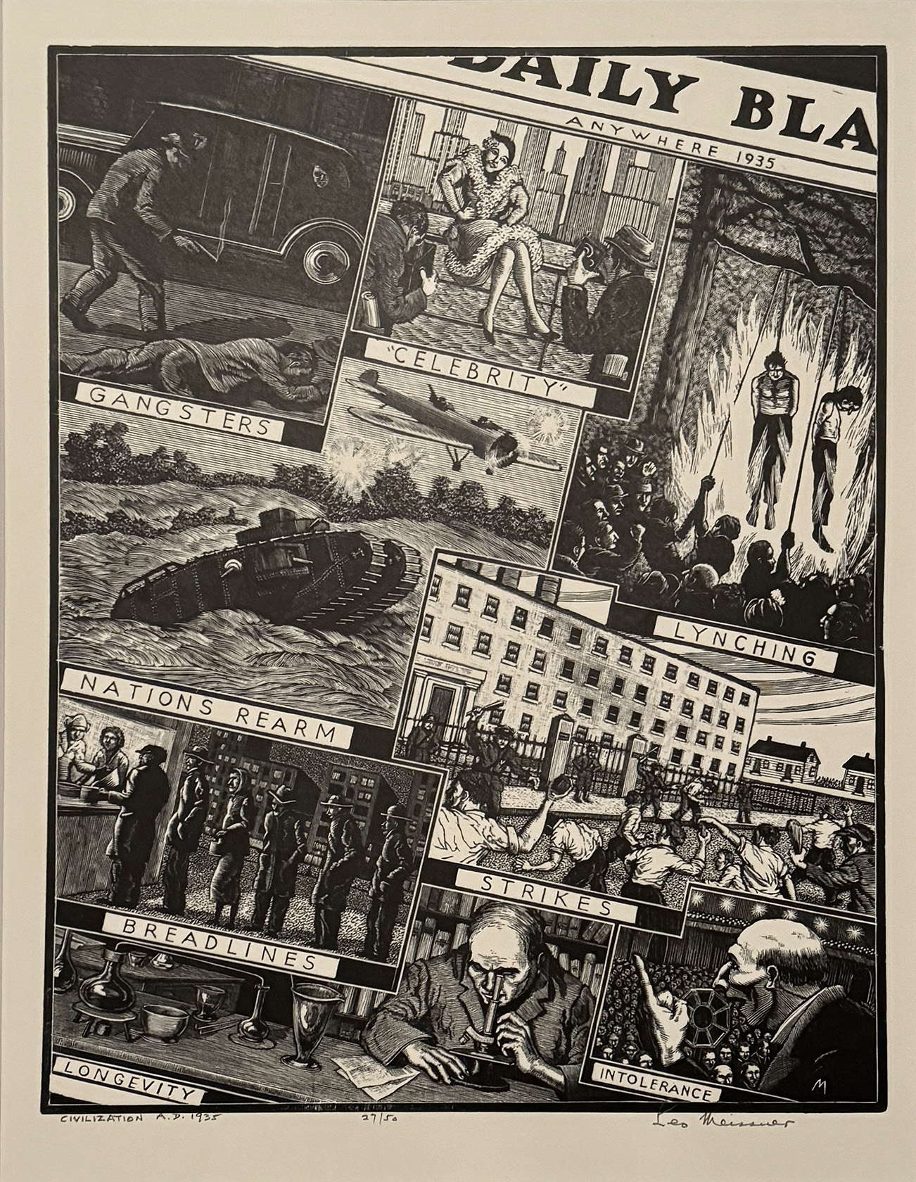
Leo Meissner, “Civilization A.D. 1935,” wood engraving, 12” x 10 3/4”, ed. 50
Leo Meissner’s “Civilization A.D. 1935”
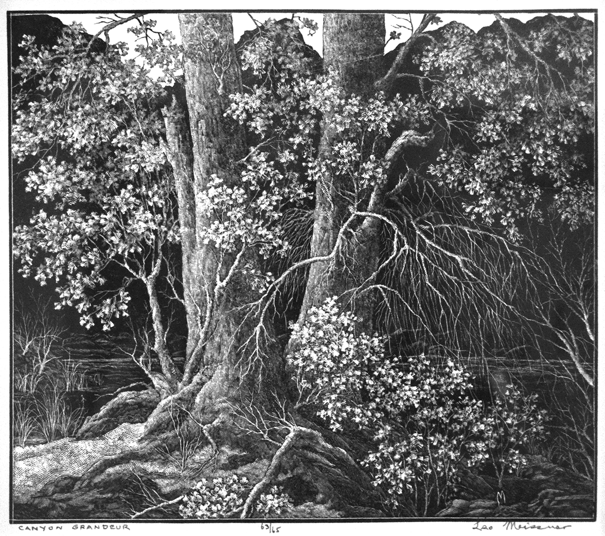
Leo Meissner “Canyon Grandeur,” wood engraving, 1954, 7 3/8” x 8 1/2”, ed. 65
Forty-three years elapsed between my first Leo Meissner (1895-1977) print purchase and my second. One way to compare those acquisitions is price. In 1981 Canyon Grandeur was sold to my be Betty Duffy, who ran the wonderful Bethesda Art Gallery outside of Washington. In 2001 I was working part-time at the Baltimore Sun as a copy editor and my discretionary art allowance was $100. Canyon Grandeur fell under that limit. Then again so was the Howard Cook wood engraving Chimneys, which I also bought from her that year. (Betty Duffy was strict. She wouldn’t reduce the price, but if you spent $500 or more at a time (which I never did), you could pay it out over time.) Civilization A.D. 1935 was decidedly more dear when I acquired it in August 2024. Let’s say it was over 14 times more costly than Canyon Grandeur. (And that was a bargain these days.)
But another way, and more importantly, the difference between the two purchases was how it illustrated my development as a collector over the years. Gone was my gravitation toward bucolic, realistic scenes as beautifully expressed in Canyon Grandeur. My choices these days often have strong political punch. No print can illustrate that better than Civilization A.D. 1935. How little American has changed since 1935. Lynchings might have ended, but now without a rope there are so many effective ways to keep the non-white, non-rich “other” in check.
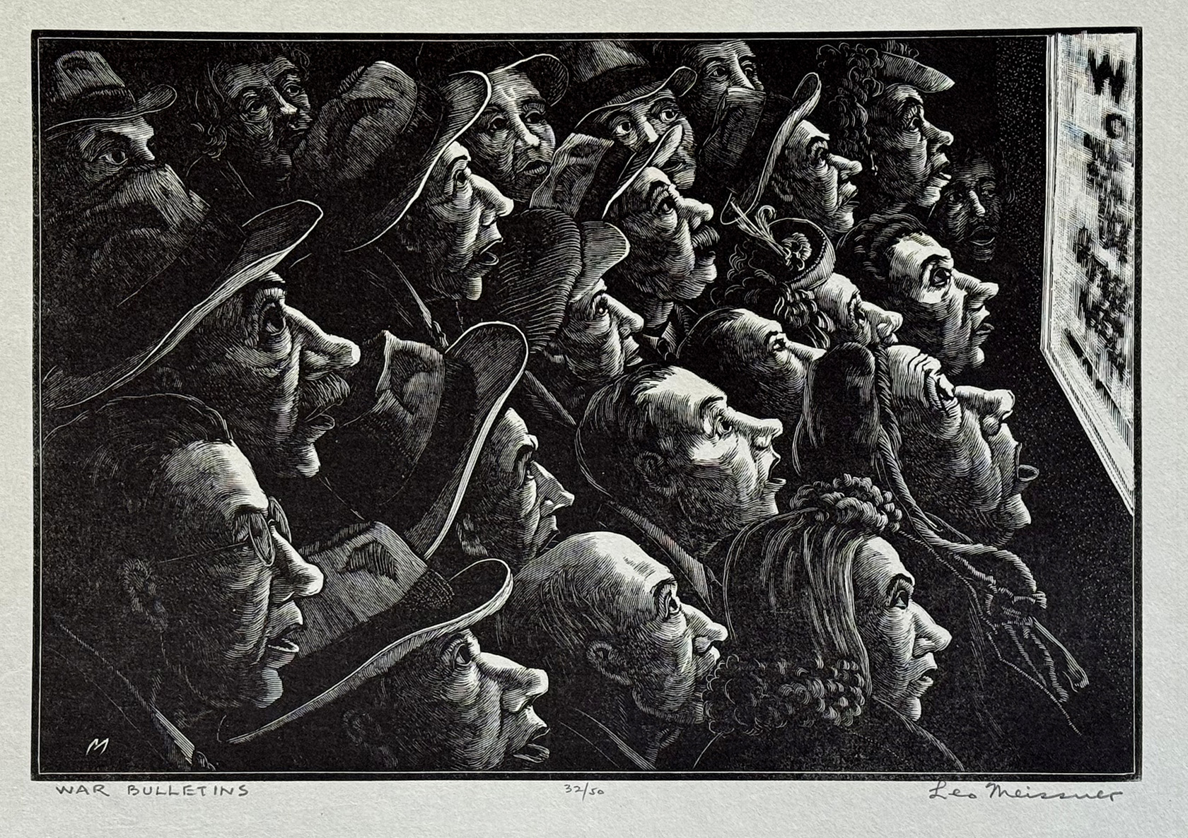
Leo Meissner, “War Bulletins,” wood engraving, ed. 50, 6 1/8″ x 9 1/16″
Leo Meissner’s “War Bulletins”
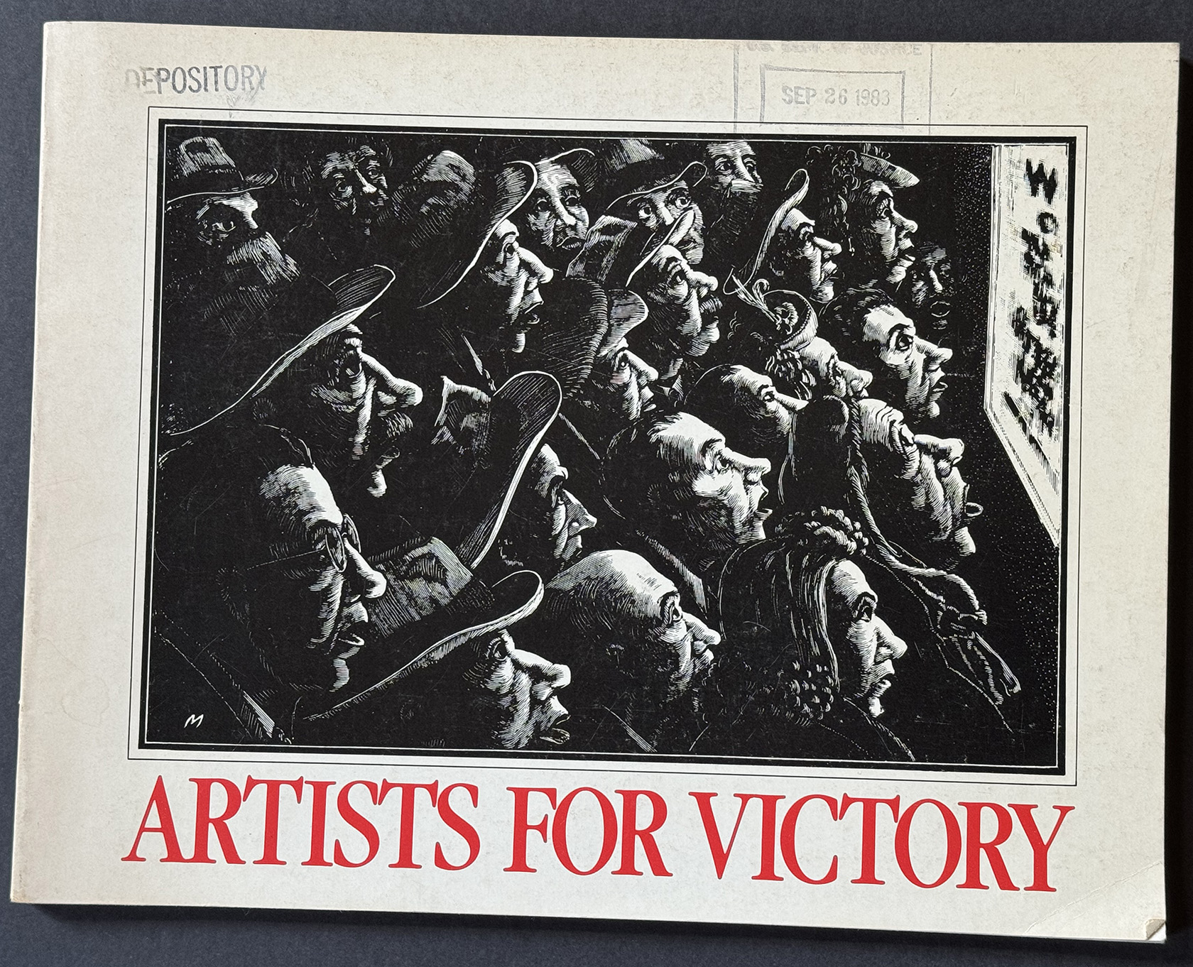
Cover of “Artists for Victory” by Ellen G. Landau (Library of Congress, Washington, 1983)
Then a year later (August 2025) this important Meissner print appeared on eBay, and despite being more expensive than Civilization, I couldn’t resist largely because the image made the cover of the Library of Congress book “Artist for Victory.” This was the catalog for an exhibition from Feb. 20- July 31, 1983 at the Library of Congress. According to Landau’s “America in the War” essay, Artists for Victory was the name given in 1942 to an organization of U.S. artists with the purpose “to render effective the talents and abilities of artists in the prosecution of World War II and the protection of the country.” One of its undertakings began in 1943 with various programs in observation of Four Freedoms Days. And one of the programs was to hold a national competition for printmakers. Artist Joseph Leboit ran the competition for a projected exhibition of 100 prints from four major print types: relief, lithographic, intaglio and serigraphic.
In the prospectus he wrote: “Artists for Victory invites all artists to participate in this national graphic arts exhibition which promises to be a dramatic event in the world of war. The theme, ‘America in the War,’ should be interpreted in its broadest sense, so that the exhibition when assembled becomes a picture of America in 1943, a country and a people in their second year of war.”
Since my father was in the Army Air Corps and a navigator for a bomber stationed in North Africa, notices of war updates were crucial for his parents. All the wide-eyed faces staring at the latest news from overseas in Meissner’s wood engraving couldn’t have been more apropos. (My father’s plane was shot down near, Naples and he became a P.O.W. for 21 months in Germany.)
Previously I’ve acquired the following prints that were included in the Library of Congress exhibition: Donald Vogel’s drypoint Swing Shift, Ruth Starr Rose’s lithograph I Couldn’t Hear Nobody Pray, and J. Jay McVicker’s aquatint Arc Welder.
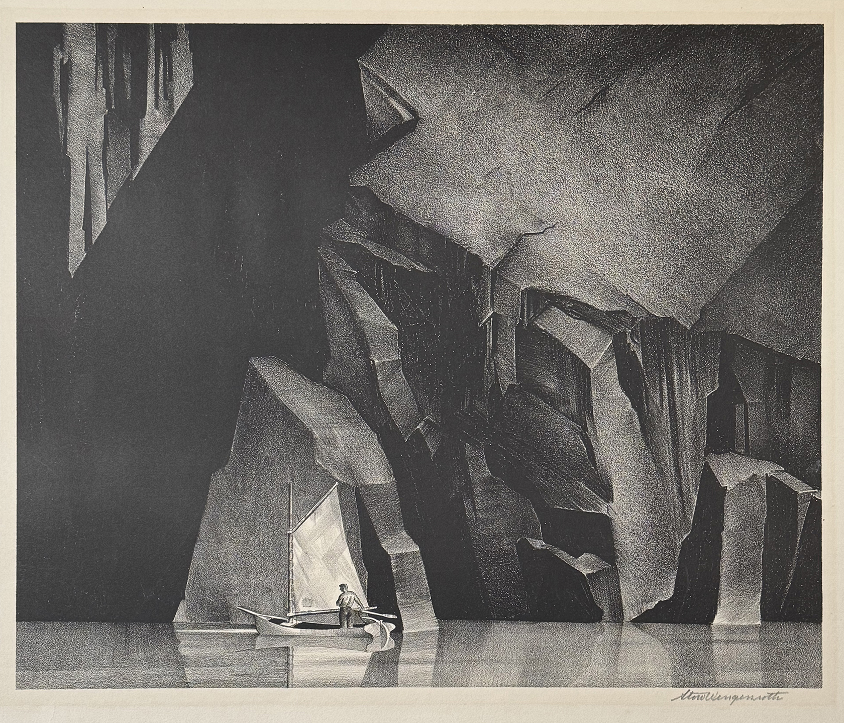
Stow Wengenroth, “Aphelion,” lithograph 1931, 11 15/16″ x 13 11/16″, ed. 50
Stow Wengenroth’s “Aphelion”
Oddly enough the purchase of Meissner’s War Bulletins led directly to this acquisition. That was because the seller of the Meissner via eBay turned out to be married to the son of Ronald and Joan Stuckey, who wrote the catalogs raisonné on the prints of Stow Wengenroth. (“The lithographs of Stow Wengenroth 1931-1972,” Boston Public Library, 1974, and “Stow Wengenroth’s Lithographs: A Supplement,” Black Oak Publishers, Huntington, N.Y., 1982) While our conversation began on eBay with the negotiation on the price of the Meissner’s War Bulletin, I was able to direct her to my email address on this website. Once that happened, she emailed with me a list of printmakers whose works she had for sell. The list included Wengenroth. On further inquiry she said she had a number of Wengenroths because of whom she had married. That led me to consult the first Wengenroth book by the Stuckeys. So I gave her a short list of preferred Wengenroth prints from the 1930s, his earliest (I find most interesting ) period. That’s how I ended up with Aphelion.
In the essay “Master of Art and Craft” in the book “The Lithographs of Stow Wengenroth 1931-1972” Sinclair Hitchings wrote: “From the very beginning of his printmaking, in 1931 and 1932, Wengenroth shows insistence upon knowing what his lithographic crayons can yield on the stone. Working with a soft crayon, he draws a cape of headland starkly immovable in its towering blackness of rock confronting the sea. From that intense black he uses harder crayons to move across a spectrum in which greys of differing intensity are seen as colors in themselves. He created his own range of color between the stern extremes of black and white.” That’s a pretty good description of Wengenroth’s facility in creating Aphelion of 1931.
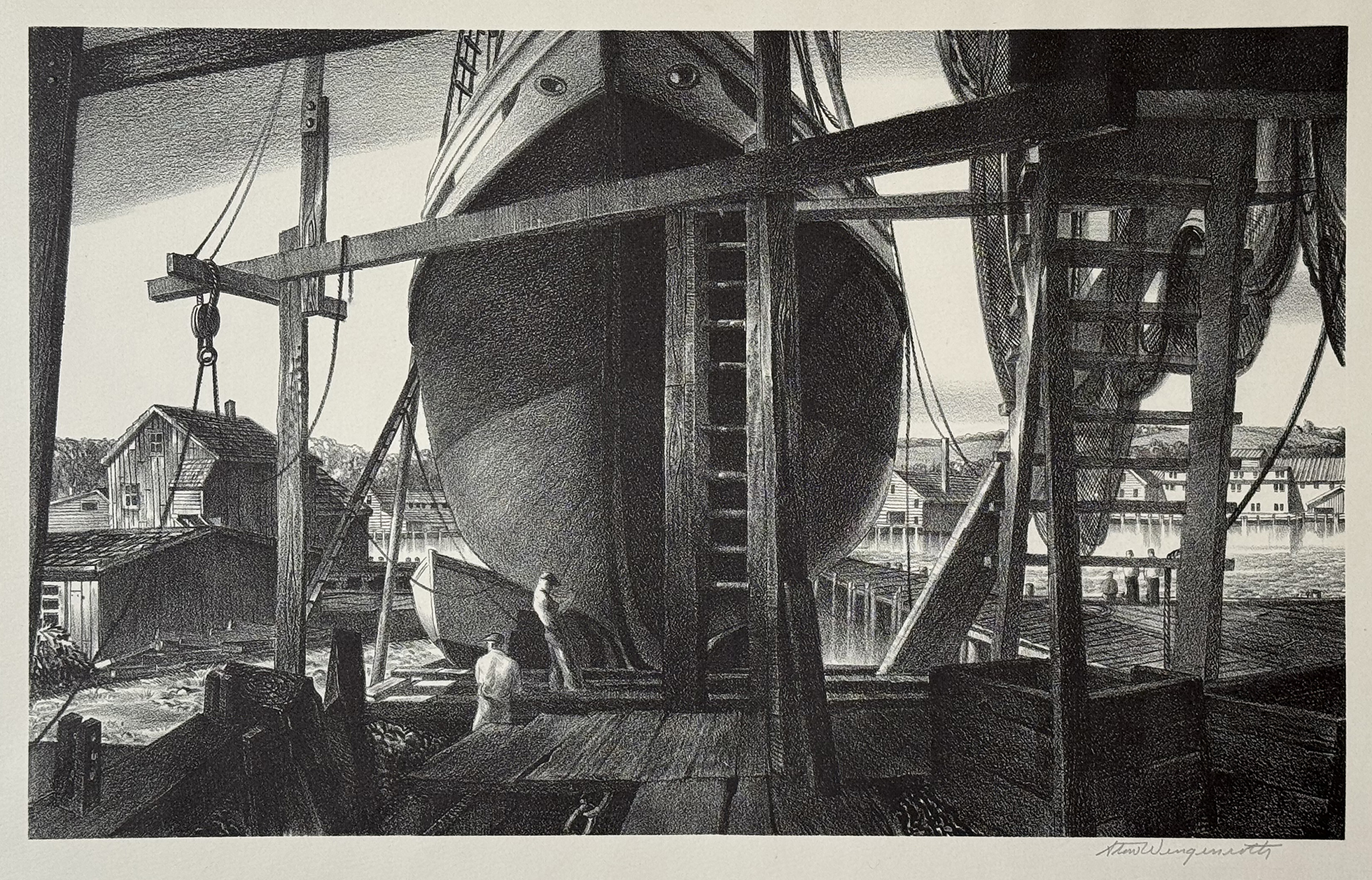
Stow Wengenroth, “Home Port” (Gloucester, MA), lithograph, 1936, 8 5/16″ x 13 1/2″, ed. 60
Stow Wengenroth’s “Home Port”
But Aphelin was not the only Wengenroth that I inquired about. I asked about a number of harbor scenes that Wengenroth did because I sought an image that was not archetypical like Aphelion but more observational, e.i.. more prosaic. Home Port was one of them. But the seller kept saying she didn’t have a copy to sell. Then she emailed me that a print dealer I’ve met and patronized over the years had a copy. And why did she know? Because she had a copy of Home Port on consignment with that dealer. So indeed I was able to acquire that print through the dealer.
In the essay “Realistic, Imaginative, and Contemporary” from the book “The Lithographs of Stow Wengenroth 1931-1972” Paul Swenson wrote: “Around 1934, Wengenroth’s early style is very gradually transformed to present a view of nature very much his own and one which continually seeks out subjects which lend themselves to a more realistic and penetrating delineation. Trees, rocks, the ocean, the skies are often rendered with a precision of effect which evokes the feeling of a certain time of day and season of the year.” And I would add “place” as in his lithograph of Gloucester, MA in Home Port.
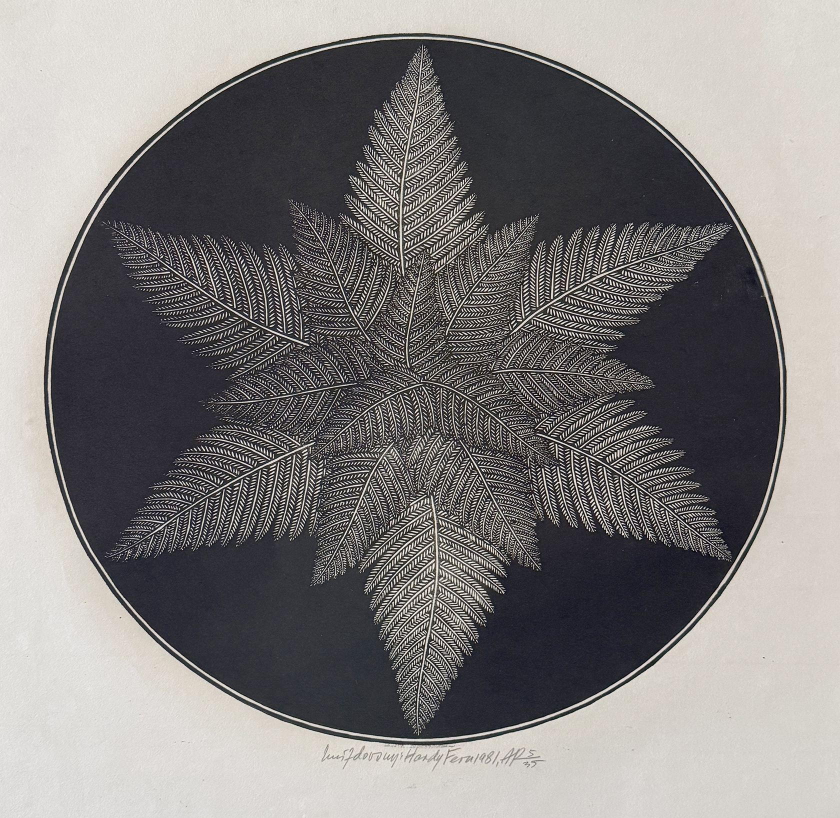
Jacques Hnizdovsky, “Hardy Fern,” woodcut, AP 35, ed. 150, 14 3/8″ x 14 3/8″
Jacques HNIZDOVSKY’s “Hardy Fern”
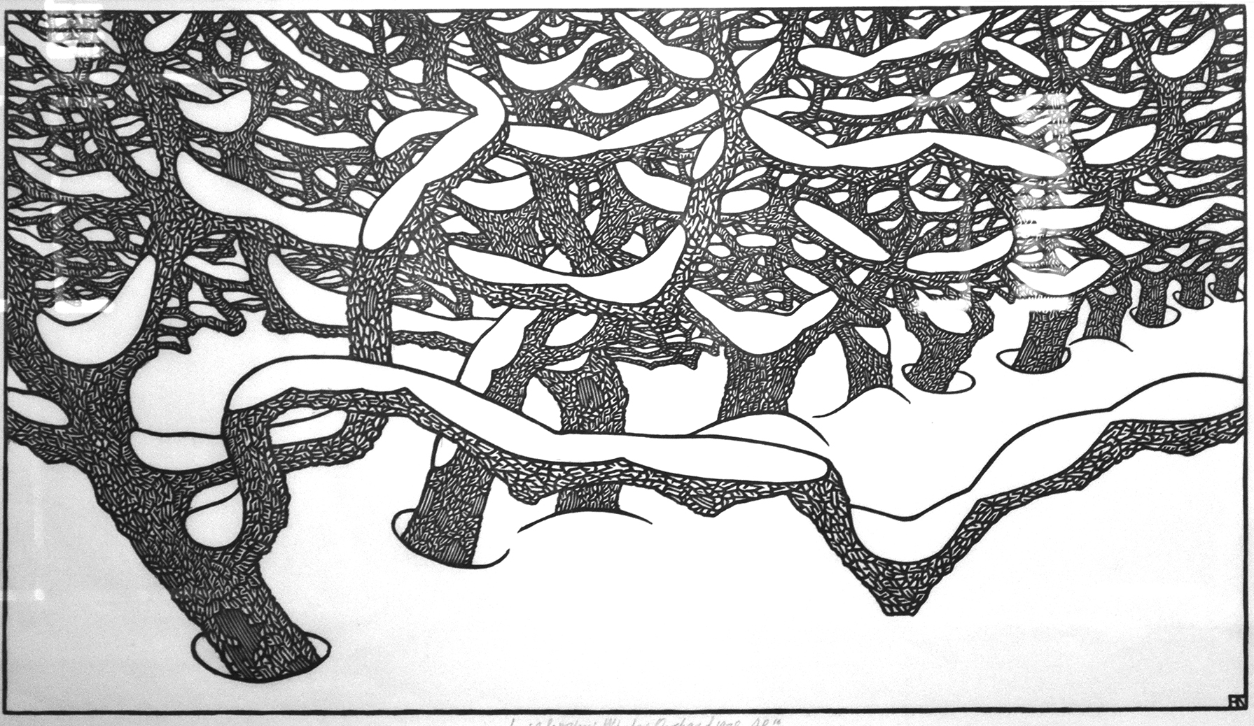
Jacques Hnizdovsky, “Winter Orchard,” linocut, 1978, ap 30, ed. 150, 13 3/4″ x 24″
I hardly ever venture pass 1950 as the date for the creation of a print when considering an addition to my print collection. But there are some artists so skillful and so individual that I’ve occasionally, should I say “rarely,” make an exception. I made such an exception for the woodcuts of Jacque Hnizdovsky (1915-1985). It was the combination of his straight-forward woodcut cutting and his love of patterns–patterns that fascinated him in both plants and animals. He loved repetition.
Print dealer William Greenbaum, who died in 2022, introduced me to Hnizdovsky. Greenbaum was a regular at print fairs and, if my memory is correct, started showing Hnizdovsky prints in the late 1990s. I bought Winter Orchard from him in 2001. (I have a price list from him dated 2013 if anyone is curious about how Hizdovsky prices have grown.) I loved that the print combined a sense of perspective as seen in the lower half of the image and a sense of nature’s chaos in the upper half of the image. That sense of chaos is rare in Hnizdovsky.
He usually made nature seem completely ordered as elegantly expressed in Hardy Fern. He sometimes did light and dark versions of the same image. Paporoit II was apparently created from the same wood block. He simply removed the wood between the outmost fronds and the circle, turning a black background to white.
(I must acknowledge my attraction to circular imagery as is evident in my recent production of linocuts and the book Circularity that followed See blog posts: LINK and LINK.)
In researching for this Hnizdosvsky entry I came upon the website Hnizdovsky Gallery (LINK), which is operated by the Hnizdovsky Trust. Besides being a source for those interested in acquiring a Hnizdovsky print, it has some rich biographical information. I’d like to share a small section for the artist’s early years because it many ways it parallels the life of many Jewish emigres from Eastern Europe.
1926: “Attends private school (gymnasium) in Chortkiv. During his years in Chortkiv, Hnizdovsky has a roommate who was heavily involved in politics, something Hnizdovsky has no interest in. During a school search by the Polish police, Hnizdovsky’s roommate, fearing impending arrest for his political activities, decides to hide all his political flyers under Jacques Hnizdovsky’s mattress. Hnizdovsky is arrested and imprisoned, while his roommate goes free. The imprisonment appears to have lasted over a year and a half. Jacques Hnizdovsky is cleared of all charges, but the Chortkiv Academy refuses to allow him to return. This experience creates a distaste for all things political for the artist’s entire life.”
1933: “The young artist is saved from a Polish concentration camp by Metropolitan Andrey Sheptytsky OBM, who transfers the young artist to Seminary, allowing him complete his gymnasium studies.”
1939: “The German invasion of Poland forces the sudden closure of the Academy of Fine Arts in Warsaw. Hnizdovsky is forced to flee by foot and by stowaway, with nothing but the clothes on his back. He settles in Zagreb, where he receives a scholarship to study at the Academy of Fine Arts at the University of Zagreb, receiving credit for the two semesters he completed in Warsaw.”
1944-49: “Continues painting and drawing while living in the Weyarn Displaced Persons’ Camp near Munich, Germany. Awaits permission to emigrate to the Unites States. Arrives in the United States and settles in Saint Paul, Minnesota, working as a commercial artist and textile designer for Brown & Bigelow”
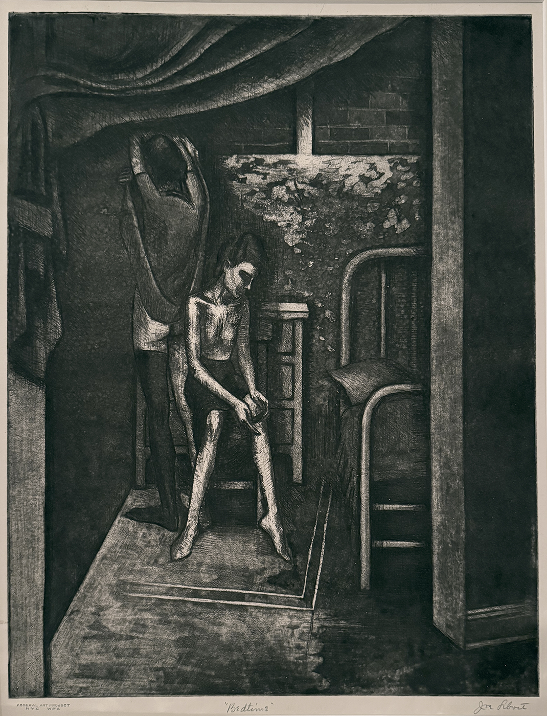
Joseph Leboit , “Bedtime,” aquatint, 1935-43, ed. c. 25, 14 5/8″ x 11 1/8″ (The date range simply reflects that the print carries the federal Art Project stamps for the New York WPA.)
Joseph Leboit’s “Bedtime”
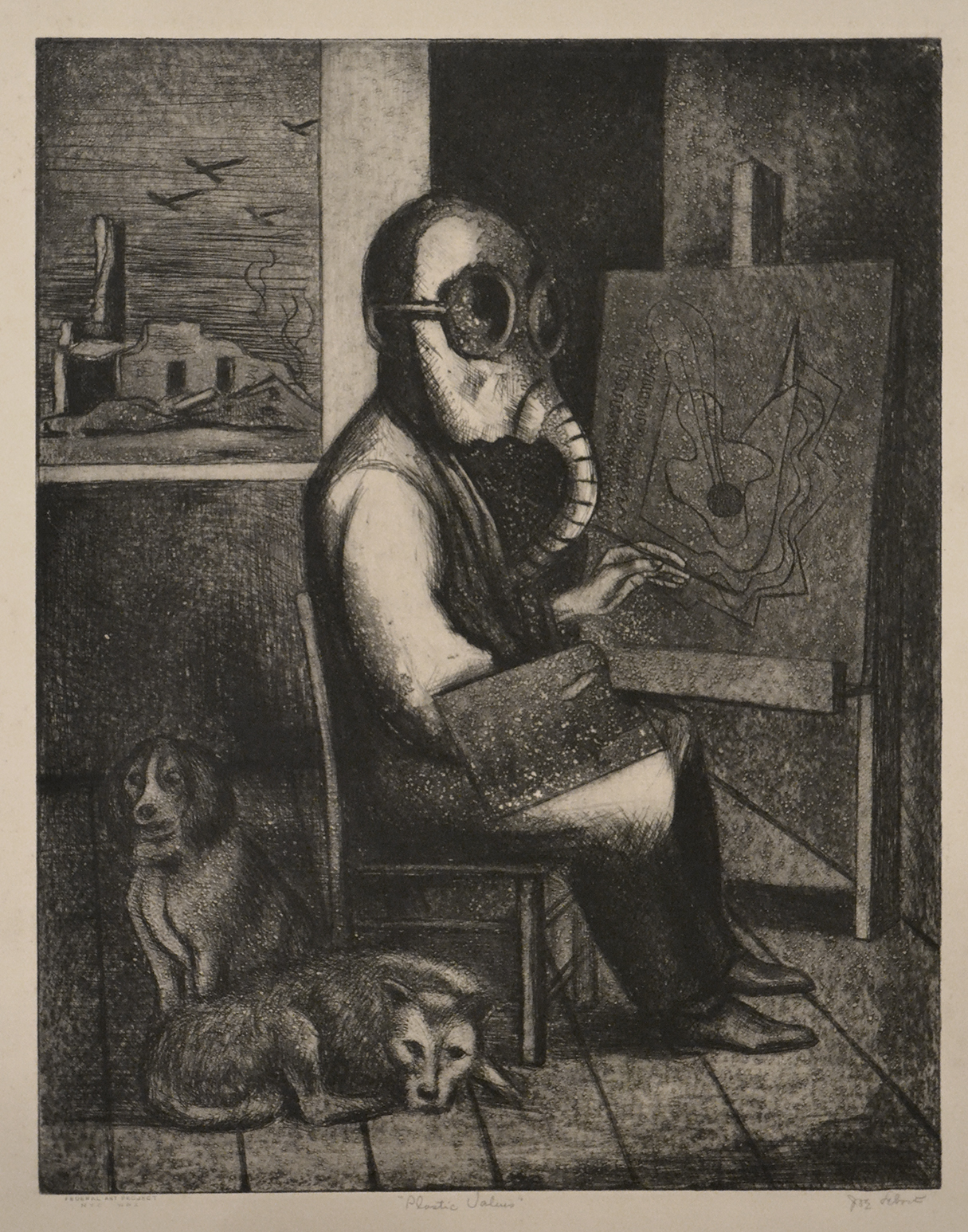
Joseph Leboit, “Plastic Values,” etching and aquatint, 1934-43, 14″ x 10 7/8″. (also with Federal Art Project New York WPA stamp)
Joseph Leboit (1907-2002) occasional made some pretty tough images. Bedtime with its shadowy domestic interior and suspicious relationship between the seated figure and the standing figure is a prime example. I won’t attempt to unravel the psychology behind the image, but it’s interesting to learn about Leboit’s non-art career as quoted in my blog post (LINK) on Jewish American artists: “Leboit was born in New York as Joseph Leibowitz. According to his bio on the Annex Galleries website: ‘In the mid 1930s Leibowitz changed his name to Leboit, though whether it was due to mounting anti-Semitism or the art world’s growing affinity for French artists is unknown.’ After the war he trained as a psychologist and as ‘a certified psychologist and for twenty-five years served as director of the Advanced Center for Psychotherapy, a non-profit mental health clinic, which he co-founded.’ ”
The other Leboit in my collection is Plastic Values, which generally goes by the title Tranquility. When the name was changed I don’t know. But I did a blog post (LINK) about this particular impression because of the signatures well below the image. In this blog post I detailed why I believe my impression served as the bon à tirer (B.A.T.) for the edition. In other words both the artist and the head of the New York WPA print studio director signed off on this impression as the approved way the edition was to be printed.
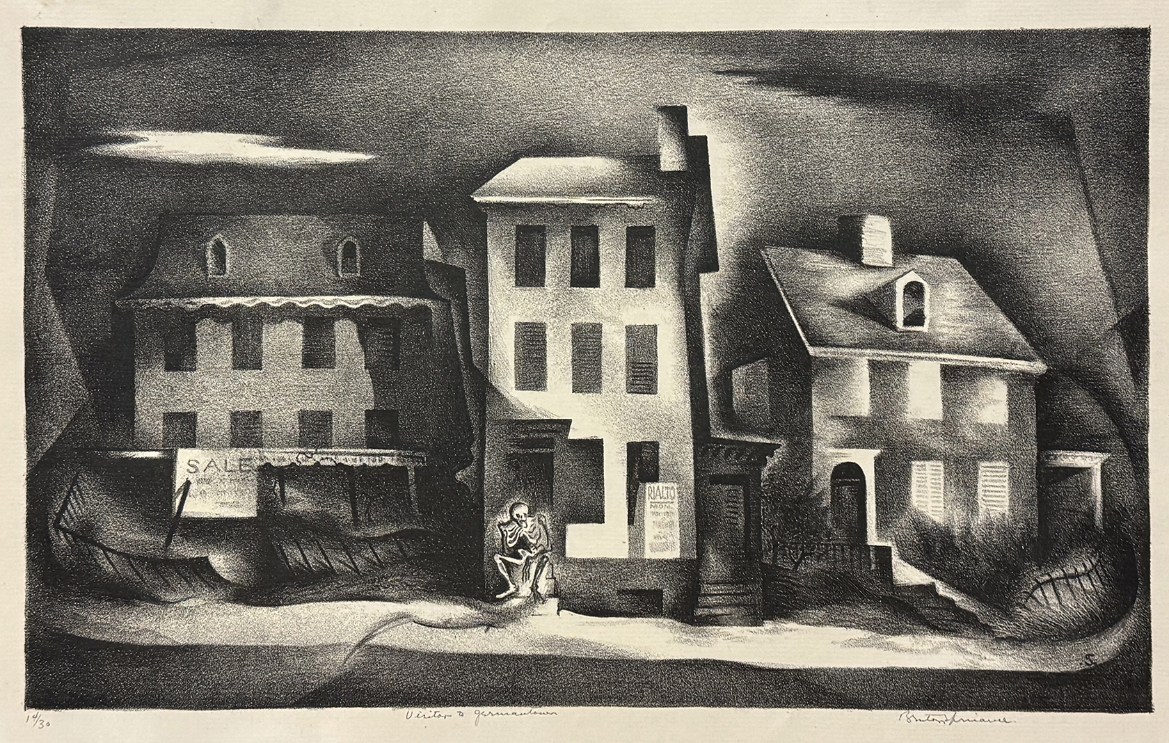
Benton Spruance, “Visitor to Germantown,” lithograph, 1935, ed. 30, 8 7/16″ x14″
Benton Spruance’s “Visitor to Germantown”
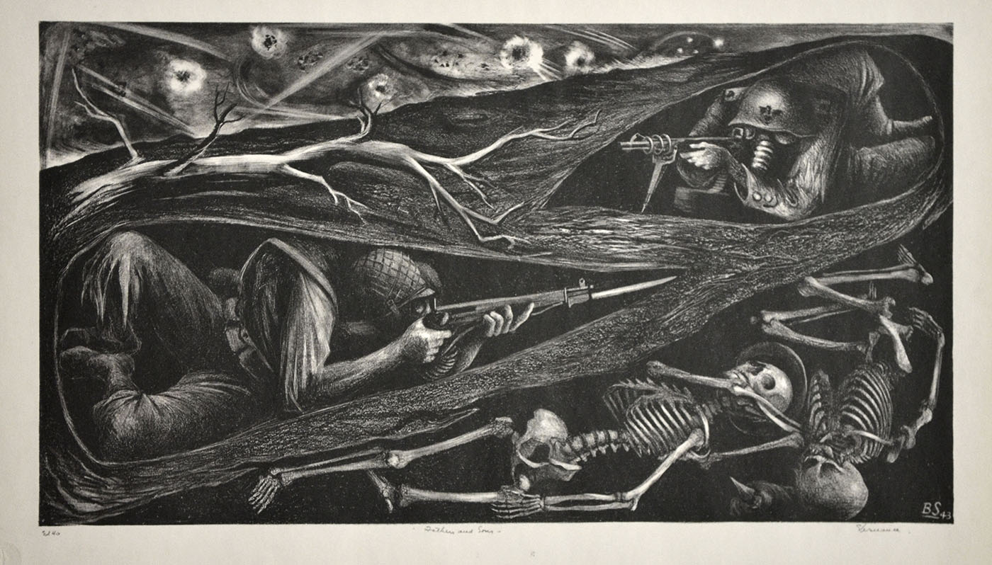
Benton Spruance, “Fathers and Sons,” lithograph, 1943, ed. 40, 11 1/8″ x 20 3/16″
This print by Spruance (1904-1967) came up at auction soon after my husband Michael Frommeyer’s death. (Our life together is told in photos in my blog post “The Mike and Scott Show: No Reruns.” LINK) With its image of a skeleton sitting on the front stoop of a house, it just seemed appropriate to acquire an image of death arriving to a home, as death did at our house.
Death in the form of a skeleton made a number of appearances in Spruance’s art. Fathers and Sons was the first Spruance to enter the collection. Generation after generation, the unlearned lesson of the futility of war.
★ ★ ★

Trackback URL: https://www.scottponemone.com/accessions-short-stories/trackback/
Leave a Reply
-
Accessions: Short Stories Dec 21, 2025

-
The Mike and Scott Show: No Reruns Nov 25, 2025

-
Griffin Chairs: Both naive and refined Oct 04, 2025

-
Circularity: The Pairing of Two Talents Jul 12, 2025

-
Frans Masereel: Workers’ Paradise in 1939 Europe Apr 11, 2025

-
Erich Glas: Through the Night vs. Leilot/Nights Jan 15, 2025

-
Gustav Wolf: His Monster Menagerie Dec 23, 2024

-
Linos: #5 through 15 Nov 01, 2024

-
Gustav Wolf: Confessio Aug 02, 2024

-
Justin Remo’s Big Finale May 21, 2024

-
Accessions: Short Stories Dec 21, 2025
-
The Mike and Scott Show: No Reruns Nov 25, 2025
-
Griffin Chairs: Both naive and refined Oct 04, 2025
-
Circularity: The Pairing of Two Talents Jul 12, 2025
-
Frans Masereel: Workers’ Paradise in 1939 Europe Apr 11, 2025
-
Erich Glas: Through the Night vs. Leilot/Nights Jan 15, 2025
-
Gustav Wolf: His Monster Menagerie Dec 23, 2024
-
Linos: #5 through 15 Nov 01, 2024
-
Gustav Wolf: Confessio Aug 02, 2024
-
Justin Remo’s Big Finale May 21, 2024