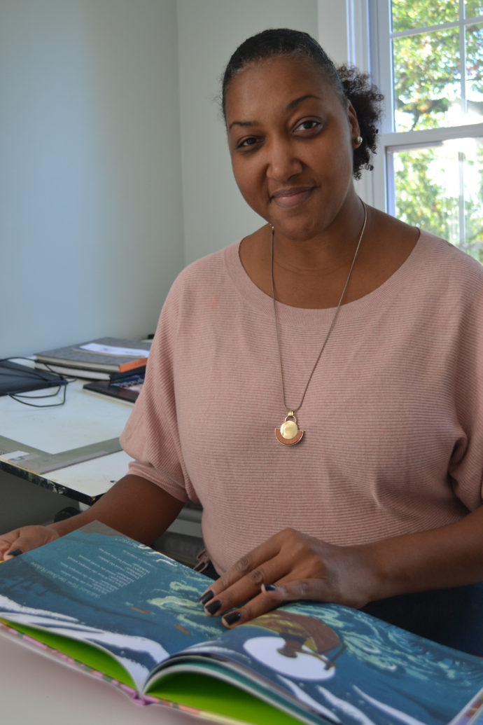
Shadra Strickland: children’s book Illustrator

INTRODUCTION
The first part of this blog post is largely a reprint of an article–”Shadra Strickland: Reduction Linoleum Cuts for Children”–that appeared in the fall 2016 edition of the Newsletter for the Print, Drawing & Photograph Society of the Baltimore Museum of Art. It presented a conversation I had with Shadra while she was working on linoleum cuts to illustrate a children’s book of poems by Deloris Jordan.
Soon after the issue was printed I asked Shadra if I could turn the article into an ART I SEE blog post with color photos instead of black and white. I also wanted to use photos that the print edition layout didn’t allow. At the time Shadra requested that I wait until the book she was working on in 2016 was published. That event didn’t happen until last month.
So now I can present A Child’s Book of Prayers and Blessings: From Faiths and Cultures Around the World, by Deloris Jordan, artwork by Shadra Strickland (Simon & Shuster Books for Young Readers, New York, 2017). The first section largely reprints the Newsletter article with additional photos. In the second section Shadra answers questions about whether there were any bumps in the road to publication over the past year.
All artwork © 2017 by Shadra Strictland. All photos by Scott Ponemone except where noted.
WORK IN PROGRESS
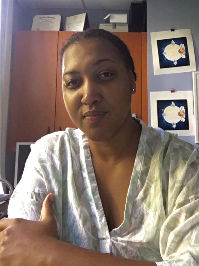
Shadra Strickland (Photo by Shadra Strickland)
An award-winning illustrator of children’s books, Shadra Strickland tackled something new in 2015. She worked in reduction linoleum cuts. In fact this was her first book using a printmaking medium. Previously she primarily relied on ink, watercolor, gouache, charcoal and acrylic in various combinations. So her latest book, initially entitled A Child’s First Book of Prayers, has been an adventure for her.
Shadra is a full-time faculty member at Maryland Institute College of Art. She said, “I teach at least one core class per semester (Sophomore-Senior Illustration) and have taught specialized courses such as Visual Journalism, Professional Development, Book Illustration, and Advanced Book Illustration.” She earned her B.F.A. from Syracuse University (design & illustration) and an M.F.A. from the School of Visual Arts in Manhattan (Illustration as Visual Essay).
After I visited her in her Hampden rowhouse and enjoyed viewing her project first hand, I sent her questions via email, beginning by asking about her passion for illustrating children’s books before I directed my questions to her current project.
How and why did you get interested in making your own children’s books?
After graduation from Syracuse, I had no real idea what I wanted to do or how to be a professional illustrator. After college I moved home to Atlanta and began teaching elementary school art. In the mornings teachers were required to read to students for 20 minutes or so. That was when I discovered a love of picture book art and was able to see a large range of artistic styles in illustration. After three years of teaching in public school, I moved to New York to pursue my MFA and a career in picture books.
What children’s books have had a great influence on you from your childhood and as an adult?
I loved The Snowy Day by Ezra Jack Keats. There weren’t many picture books around that featured children of color. Peter [a character in The Snowy Day] was a revelation. As an adult, Kadir Nelson’s books were inspirational for me because his style was so fresh and playful. Seeing his work helped me realize that I could make books too.
Now, I have a deep respect for a very wide range of styles and content. As a fan of picture books and a professor, I devour picture books so that I can hand pick recommendations for my students. It is so important for them to see a wide range of work being made so that they can find a place for themselves on the shelves.
You appear to direct your books to an African-American audience. Is that purposely so and why?
I don’t direct my books to an African-American audience and not all of my books feature African-American characters. I’m African American and illustrate stories about people of color, though not exclusively. My stories are for all readers. I get this question a lot in interviews. No one asks white artists why their books are directed to white readers. So why should I, an African-American woman be asked why I paint people who reflect the world I live in?
The preliminary title of your new project is A Child’s First Book of Prayers. What is the source of it’s text?
The book is by Delores Jordan and is compilation of spiritual poems and prayers for children.
When did the project begin? When’s the due date for your illustrations?
I signed the book [contract] a few years ago, but I began working on the prints last June. I will finish the prints this month [July].
How many poems will be illustrated? How many single-page illustrations, and how many two-page spreads?
There are 23 poems; 9 spreads and 10 single pages plus the cover.
How do your images begin?
Each book is different, but I begin by making small thumbnail sketches of any images that come to mind while I am reading the manuscript. It is somewhat like storyboarding a movie. In the case of this book, each image needed to stand on its own to represent each poem. When working on narrative texts, images have a natural flow that reflects the passing of time and changing mood based on the story. There is typically a set color scheme from start to finish. The challenge for this book has been finding a way to order the poems and images into similar groups and allow colors to flow naturally, gradually from the beginning of the book to the end.

Shadra holds her preparatory miniature booklet.
What is the next step?
The storyboard is the map. After I have finished the thumbnails I print them out and assemble them into a miniature booklet so that I get a sense of the page turns and overall pacing of the story. Because illustrating a picture book is more a marathon than a sprint, these extra little steps are ways to add markers to the process before having to focus on making 16 or more finished pieces of art. I do change the order of images based on the development of the thumbnails. Once the thumbnails are set, I focus fully on finishing the artwork.
Why did you decide to illustrate it with color reduction linoleum cuts?
I chose linocuts for this book because it is for very young readers, and I wanted to use simpler shapes, texture, and color to appeal to that audience.
What experience did you have in this medium at the start? Where did you go for advice?
One of my dear artist friends, Taeeun Yoo, works primarily in linocut. I always admired her process and asked if one day she would give me a demonstration. When this book opportunity came along, I knew that linocuts would be a great fit for it. I took a trip to Seoul to visit Taeeun in 2014. She taught me how to make a print before I left. To supplement and refresh my knowledge almost a year later, I watched lots of YouTube videos and referred to many great books on relief printmaking.
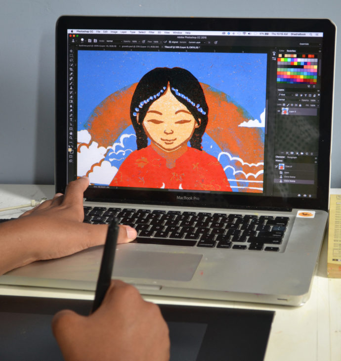
Shadra uses a computer to make a color study of an image and (as shown here) to make adjustments to a linoleum cut.
Please briefly run through your procedure for creating an image and then for printing? What tools do you use?
Once the thumbnails were completed, I started the prints. First I make a detailed digital color study using Procreate on my iPad Pro and then finish it in Photoshop. Once that is done, I flip the image [right to left] and print a copy that I use to trace down onto a piece of battleship grey linoleum.
I use Gamblin oil-based relief and etching inks. Most colors are mixed from primary colors: red, blue, yellow, green, white [but] no black. I mix and ink on a sheet of glass and then roll colors onto the plate with one of three rollers. In most cases, I am printing light to dark, using the same printout to trace each color. As each color is printed, the same block is carved away so that by the end of the print, very little (if any) of the plate is left.
When I first began printing I purchased an 18×24 piece of glass, a desk from Ikea, registration pins and a wooden spoon for burnishing. I added an Akua pin press, which has made my life a whole lot easier.
I carve at my drafting table and print on the desk next to me. It is helpful to keep the carving and inking surfaces separate so that I don’t get little pieces of linoleum in the ink.
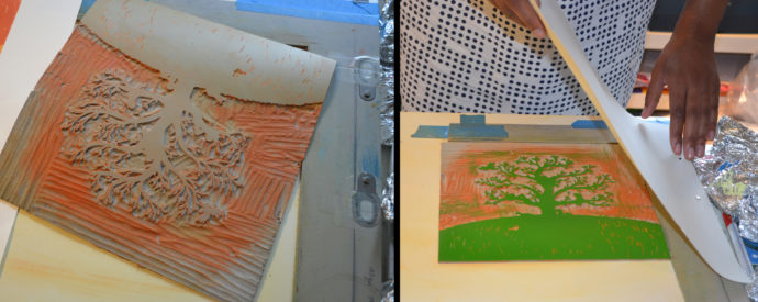
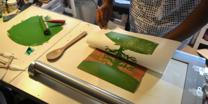
Shadra demonstrates printing her linoleum block for the poem “Child’s Prayer.” The block had already been used to print the orange background. Then she removed more of the linoleum so that she could print the next color: green. (Right) She carefully places paper using the registration tabs, shown just below her fingers.
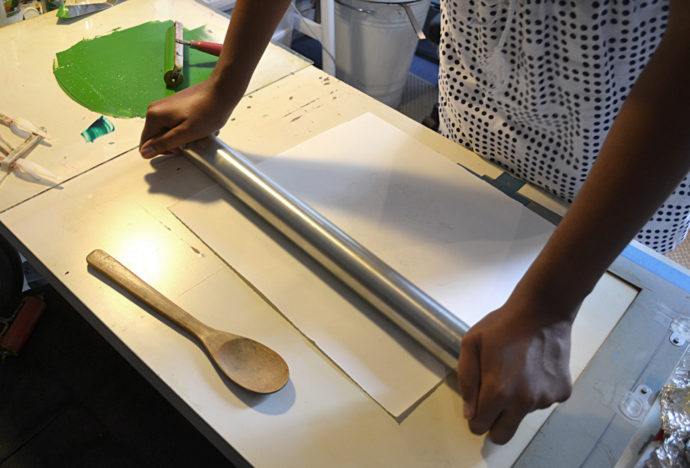
Shadra uses an Akua pin press the transfer the ink from the linoleum plate onto the paper. (Below) She carefully lifts the paper to reveal the green tree and grassy slope.
What are some of the lessons you’ve learned in the medium as you progressed from image to image?
I have learned so much within the year of printmaking:
• Initially I printed with only a spoon. Adding a pin press cut my printing time in half.
• Registration tabs saved me from ruining prints that were initially slipping on the plate.
• It is possible to print multiple colors in one day (four is my max).
• Printing is hard work, breaks and massages are essential self care elements
• Adding vegetable oil to my cleanup routine saves my budget and the environment.
• In printmaking, white paper is never totally white.
• Lightweight paper is best for hand printing.
• The online printmaking community is extremely supportive and generous! I love my linocut friends group on Facebook.
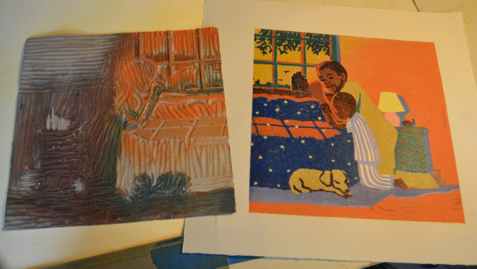
The completed print for “Now I Lay Me Down to Sleep” (right) beside its linoleum block with only the last areas to be printing–the bright orange highlights on the arms for instance–left uncut.
Which images were the easiest to achieve? The hardest? Which are you most satisfied with and why?
The easiest have been ones with large shapes and fewer colors. I was able to finish printing a four-color print in two days, where the eight- to eleven-color prints with smaller details have taken between one to two weeks.
I think I am most satisfied with the prints that have a gradient layer.* There is something so magical about them to me.
There is one difficult print that I may redo after I finish the book. It was a larger spread and I was printing without registration tabs. I was able to get maybe one clean print out of twelve attempts. That was a very sad week in the studio.
(*EDITOR: A gradient layer is where two colors are printed at once and the colors blend together softly where they meet creating a gradient.)
Once you finish with each reduction print, you scan one copy in so you can clean up the images. If you are going to finish up on the computer, why not do the whole project on the computer?
Though the computer can mimic many things, it really can’t replicate the wabi sabi that happens when working by hand, and I absolutely love working traditionally.* The computer is a great tool, but it is so easy to fix mistakes and perfect an image there. I like the happy accidents that comes along with working with traditional techniques. It’s also much more satisfying to have a handmade object at the end. The digital finishing on this book will be minimal, just cleaning a bit of printing noise here and there. The majority of the prints will require no extra touching up.
I also plan on selling the prints once the book is released instead of selling digital prints, which is what I do for my other books.
(* EDITOR: Wabi sabi is a Japanese aesthetic that prizes the imperfection of things, the beauty in the humble and modest.)

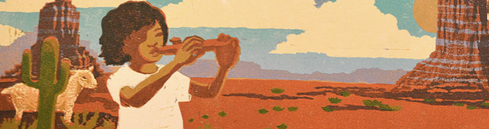
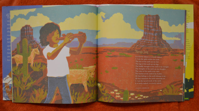
Shadra holds up the completed print for “Navaho Song,” while below is the image in the completed book.
What does going through traditional relief printmaking do to make the images strong?
I love the process of it all. There are so many steps involved along the way that I feel completely invested in the object. There are no lazy printing days. I am not relaxed on my couch when I’m printing. It’s hot, sweaty, intense labor. My body aches at the end of a long day of printing. It’s as satisfying as a good run. So, I think that that is part of it … the manual labor component.
In addition the texture that is achieved with lino is unmatched. I have seen students and friends try to replicate it digitally. Some have come close, but there’s still a difference to me.
Lastly I believe that working traditionally makes me a stronger digital artist. At the end of the day, each medium has it’s own vocabulary, including digital. As an illustrator, I am always thinking of the best voice for whatever text it is that I am working on. Having a lot of experience in many different types of media helps me make the best book I can …. or maybe I just like to play.
AFTER PUBLICATION
Since over a year had passed since I last interviewed Shadra Strickland for the Newsletter article, I thought it would be enlightening to check back in with her. Best of all, I got to see the finished book and how her linoleum cuts appeared as book illustrations. This second interview was held 30 Oct. 2017.
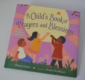
“A Child’s Book of Prayers and Blessings: From Faiths and Cultures Around the World,” by Deloris Jordan, artwork by Shadra Strickland (Simon & Shuster Books for Young Readers, New York, 2017).
Where there any significant changes to A Child’s First Book of Prayers since last year?
The title changed to A Child’s Book of Prayers and Blessings: From Many Faiths and Cultures from Around the World. The publisher changed it, more than likely to reflect the diversity of the collection.
Did you finish up your lino printing in July 2016 as planned? If not, when did you finish?
I finished the last print in September.
Has there been any changes to your MICA workload and the type of classes you teach?
I still teach three classes per semester. Currently I’m teaching sophomore illustration, book illustration, and professional development.
Did any of your prints need to change?
None of the prints needed to be changed. I did have to clean a few stray ink marks, but any changes made, were ones that I deemed necessary.
How difficult is it for you to redo an image once it meets your own initial satisfaction? You’re quite a veteran illustrator, but I was wondering how tough it is for you to accept criticism of your art work.
As a book illustrator, I understand the collaborative nature of what I do. It is rare that I am asked to redo an image after it’s finished because we usually go through an extensive sketch phase before getting to final art.
It isn’t difficult to accept criticism, but illustrating an entire book is like a marathon. Redoing an image after it’s done would be like running backward and then turning around to finish the race again.
Did any part of the publication timetable change from what you anticipated in summer 2016? If so what were the changes?
I didn’t know what the new publication date actually was. Once I turned in final art, I waited to see what they would release it.
And if so, how did you feel about the delay?
I was fine with it, just excited about it’s final release date.
As the project proceeded and you got page proofs, were there any surprises either positive or negative? If any surprises, what were they? And what changes were made, either to the illustration or typography?
A few poems were changed from the initial ones I illustrated. That was a little frustrating, but it wasn’t a fight I was willing to have at that point. I just trusted the editor and author’s judgement there.
How was working with Deloris Jordan on this project?
We never spoke. It is uncommon for authors and Illustrators to communicate during a book’s progress … if ever.
Have you received any prepublication reaction to your illustrations? If so, what were they?
Mostly friends and family. My editor and art director were extremely pleased with the book though. I’m waiting now to hear what critics think.

Shadra showed me completed linoleum block prints when I first interviewed her in 2016.
Will you be exhibiting your A Child’s Book of Prayers and Blessings prints?
Hopefully, though I haven’t lined up any shows yet.
What illustration projects are you currently engaged in? Where are you in each project?
I contributed to Susan Hood’s latest project, “Shaking Things Up”, https://www.harpercollins.com/9780062699459/shaking-things-up-14-young-women-who-changed-the-world
I did the cover of Jewel Parker Rhodes’s next anticipated title, Ghost Boys.
And I am currently working on my first authored book, Jump In. After that, I have two other exciting titles lined up that I can’t discuss at this time.
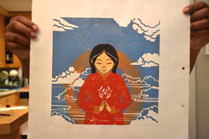
Shadra holds up her linoleum block print that she made to illustrate the poem “Ancient Tibetan Buddhist Blessing.”
ONLINE
To see more of Shadra Strickland’s work, please go to: http://www.jumpin.shadrastrickland.com/
Shadra’s Books
Here is a list of Shadra Strickland’s children’s books, listing the media used to make the illustrations and recognition received:
• A Child’s Book of Prayers and Blessings: From Many Faiths and Cultures Around the World by Deloris Jordan, Simon and Schuster Books, 2017, reduction linoleum cuts
• Loving vs. Virginia written by Patricia Hruby Powell, Chronicle Books, January 2017; ink drawings and digital color (A Junior Library Guild Selection)
• Sunday Shopping written by Sally Derby, Lee and Low Books, 2016; watercolor, acrylic, and digital collage (A Junior Library Guild Selection, Bank Street College Best Book of the Year)
• Please, Louise written by Toni and Slade Morrision, Simon & Schuster, 2015: watercolor, gouache, and crayon
• White Water written by Michael S. Bandy and Eric Stein, Candlewick Press, 2011; watercolor and gouache (Oppenheim Toy Portfolio Award, NAACP Image Award Nominee)
• A Place Where Hurricanes Happen written by Reneé Watson, Random House Books, 2010; watercolor and gouache
• Bird written by Zetta Elliott, Lee and Low Books, 2009; watercolor, charcoal, gouache, and ink (Ezra Jack Keats Award, Coretta Scott King/John Steptoe Award, ALA Notable Book, Kirkus Best Book of the Year)
• The Diary of B.B. Bright, Possible Princess written by Caroline Randall Williams and Alice Randall, Turner Publishing, 2012; pencil (Phillis Wheatley Book Award, NAACP Image Award Nominee)
Trackback URL: https://www.scottponemone.com/shadra-strickland-illustrator/trackback/
One comment on “Shadra Strickland: children’s book Illustrator”
Leave a Reply
-
Accessions: Short Stories Dec 21, 2025

-
The Mike and Scott Show: No Reruns Nov 25, 2025

-
Griffin Chairs: Both naive and refined Oct 04, 2025

-
Circularity: The Pairing of Two Talents Jul 12, 2025

-
Frans Masereel: Workers’ Paradise in 1939 Europe Apr 11, 2025

-
Erich Glas: Through the Night vs. Leilot/Nights Jan 15, 2025

-
Gustav Wolf: His Monster Menagerie Dec 23, 2024

-
Linos: #5 through 15 Nov 01, 2024

-
Gustav Wolf: Confessio Aug 02, 2024

-
Justin Remo’s Big Finale May 21, 2024

-
Accessions: Short Stories Dec 21, 2025
-
The Mike and Scott Show: No Reruns Nov 25, 2025
-
Griffin Chairs: Both naive and refined Oct 04, 2025
-
Circularity: The Pairing of Two Talents Jul 12, 2025
-
Frans Masereel: Workers’ Paradise in 1939 Europe Apr 11, 2025
-
Erich Glas: Through the Night vs. Leilot/Nights Jan 15, 2025
-
Gustav Wolf: His Monster Menagerie Dec 23, 2024
-
Linos: #5 through 15 Nov 01, 2024
-
Gustav Wolf: Confessio Aug 02, 2024
-
Justin Remo’s Big Finale May 21, 2024
I loved reading this interview. Thank you so much! I will tweet this because it is so relevant and perfect for all those interested in children’s literature aka #kidlit :))))