Introduction
Exciting developments at the end of 2019 spark this ART I SEE post. In November I was able to obtain a copy of Erich Glas’s Leilot, his 1945 book of 29 linocuts on the Holocaust that I wrote about in October 2018. (See https://www.scottponemone.com/leilot-erich-glass-traumatic-creation/) And just yesterday, UPS delivered a major color woodcut by Antonio Frasconi from his 1957 series 14th Street Meat Market. I also would like to use this post to mention other 2019 print acquisitions not covered in ART I SEE.
To recap 2019 posts, In March I presented Yoshijiro Urushibara’s 1924 book Ten Woodcuts, based on designs by Frank Brangwyn. (See https://www.scottponemone.com/east-west-woodcuts-urushibara-brangwyn/) In June and then in October, I made two posts on Erich Avery and his Paradise Lost pair of banners. (See https://www.scottponemone.com/eric-avery-doctor-of-printmaking/ and https://www.scottponemone.com/eric-avery-paradise-arrives/) And there were a pair of posts on Alfred Rethel’s 1849 broadsheet Ein Todtentanz aus dem Jahre 1848. (See https://www.scottponemone.com/rethels-death-as-counterrevolutionary-meme/ and https://www.scottponemone.com/remedy-for-rethel-conserving-1840s-broadsheet/)
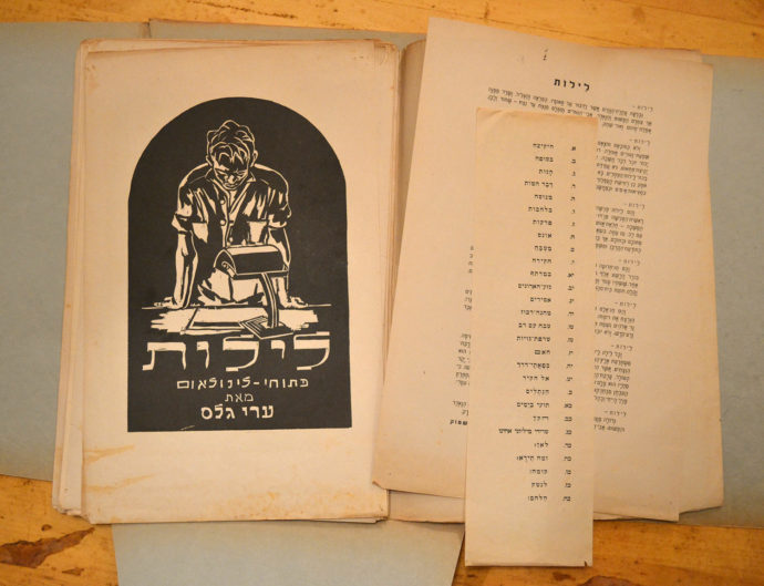
The intro text, the list of plates and the frontispiece from the 1945 edition of “Leilot.” (All photos by Scott Ponemone unless noted)
Leilot
Choosing the right words for an online search is so important. I have an almost daily routine, especially involving eBay. I search for books with prints and stand-alone prints, with emphasis on relief printmaking. This includes woodcuts, wood engravings and linocuts (also called linoleum cuts). Somehow I altered the search one day in November–and I don’t remember just what I did differently–but up popped a copy of Leilot.
Its creator, artist Eric Glas, was born in Germany in 1897, was a pilot for the Kaiser in WWI, participated in the Bauhaus in Weimar, then fled the Nazis in 1934 to live in the Kibbutz Yagur in the British Mandate of Palestine. Apocryphal or not, the story goes that in 1942 Erich woke up from nightmares–hallucinations even–that compelled him to create a picture narrative about the Holocaust. The narrative, which grew to 28 linocuts, includes the artist having nightmares, being directed by a golem, a lengthy description of the Nazi horrors, waking up from his dreams, becoming defiant and showing a newly armed Jewish people.
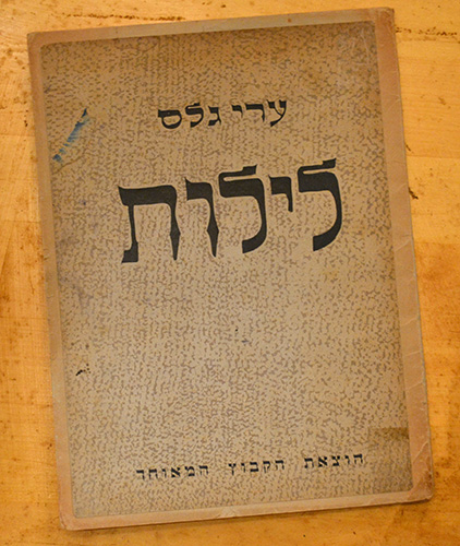
The cover of the Hebrew 1945 edition of “Leilot.”
I owe the above description to two of Glas’s grandchildren: Hagar Lev, who works in Germany for enterprise software companies in business development and marketing, and Iddo Gal, a professor in Israel. We communicated via email after Lev came upon my first post about her grandfather. (See https://www.scottponemone.com/fables-erich-glass-prints-add-to-genre/) They informed me that there were two editions of Leilot (Through the Night in English, לילות in Hebrew). Initially Glas couldn’t find a publisher in Palestine because, as Lev emailed me, “the reality of what was actually happening in Europe was not clear to all. There were shreds of information, claimed by many to be merely rumors. After all, who could believe such atrocities were real.” But Glas found a publisher in South Africa (SA). In an edition of 200 signed by the artist, Leilot was printed there in 1943 with 20 linocuts.
Not until 1945 did a Palestine edition appear. Gal said that the later edition gave “credit in Hebrew to the special edition in SA” and it had “a new introduction in Hebrew (a very poetic piece by Dov Shtok-Sadan).” He found no publication date or edition size in the Hebrew edition. The Hebrew edition added eight plates not found in the SA edition. The 28 plates of the narrative were printed on both sides of the sheets. It seems unlikely that the images were printed from the original linoleum blocks.
What I found on eBay was a copy of the 1945 edition. It had been unbound, the front and back covers were pasted onto the outside of a portfolio. The Hebrew intro, the list of plates and frontispiece, survived. The sheets with a narrative images all have thumbtack holes, suggesting that they were on display at least once.
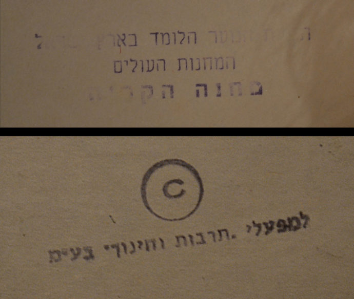
In two places I noted there were stamps with Hebrew lettering, possibly used by an institution to indicate ownership. So I sent images of them to Lev and Gal. Referring to the top image, Lev wrote back:
And to the lower image, she wrote: “Tarbut Vechinuch, a publisher founded in 1953 with the aim of creating appropriate reference books for educational activities of the Histadrut (the umbrella organization of workers in Israel) specializing in textbooks, educational aids, the writings of the Histadrut’s fathers and leaders, and pedagogical magazines. It was one of quite a few small publications that were established in the pre-Israel Palestine and early Israel days, most of which merged later on into a few publications.”
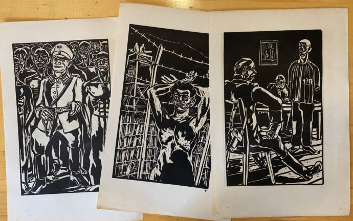
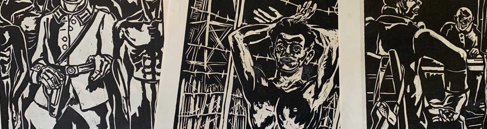
Three plates from the 1945 edition of “Leilot.”
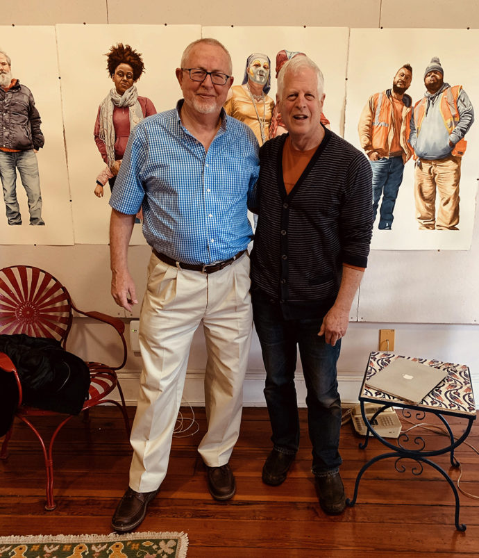
Iddo Gal and me in my studio last May. (Photo by Michael Frommeyer)
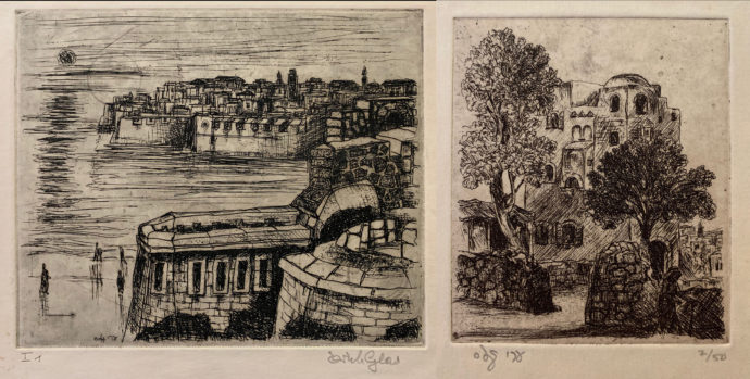
Two etchings by Erich Glas. (note his Hebrew signature on the one on the right.) The one the left appears to be of Acre with its medieval sea walls.
Meat Market
Besides eBay, I try to scan offerings on aggregated auction-house sites like liveauctioneers.com. In November a New Jersey auction house listed three large color woodcuts by the Uruguay-American artist Antonio Frasconi (1919-2013).
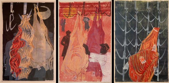
Three Frasconi woodcuts from his “14th Street Meat Market” series: (L to R) “# 1”, “# 2” and “Lot 16”. The paper for each is about 35 inches tall.
The figures of workers in the print on the left are bit ghostlike. The workers in the middle print are fine but the meat fades away. (There’s a tear in the image just to the left of the chest on the white-coated worker.) No workers appears the the right print, but the meat and hooks are quite graphic. So I bid on the right image–Lot 16–and despite some competition won it from about half to one-third of retail price.
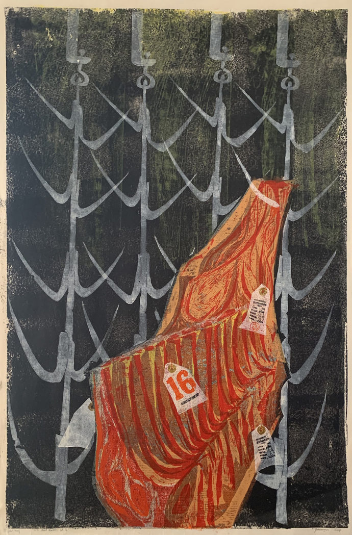
Antonio Frasconi, “14th Street Meat Market, Lot 16,” color woodcut, 1957, artist proof, 34.75″ x 23″ (sheet)
After the print arrived, I checked my reference library. First to Nat Hentoff’s “Frasconi: Against the Grain” (Macmillan and Co., New York, 1974). On page 82 is a picture of Lot 16, while the List of Woodcuts in the back indicated it was made in eight colors and in an edition size of ten. While Hentoff’s introduction doesn’t mention the Meat Market series, it does offer extensive quotes from Frasconi. Here’s one that provides a bit of the artist’s philosophy:
“An artist is, or should be, part of the world–part of the joy of the world and part of the misery and injustice of the world. I don’t mean that an artist should be like a totally political man on a soapbox. I do many landscapes, scenes of farmers in their fields, birds in the marshlands, workers in a fish market, ears of corn, onions, the head of a cabbage.”
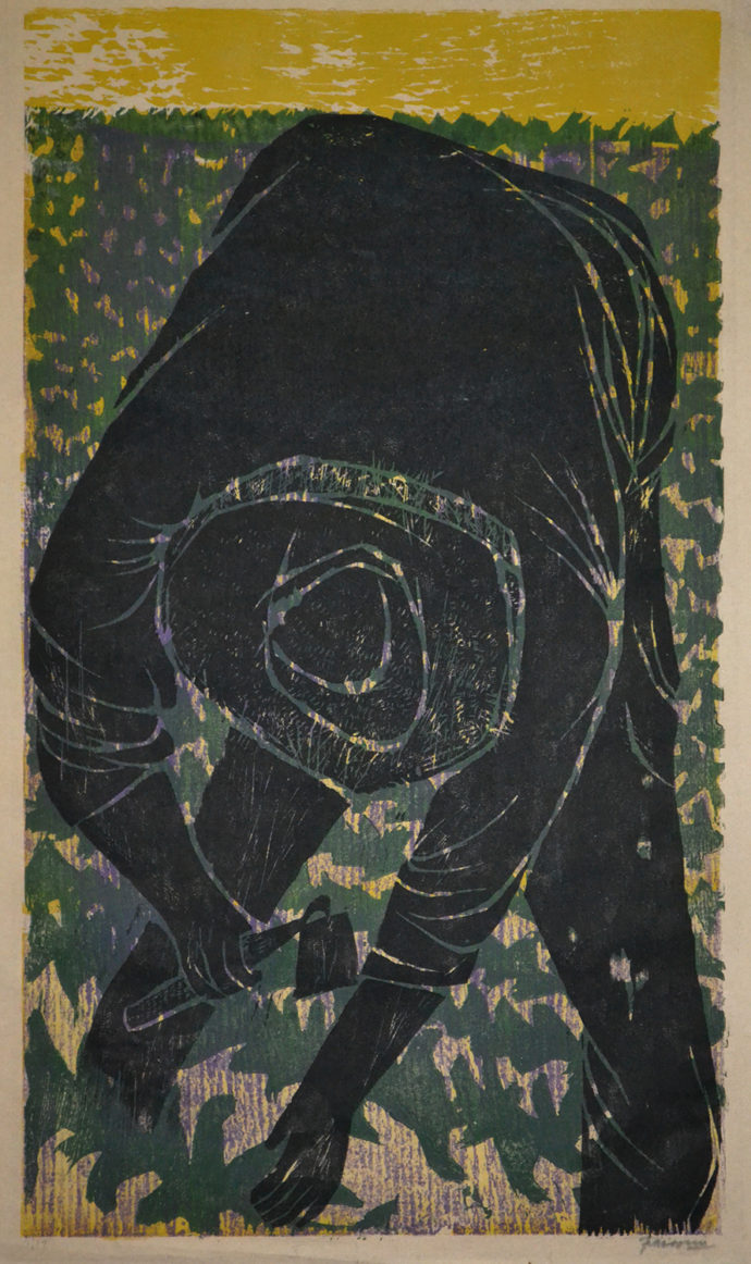
Frasconi, “Lettuce,” 4-color woodcut, 1953, 7/10, 20 1/4″ x 11 1/2″. This was an eBay purchase.
And this Frasconi quote about his Fulton Fish Market series gives a sense of how he worked on the Meat Market series: “There is so much going on, so much material for artists! You go back a hundred times to a place like the Fulton Fish Market … until you know just how a man lifts a box, say, or how the place looks before dawn. Then you’re ready to make a picture–to put your own feeling into it.”
I also checked out David Acton’s “A spectrum of Innovation: Color in American Printmaking 1890-1960” (Worcester Art Museum, W.W. Norton & Company, New York and London, 1990). To my delight, not only was Frasconi listed, but his 14th Street Meat Market, N.Y. #1 was pictured.
In the text opposite the image, Acton wrote: “The present print is one from a series of six large-scale color woodcuts, representing Frasconi’s observations of the meat market in New York City. Executed in 1957, these woodcuts straddled the boundary between still life and abstraction. In this nocturne, the hanging sides of beef and the undulating forms of the hardware suspending them were rendered in the artist’s distinctive drawing. Many of the component forms of this image were outlined and isolated by color of the background. Pushed forward toward the picture plane, these shapes created a strong surface pattern.”
Acton also mentioned Frasconi’s 1953 Lettuce Workers series of woodcuts, of which I was able to purchase the print on the left in 2017. He said: “Frasconi first represented the farm laborers from a distance, scattered among endless rows of plants in vast fields, often bending to pick the lettuce. In subsequent prints, the artist zoomed in on the workers like a cameraman, so that details of their stooped figures comprised entire compositions. This device not only emphasized the experience of the laborers, but also symbolized the seeming endlessness of their task.”
Sawers
Speaking of workers in art, here’s a woodcut that entered my collection via a trade with a longtime friend and print collector.
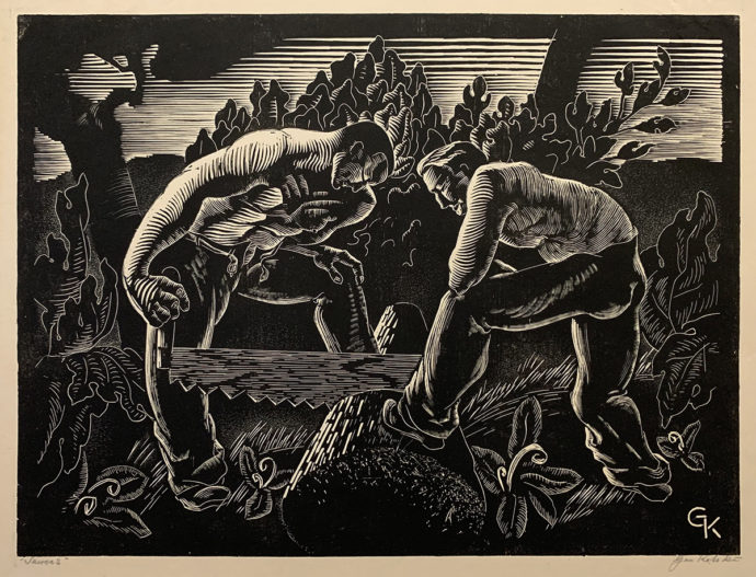
Gan Kolski, “Sawers,” woodcut, 9″ x 12″
We traveled together to the 2019 Capital Print Fair when I came upon this print. I didn’t feel comfortable spending money at the time, but my friend and fellow Amherst College alumnus desired gifts to mark two upcoming weddings. So we agreed that I would paint two watercolors for him in exchange for him buying this print for me.
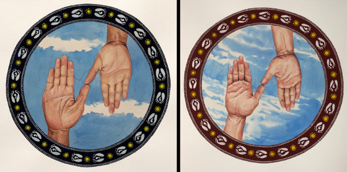
Scott Ponemone, a pair of wedding paintings, 10″ across, gouache and watercolor, 2019
These are the two wedding gifts that I made to complete the exchange. Each shows the right hands of the betrothed couple touching at the tip of their thumbs. The border designs with the footprints of the Hindu Goddess Lakshmi derived from the Aipan folk painting tradition of Uttarakhand, India, where I had an artist residency in early 2016. (I posted on lessons in Aipan painting at https://www.scottponemone.com/lessons-in-aipan/)
The artist Gan Kolski had a short tragic life. I borrowed the following from the Ackland Art Museum, University of North Carolina, Chapel Hill, website.
“The Polish-born artist Gan Kolski (1899-1932) lived in New York City on Horatio Street, near the burgeoning artistic neighborhood Greenwich Village. Kolski produced illustrations for the radical left magazine New Masses and participated in exhibitions by the John Reed Club, an organization for Marxist artists and intellectuals…. Although Kolski did not become as well known as some of his contemporaries, in part because his career was cut short by suicide at the age of only 33, his prints are an excellent example of the social realist aesthetic of the era.”
In a review in April, 2017, in the New York Times of Jules Stewart’s book “Gotham Rising: New York in the 1930s” Gan Kolski is quoted. According to the book, before leaping to his death from the George Washington Bridge over the Hudson, Kolski wrote: “If you cannot hear the cry of starving millions, listen to the dead, brothers. Your economic system is dead.”
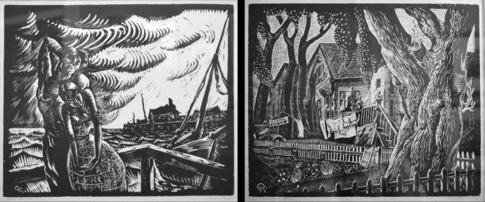
(Left) Gan Kolski, “After the Storm,” woodcut, c. 1928, 10 3/4″ x 12 15/16″ (Right) Gan Kolski, “Summer,” woodcut, 1928, ed. 50, 10″ x 12″ Since Kolski has done a print entitled Provincetown and a number of prints involving fishing fleets, I’m assuming both of these images derive from his stays in Provincetown.
Sawers was the third Kolski to enter my collection. I bought the pair above from the Mary Ryan Gallery in 1987.
Ever since a print dealer years ago confided in me that he was hoping to do a catalog raisonné on Gan Kolski, I had been hoping to do a full blog post on him. Unfortunately the dealer said his willingness to cooperate was contingent on him being able to buy a cache of Kolski prints from one individual. The price, according to the dealer, had always been too dear. Even when the dealer said he had given up on making that purchase, he refused to share some of what he knows about Kolski and his oeuvre.
Rainbows
My fellow Amherst alumnus also played an after-the-fact part in my purchase of the following print.
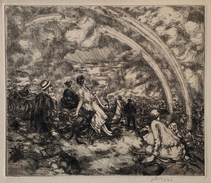
Martin Petersen (Danish-American, 1866-1956), “Picknickers and Rainbows,” etching, 1930, 9 15/16″ x 11 11/16″
I’ve been eyeing this etching by Martin Petersen ever since I added two of his prints in 1997. One of them, A Summer Shower, Central Park (see below, left), is the yin of Picknickers and Rainbows‘s yang. They would make a perfect pair. So when Picknickers and Rainbows came up at auction, I was immediately interested. But there was one problem. It was being paired with another Petersen print that I wasn’t as interested in. Fortunately my friend did like the other print–The Metal Workers (see below, right)–and bought that from me.
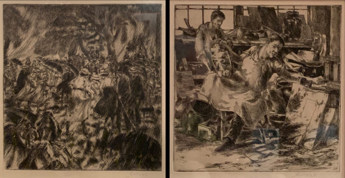
(left) Martin Petersen, “A Summer Shower, Central Park, etching, 1937, 9 7/8″ x 9 3/8” and (right) Martin Petersen, “The Metal Workers,” etching, 1925, 8 15/16″ x 8 13/16″
Before I acquired my first Petersens in 1997, I bought the 1989 Petersen print catalog published by Kramer Gallery, Inc. in Minneapolis. It arrived with a price list enclosed. From Kramer I secured a copy of Petersen’s 1943 etching Along the Hackensack. And soon after I got A Summer Shower, Central Park from a vendor at the Capital Print Fair, held annually in Rosslyn, VA.
Leon and Wesley Kramer in their Petersen catalog listed 225 prints (in a few case there’s a fill-size print as well as a smaller print after the plate was cut down). The earliest print was dated 1916, the latest 1945. Most were etchings, a few drypoint and a few lithographs. The Kramers wrote: “It appears that Petersen did not usually predetermine an edition size for his prints, but made a small number of impressions initially and printed additional impressions as needed, dating them to the year printed, not the year the plate (or stone) was completed and first printed. A few of Petersen’s records indicate an edition size of 35 prints…. Petersen signed most prints with his initials only. The few that bear his full name in script were early works.”
In their biography of the artist, the Kramers wrote: “For fifty years Martin Petersen supported himself as a anatomical artist for the College of Physicians and Surgeons of Columbia University in New York. He joined the staff in 1897, and worked closely with George Summer Huntington illustrating books and doing drawings for the department.” Later they added: “Petersen also taught anatomy at the National Academy of Design, and plastic anatomy at Columbia.” Despite his being anatomical artist, I find many of Petersen’s human figure have a certain rubbery quality (lacking a normal bone structure) and occasionally with oversized hands. Yet his presentation of body language was fine.
Coincidentally, A Summer Shower, Central Park was the one print about which the Kramers have quotes from Petersen: “Petersen created art but did not talk about it. Whatever his guiding theories or philosophies were, he kept them to himself. Only one statement by the artist survives, and it concerns his prize-winning etching A Summer Shower, Central Park:
‘Some years ago, while sketching in Central Park, I was caught in a shower. From the sketches drawn at the time. the plate was made. As the work proceeded there were, however, a number of changes, some figures were eliminated and others added, so was to produce a well-balanced composition. Like all my plates it was entirely bitten, no drypoint….’
So on the mention of “prize-winning” I checked Albert Reese’s book American Prize Prints of the 20th Century (American Artist Group, inc., New York, 1949). He listed A Summer Shower, Central Park has having been awarded First Purchase Prize, Library of Congress, 1944. And Reese provided a more complete quote by the artist about the print. So after the phrase “no drypoint” Petersen said: “It was a very easy plate to print. All there is in the print is in the plate, no retroussage. Every printer can print it by wiping the plate clean, and will get about the same result in all the prints.”
Poverty
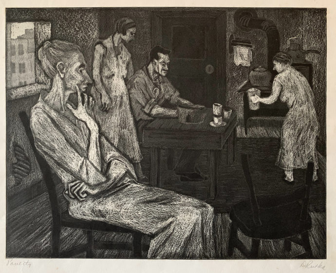
Dorothy Rutka (American, 1907-1985), “Poverty,” crayon aquatint, c. 1940, 8 1/2″ x 10 3/4″
This is one of those prints that I regret not buying years ago. Of all of her visual essays on the Depression this is the one I’ve liked the best. This copy appeared on eBay in the end of the summer and had no takers but me, possibly because the seller identified the medium as “aquatint” and didn’t add “etching” as well. This limited its visibility on eBay.
Elizabeth G. Seaton’s book Paths to the Press; Printmaking and American Women Artists, 1910-1960 (Marianna Kistler Beach Museum of Art, Kansas State University, 2006) has a two-pages spread on Rutka with an image of her print Striker’s Wife, also an aquatint. Of Slovenian-German descent, she attended the Cleveland School of Art, married the political editor for the Cleveland News, and began employment in the Cleveland WPA-FAP in 1936.
Seaton wrote: The artist spent most of her time in the program’s printmaking workshop, where she produced at least sixteen images, many of them powerful portraits of the unemployed and union workers and their families. Rutka’s commitment to visualizing labor issues coincided with her membership in Cleveland chapters of the left-leaning Artists Union (AU) and American Artists Congress, both of which called for government assistance for the unemployed and supported the period’s union drives.”
Since Poverty and Striker’s Wife share the same grainy textures, let me quote Seaton on Rutka’s aquatint method: “In Striker’s Wife Rutka used the intaglio method of crayon aquatint to render her lighter form in darkened space. In this technique she employed a greasy crayon over the plate’s aquatint areas before placing it in an acid bath. The areas covered by the crayon became the image’s haunting highlights, such was the angled, thin folds of the emaciated woman’s dress and the bony body of the child.”
As a member of the American Artists Congress, one of her aquatints Let ’em Eat Cake was exhibited in “America Today,” which the Congress organized. In the catalog, also called “America Today,” artist Alex R. Stavenitz wrote that 100 prints from 100 artists were to be part “of a nation-wide exhibition of duplicate exhibits to be held simultaneously in thirty American cities during the month of December, 1936.”
He added: “The exhibition, as a whole, may be characterized as ‘socially-conscious.’ It reflects a deep-going change that has been taking place among artists for the last few years–a change that has taken many of them not only to their studio window to look outside, but right through the door and into the street, into the mills, farms, mins and factories.”
Politics
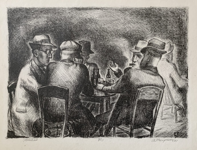
Edward R. Ferguson (American, 1914-2001), “Politics,” lithograph, 1937, 7/15, 8″ x 10 7/8″
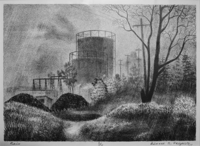
Edward R. Ferguson, “Rain,” lithograph, 1939, 7/10, 8 7/8″ x 12 5/8″
This print by Edward Ferguson was produced for the Flynt, Michigan, Federal Art Project, according to the Paramour Fine Arts website. Had it been produced in time for the American Artists Congress’s 1936 “America Today” exhibitions it would have been a perfect fit. So would have the other Ferguson lithograph in my collection.
Rain was included in “The Federal Art Project: American Prints from the 1930s,” a 1985 exhibition at the University of Michigan Museum of
Art, Ann Arbor.
A copy of Rain entered my collection from a New Orleans dealer in 1999, while Politics was purchased from an online auction last February.
Architecture of Music
This last item is certainly worth a full blog post on its own, but its author asked me not to.
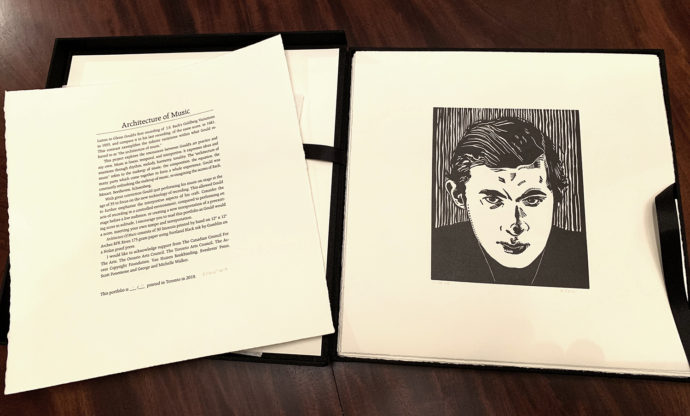
Stefan Berg (Canadian, born 1986), “Architecture of Music,” portfolio of 30 linocuts, I of a variable edition of 10
Last March I received a handsomely box set of linocuts from the Canadian artist Stefan Berg centered around pianist Glenn Gould (1932-82) obsession with J. S. Bach’s Goldberg Variations. Initially (March, 2015) this project was intended to be Berg’s second wordless graphic novel. His first was Let That Bad Air Out: Buddy Bolden’s Last Parade, published as a trade paperback in 2007. I was so much taken with Bolden that I asked Berg if he had a proof sets of prints (linocuts) for sale. In response he created a one-of-a-kind box set of proofs in February, 2015. In turn I devoted a whole ART A SEE post on the set. (See https://www.scottponemone.com/stefan-berg-buddy-bolden-in-black-white/)
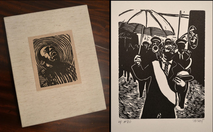
The cover of Berg’s proof set of “Buddy Bolden” (left) and a proof of #20 from the series.
So when the Glenn Gould-themed portfolio arrived, I was hoping to also devote an entire post to it. Because I had collated all of Gould-related emails between Berg and me over four years, I could present a pretty detailed picture of the gestation of his Architecture of Music. I also could present how his linocut cutting technique changed over the years, especially his intentional overprinting (like a double exposure) on a few plates.
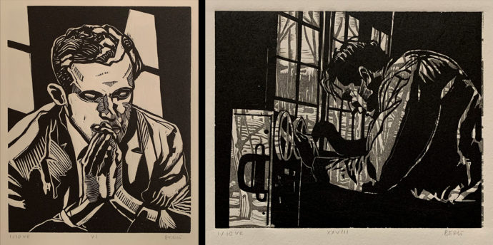
Two linocuts from Stefan Berg’s “Architecture of Music.” The one on the right is an example of a double-exposure block.