Circularity: The Pairing of Two Talents
Introduction
Every good friendship has a beginning, and, if it lasts long enough, it will take you places you can’t imagine. I met Karen Klein in 1997 when we both enjoyed an artist residency at the Virginia Center for the Creative Arts, in Amherst VA. At the time she was an Associate Professor of English and American Literature and Co-Director of the Undergraduate Humanities Program at Brandeis University in Waltham MA. At VCCA she engaged in sumi-e ink brush drawing, and I was painting oversized watercolors of parades. A year later I stayed at her Cape Cod house, where a photo on the refrigerator door caught my eye. It was a view from a window of an olive grove. Where is that, I asked. That’s Maria Grazie’s house in Umbria, Italy, she said. And before I knew it I was on the phone to Maria Grazie, who invited me to rent her Italian farmhouse, which I did with my partner for our first trip to Italy. So that was an immediate example of our friendship taking me for a ride.
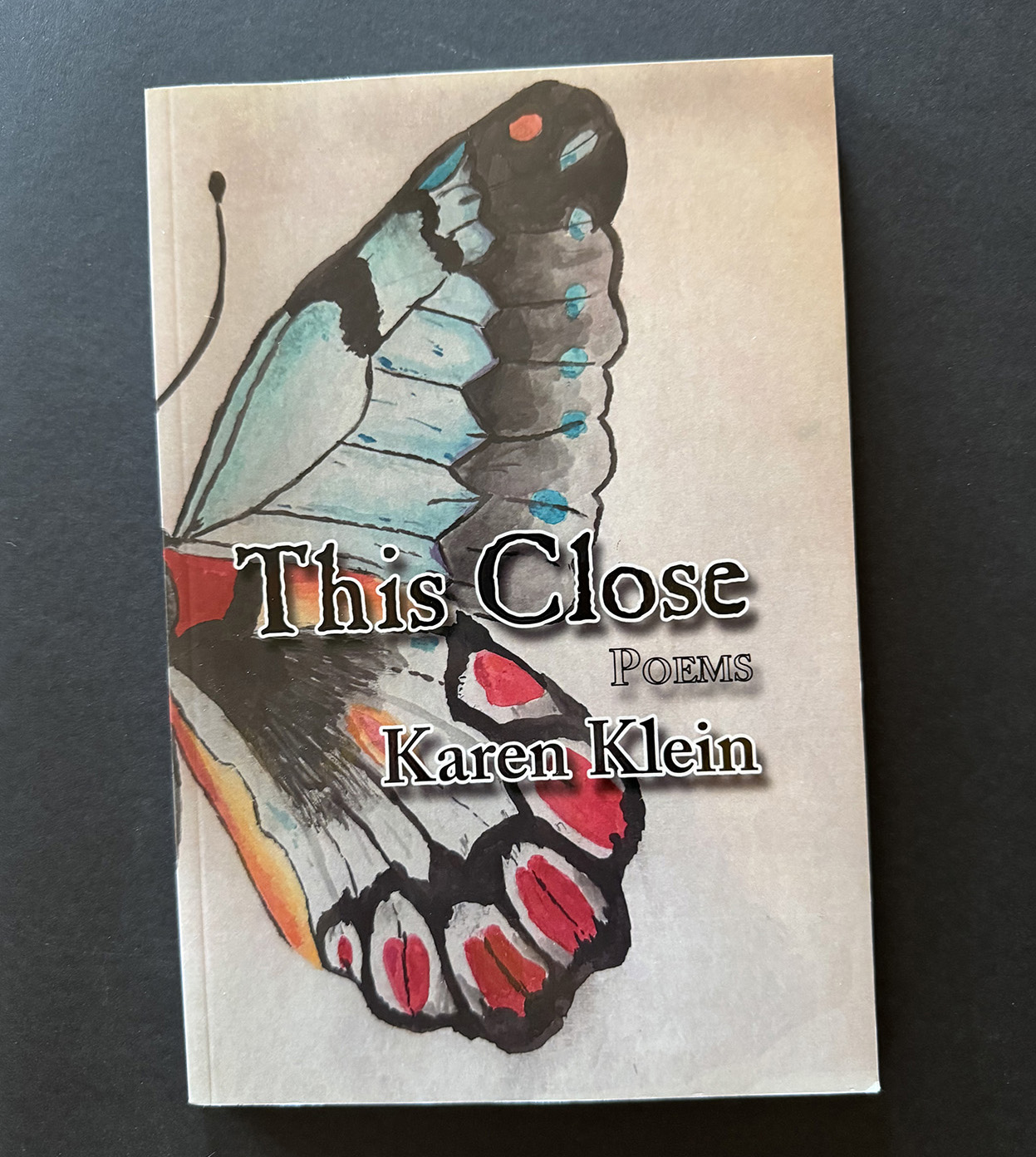
To say that Karen is multi-talented is an understatement. After concluding her 37-year tenure at Brandeis, Klein focused on modern dance and performed with Prometheus Elder for 15 years. She has also choreographed dance theater productions. Her poetry in both haiku and lyric forms has appeared in journals, anthologies and newspapers. This Close, her first book of poetry, was published in 2022 by Ibbertson Street Press, Somerville, MA.
In October 2023 (maybe a half dozen visits to Karen in Cape Cod later) I proposed a collaboration: her haiku with my linocuts, particularly a series of tondo prints I began in 2022 to compliment a group of circular watercolors I was to exhibit at a Baltimore gallery later that year. Each linocut, which I hand-colored very minimally in watercolor, referenced a decorative arts tradition.
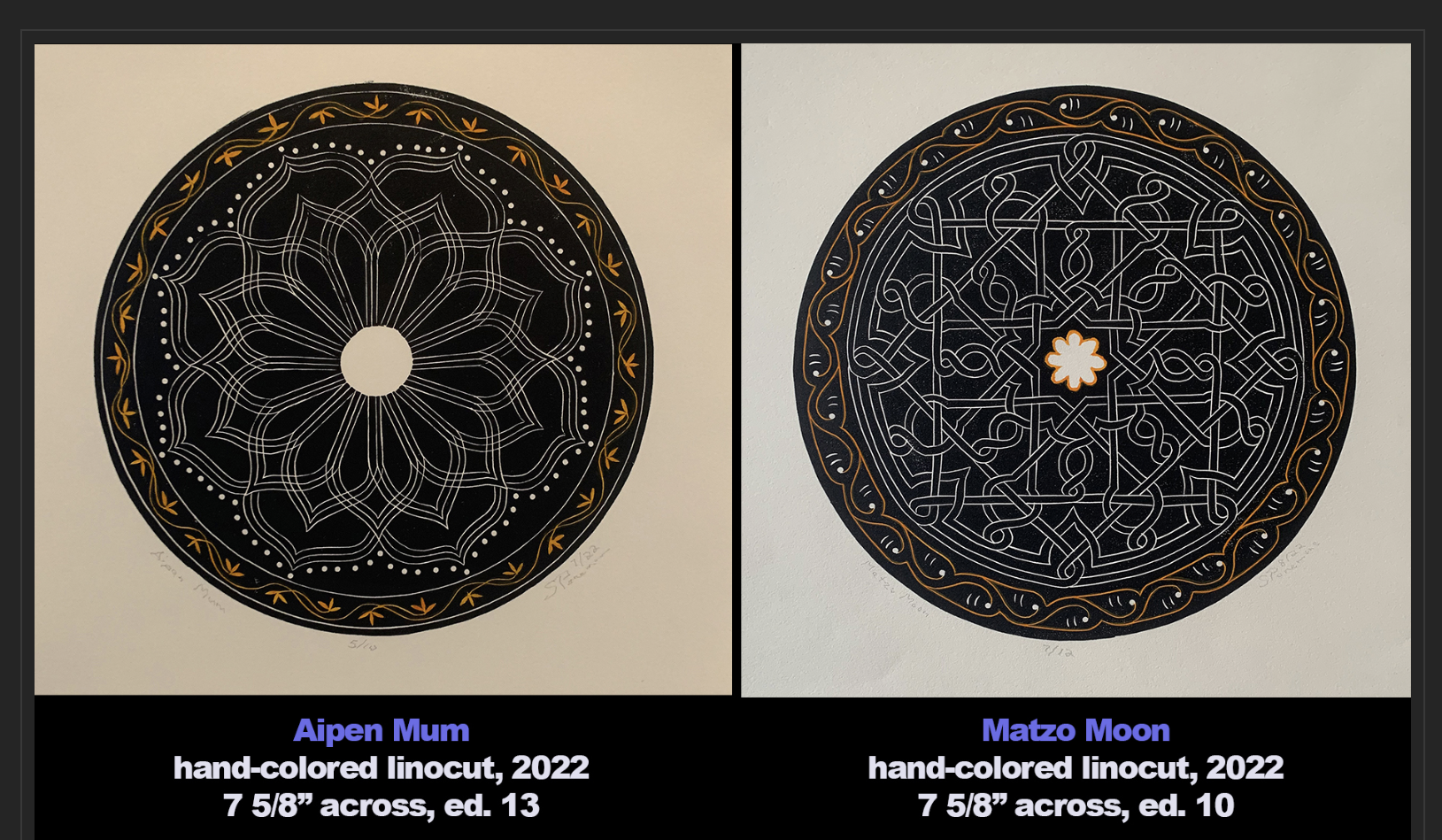
These two were the first ones. “Aipen Mum” celebrated by my 2016 artist residency in the northern India state of Uttarakhand, where I was introduced to the Aipen folk arts tradition. “Matzo Moon” referenced an illuminated miniature in the 14th-century Golden Haggadah manuscript in the British Library.
Karen was warm to the idea. I thought I would need to have completed a dozen linocuts to be worthy of a book. At the time I had completed six. So over the upcoming winter and spring I had certainly my work cut out for me. Little did I know at the time I would complete promised dozen but three more by October 2024. Our friendship now had the potential to make us collaborators.
I’ve previously posted on my linocut production in June 2023 with “Linocuts: Making of Athena” (LINK) and in November 2024 with “Linos: #5 through 15” (LINK)
Early decisions
Creating a book involves many decisions. How would we get it published? Should it be hard cover, even cloth bound? What size would it be? How would the linocuts be printed: digital reproductions or printed directly from the blocks? And, of course, what would our budget be?
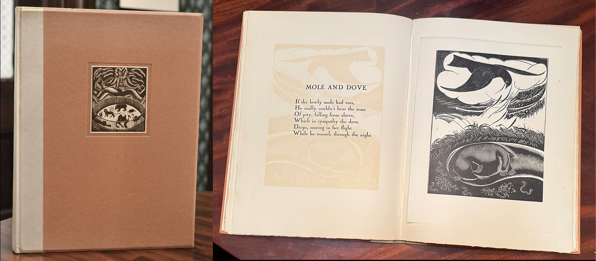
Animalia by British artist Leon Underwood (1890-1975) was immediately my model for an optimum book. In 1926 Payson & Clarke, Limited (New York) published 28 signed and numbered copies (according to the colophon) “illustrated with proofs printed by the artist from the original wood blocks.” As you can see the paper that the image was printed on was attached with a thin strip of glue across the top. So I imagined that’s how our book would be: a haiku by Klein on the left and a tipped-in linocut of mine on the right. (There also was a trade edition of Animalia printed in a smaller format so that Underwood’s horizontal images had to be turned 90 degrees to fit the page,)
Who would publish such a book? While Klein had a publisher for This Close, her self-cover book of poems, our book would hopefully be a whole different animal, an artist book like Animalia. I lacked an agent or a publisher. I certainly didn’t want to pursue either to make the book happen. In short, Klein and I would self-publish the book. That would require prowling the Internet for sites that create the physical books. I did that in 2023 when needing a catalog for an exhibition in the Reid Memorial Chapel of First & Franklin Presbyterian Church in Baltimore. I used the Mixam website (LINK) and chose the standard 8 1/2″ x 11″ sheet size so that I could do all of my page composing on iPages on my Mac. I literally created a series of PDFs–as required by Mixam–to compose the book.
Like Animalia, I wanted the linocuts presented actual size. Each are about 8″ across on 10″ square paper. So I needed to shop for a printer who could handle a 12″ square book. And one that offered hardback with cloth covers, binding that opens flat, and even blind stamping of the covers. Despite all of those “wants,” I soon landed at the Montreal site of BookArt (LINK) and began an email conversation with Harley Smart.
The problem with a book a nearly a foot square is that I couldn’t do it in iPages, which is limited to copy paper size. I used to design and edit a newsletter for a Baltimore Museum of Art group and no longer had that now-antiquated program on my computer. I could rent the Adobe page-making program InDesign, but that would involve a learning curve I wasn’t about to engage in. That meant needing a good designer. I asked around for suggestions and contacted a well-regarded local designer, butis quote was almost as high as the cost of printing the edition. I next tried Nicole Clark of Stanton Design, who had taken over for me in designing the BMA group’s newsletter. Fortunately her quote was much lower, and she agreed to be our designer.
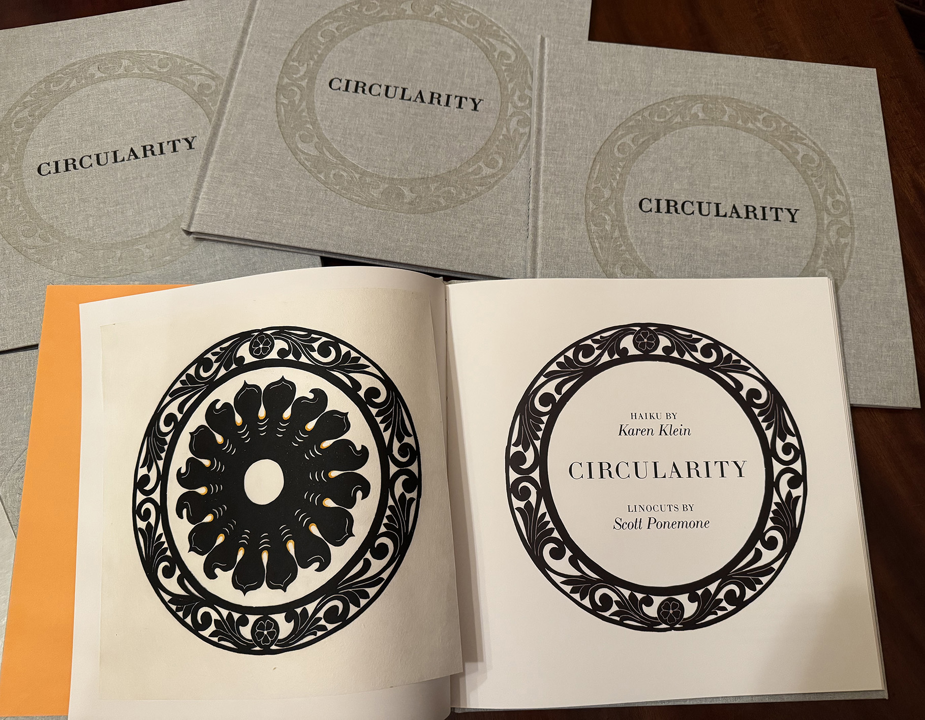
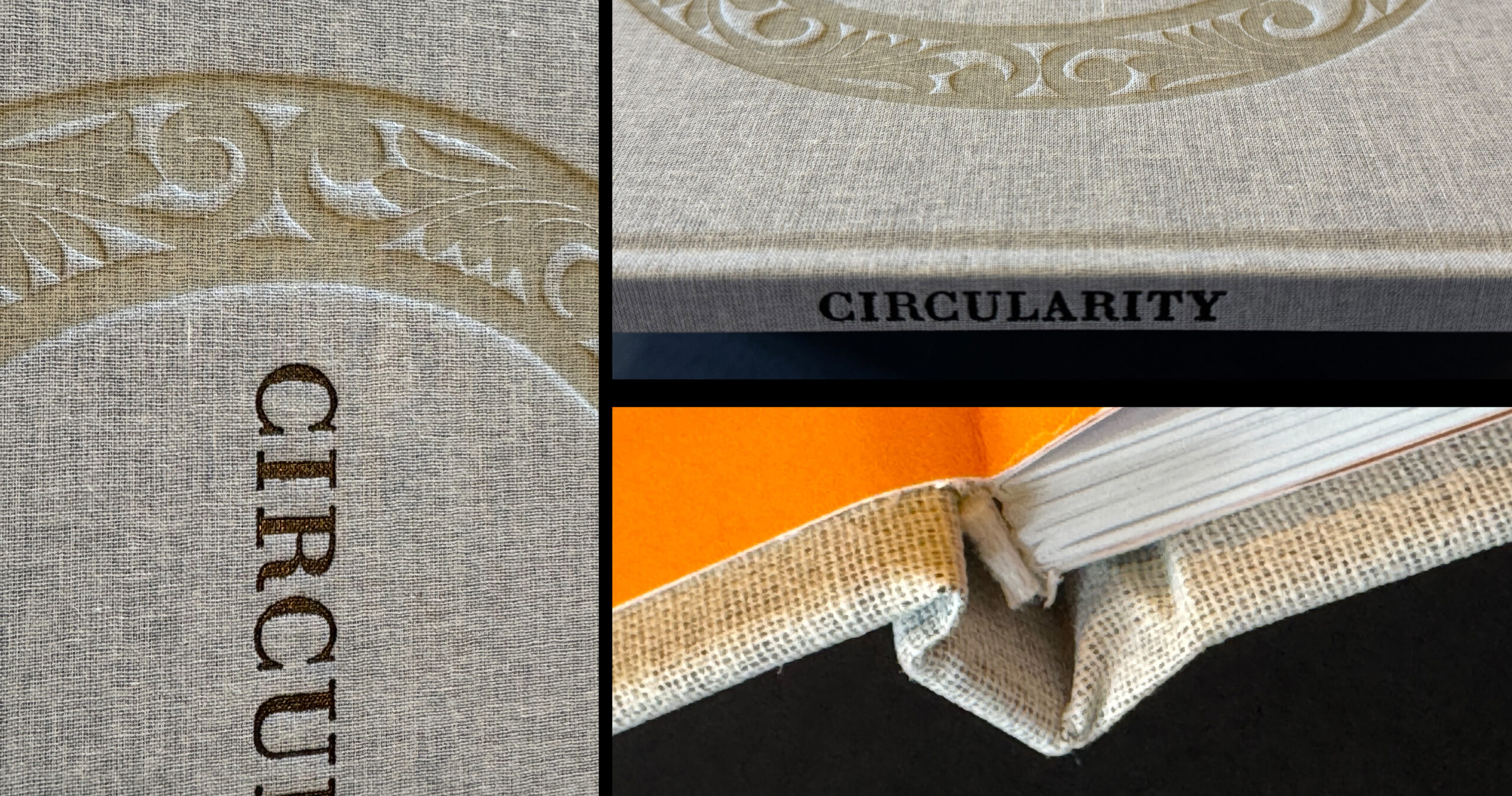
 Going through the options on the BookArt website, Karen and I settled on an edition of 60 books, half with tipped-in original linocuts, half without. The number was derived by the 15 being the number of different linocuts: 60 being 4 times 15. The size became 11.5″ x 11.5″ as that’s the largest Smart at BookArt could offer. The books would be hardbound in linen-like cover wrap. (The itemization shown here lists “MBL 421” as our cover wrap choice, but the surprise behind it I’ll touch on later.) The bindings would be sewn, and the covers would be stamped (debossed) both in black and without color (blind deboss). Both Klein and I would receive a bound prototype for our inspection.
Tipped-in linocuts
The conversations with Harley Smart began in August 2024. At the time I indicated that in the 30 special edition books all of the linocuts would be tipped-in. For my regular editions of the linocuts I had printed on RIVES light-weight buff, a rather heavy paper. Smart said that unless compensation was made in the binding, 15 tipped-in prints on that paper would prevent the covers from laying flat. I needed to select a thinner paper. At the Maryland Institute College of Art I bought a few sheets of mulberry paper. I also checked out books in my collection with original relief prints and liked the paper used in A Life in Woodcuts by Harry Sternberg (Brighton Press, San Diego, CA, 1991) in an edition of 40. Those woodcuts were printed on Sekishu, a Japanese paper.
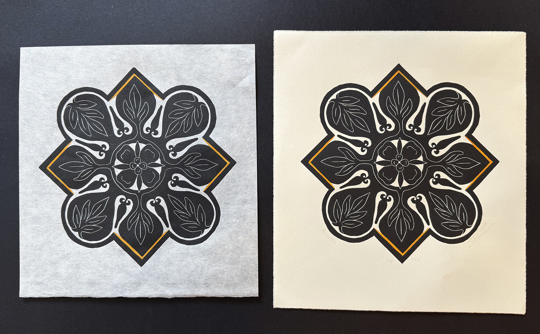
Here’s a comparison. On the right is a proof of Almora that I printed in July 2024 on RIVES paper. On the left Almora on Sekishu. I placed them on black paper to show how translucent Sekishu is. Both were printed by hand (using a baren, a disc-like printing tool, and a spoon) with Speedball brand’s “supergraphic black” ink. The orange areas I highlighted with watercolor.
Satisfied with the results, I was faced with another dilemma. If I wanted 30 books each with 15 original linocuts, I would need help in turning out 30 good impressions of each image. My regular editions of 20 with 5 proofs took two days to hand print. It was already October at the time. Needing quicker editioning, I turned to a fellow printmaker in Baltimore who has a Vandercook proofing press. His estimated cost for printing per edition more than half of the BookArt estimate. Yet I imagined that I could drop off the linocut blocks and Sekishu paper and order up the necessary impressions.
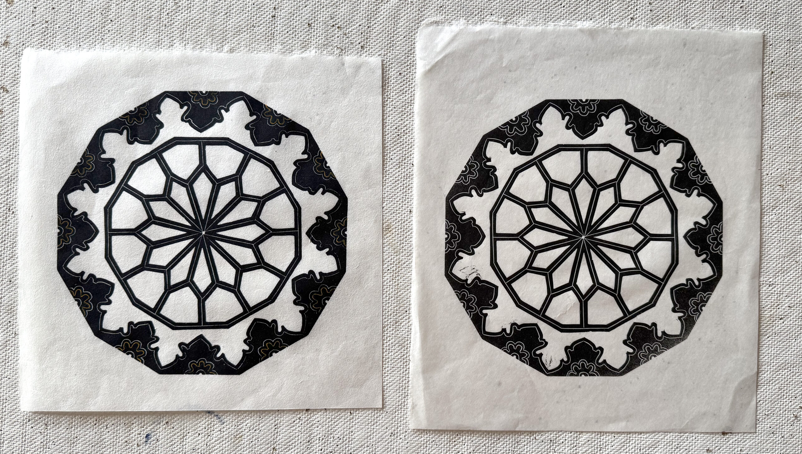
So in early November I took the linoleum block that I cut for Mughal over to do a test printing. On the right is one of the Vandercook proofs; on the left is a hand-printed (and hand-colored) proof. Three issues became apparent, the most serious being that the press inked up some of the recesses (areas where the linoleum was cut away so as not to receive ink). I would need to babysit the blocks and be ready to cut away more of the linoleum as needed. I couldn’t just drop off the blocks and later pick up the editions. Also, using a press required shimming the block or the paper so that all areas would ink evenly. Notice inking of the lower right of the Vandercook proof is not as dense. (Slight unevenness of the block is not an issue when hand-printing.) The least of the issues was that the black of the press impression was not as intense as the hand-printed one.
Faced with those issues plus the added cost, I made a critical decision. There would still be 30 special edition books, but, instead of each having 15 original proofs, each would have only one and that one would be placed opposite the title page. Karen Klein and I would each have 30 total copies, 15 with a one of the 15 different linocuts tipped-in and 15 without a tipped-in proof. And I would hand-print editions of 5 on Sekishu paper (so that I could send to Smart in Canada 3 good proofs of each, 2 for tipping in and a spare). I figured that I could print twice a week, producing two small editions a day. Sekishu paper is dear. Fortunately the MICA bookstore located a seller of 30 sheets at a discount.
Book design and essays
In conversations with designer Nicole Clark, poet Karen Klein and myself, we worked out a sequence for the book. It began by knowing what the heart of the book would be.
The above PDF created by Clark illustrates the heart of the book: a single haiku on the left and a single linocut, reproduced actual size, on the right. No page numbers. No title or other info for the linocut. Just the juxtaposition of haiku and linocut. There would be 15 such spreads, one for each of the linocuts.
To set up these 15 spreads, the book needed some explanation. So both Klein and I agreed to write short introductions to relate how we met, our friendship and why pairing a haiku with a linocut was a good idea. We also needed to talk about our craft. So Klein wrote “Haiku and Me” in large part about how she for a long time misconstrued what a haiku was. I wrote “Navigating the Circle” to put some context into my fascination with other cultures.
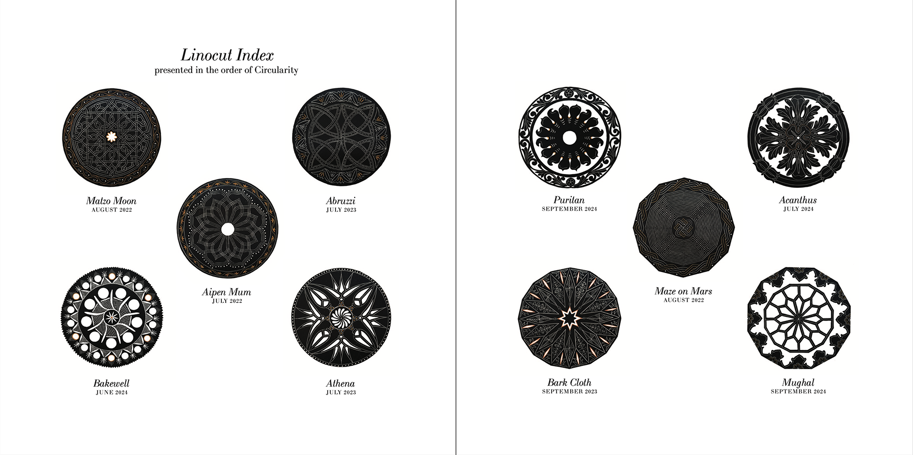
Just before the 15 sparely designed spreads of haiku and linocuts, we decided to include a three-page index (here are two of the three) giving the titles of each linocut and the date when each edition on RIVES paper was concluded. Note that the dates are not chronological. They reflect the sequence that they appear in the spreads.
After the spreads would appear very brief bios of the co-authors and a colophon showing the limitation of the edition.
The Sequence
As Karen Klein searched through her haiku production, she remarked on their formal properties. She also assessed my linocuts in the same way. Somehow I assumed she would keep the chronological order of my linocut production for our book, but she gave good reason not too. She started in the spring of 2024 when I had only completed 10 of the linocuts. By October when my linocuts reached (and stopped) at 15 different images, she offered me a selection of haiku to pair up with the linocuts.
Karen Klein started sorting through her haiku in late spring 2024. On June 29 after I sent her an image of Soumak, my 10th linocut, she wrote: “Both your linos and my haiku have formal properties that must be maintained to create them and this formality must be observable.”
By July I had completed 12 linocut editions and sent her images of all. She replied on July 29: “Gorgeous!!! I will get my Tuesday driver to take me to the library so I can print them out and find appropriate haiku to send to you.”
On Sept. 24 after I sent her an image of Puritan, my 13th linocut, Klein wrote: “I have organized these stunning linos in the order of their outer circles from closed to open. When I get the 14th, I’ll see where it fits. I can rearrange as you add more. With haiku/senryu I am moving from imagery of closedness, more interiority to open imagery of stronger movement and flight. I have put them out on the big bed in the large bedroom and keep the door closed so no cats can get in to disarrange them.”
Then on Sept. 30 she said: “I am imposing a seasonal format on the progression of haiku…. I’m starting in Spring and ending with Winter Solstice as that is both the ending season and the new beginning as the sun returns.”
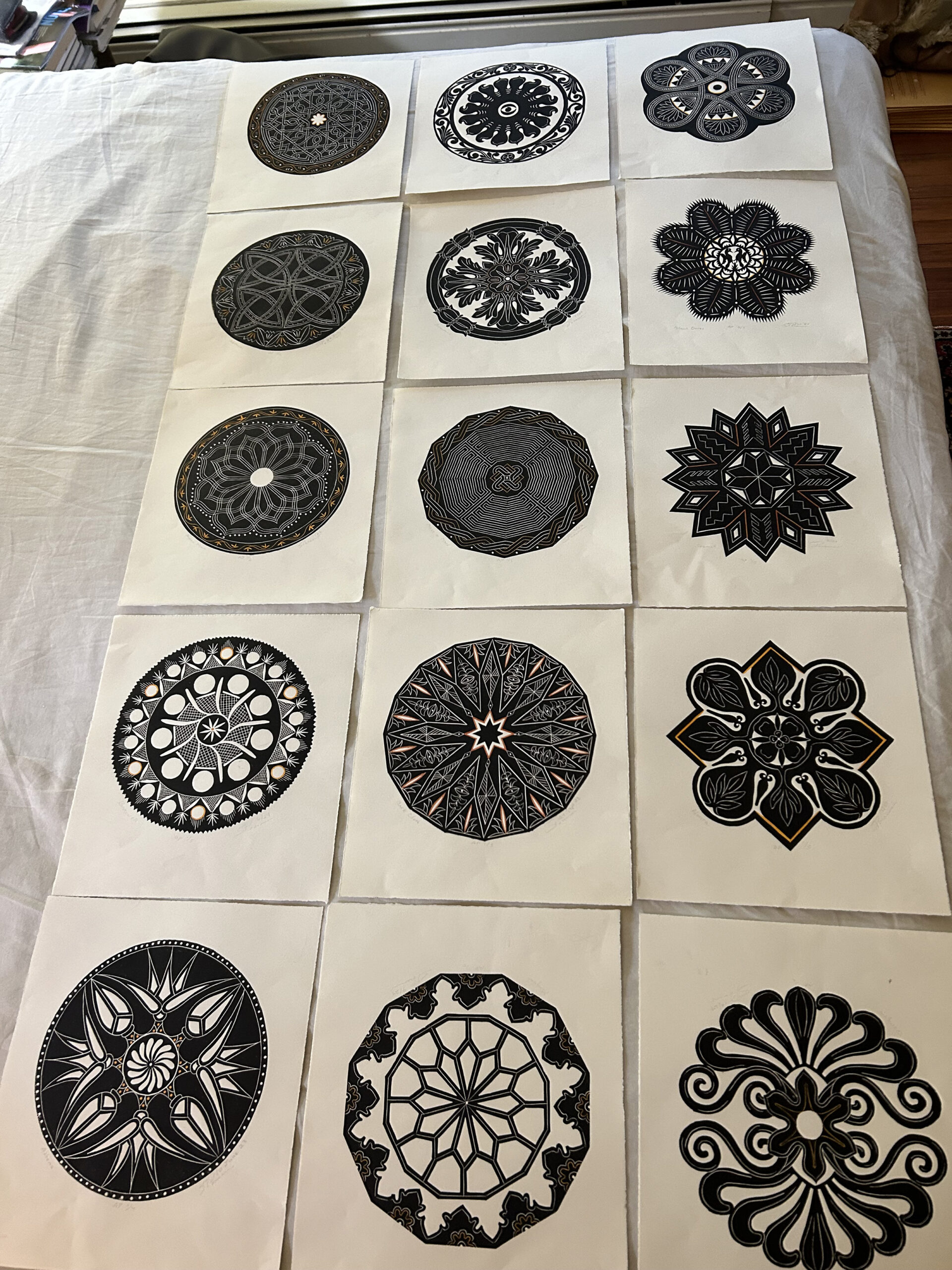
Klein’s arrangement of my 15 linocuts reads from top to bottom, left to right. (Klein photo)
On Oct. 8 Klein started offering specific haiku:
“I have been hard at work sorting decades worth of haiku, some already published—I have the rights to republish—and some unpublished. My organizational scheme is to begin with your closed circle forms and open when you break the way the outer circle is drawn. The sequence veers from closed to open, back to closed as your designs change, then open. Running concurrently with that organizational schemata is a seasonal sequence beginning a haiku that indicates potential, readiness for something to happen:”
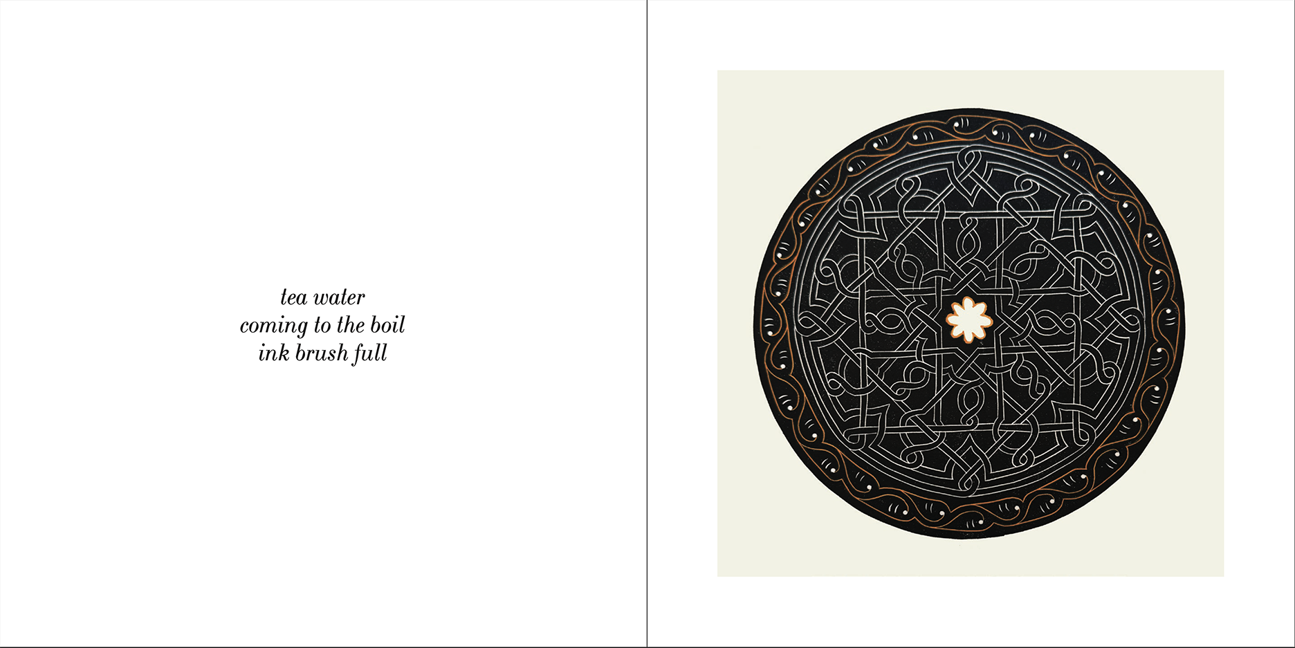
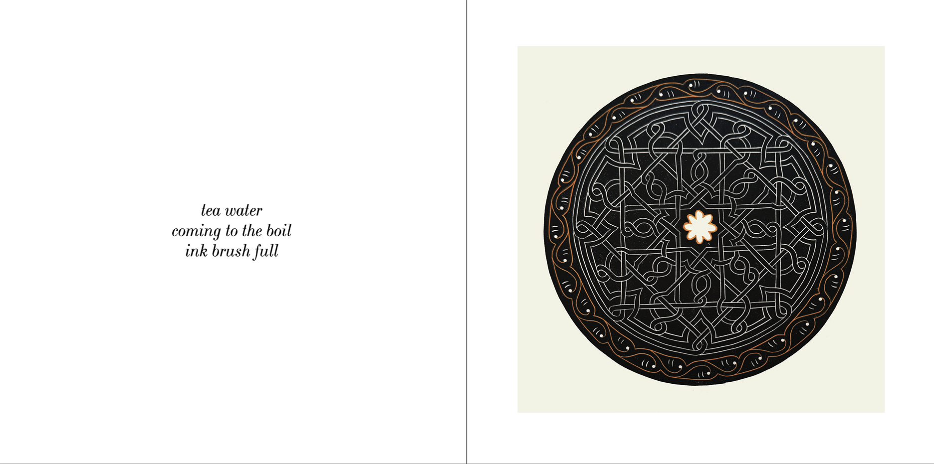
tea water at the boil ink brush full
“Now one that is full opening movement:”
sculptor’s studio from the drying wood a tiny spider
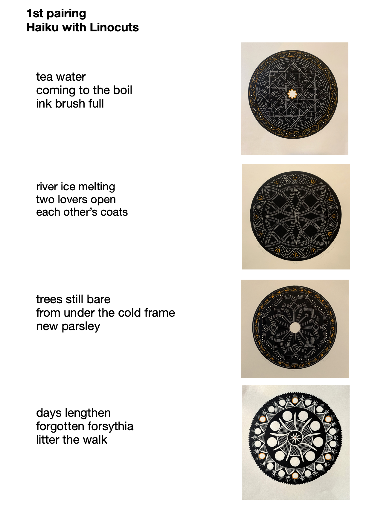
This is the first page of three showing my pairing of Klein’s haiku with my linocuts
“The next haiku starts the season in late winter with the promise of spring as playground and swings are associated with young children and children/youth are usually memes for spring in Japanese haiku:“
moving the swings in the snow covered playground wind
“Now 10 more haiku moving through spring/summer/fall and winding up in winter with a poem that both closes and opens:”
tumbling dancers their fall and rise winter solstice
On Oct. 22 she sent me a photo of all 15 linocut proofs I had sent her on her bed to show me the sequence she selected and wrote: “My aesthetic organizing principle is to follow what happens to your essentially circular patterns, how you break and reframe the outer edges while containing an overall circularity with variations. A privilege to work with them. They’re a model of imagination with the discipline of superb craftsmanship which reflects the demands of the artistic form you have chosen in this sequence.”
Finally on Nov. 1 Klein sent a sequence of her haiku for me to select from. It began with three haiku for the opener, then three for “seasonal haiku starting in late winter, moving to early spring, then spring,” then five for “spring moving into summer,” then six for “summer into fall,” then four for “fall in winter,” then a “final poem ending in winter solstice, which is both end and beginning, bringing seasons full circle.”
I made my selections from her list and sent the pairings back to her (see above) for her approval, which she gave. I really appreciated that, thanks to this process with Klein, I could see my linocuts with a formality that, I admit, I wasn’t fully conscious of. I was just playing with the circle as I became more confident cutting the linoleum blocks.
Title and title page
I can’t pin down the date, but during a three-way Zoom session between Nicole Clark, Karen Klein and myself, Clark asked if we had a title. I admitted I hadn’t given it any thought; however, Klein, who had been thinking of our pairings of haiku and linocuts as embodying a celestial cycle, was quick with the word “circularity.” I said “yes” tentatively but never offered an alternative. So Circularity it became.
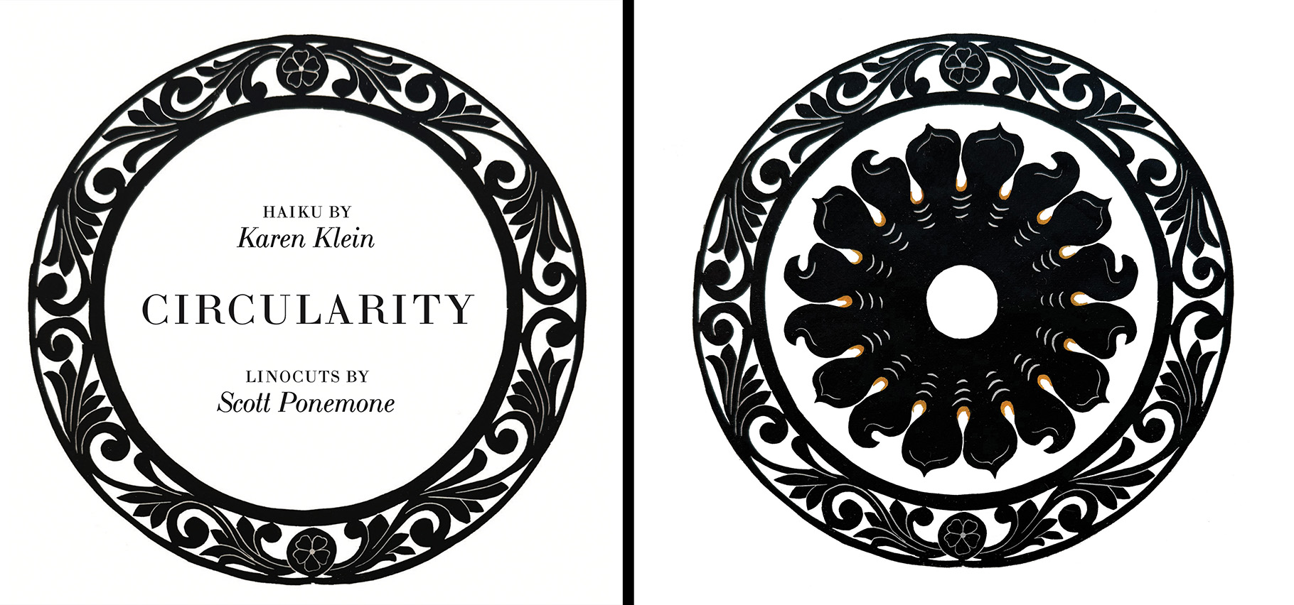
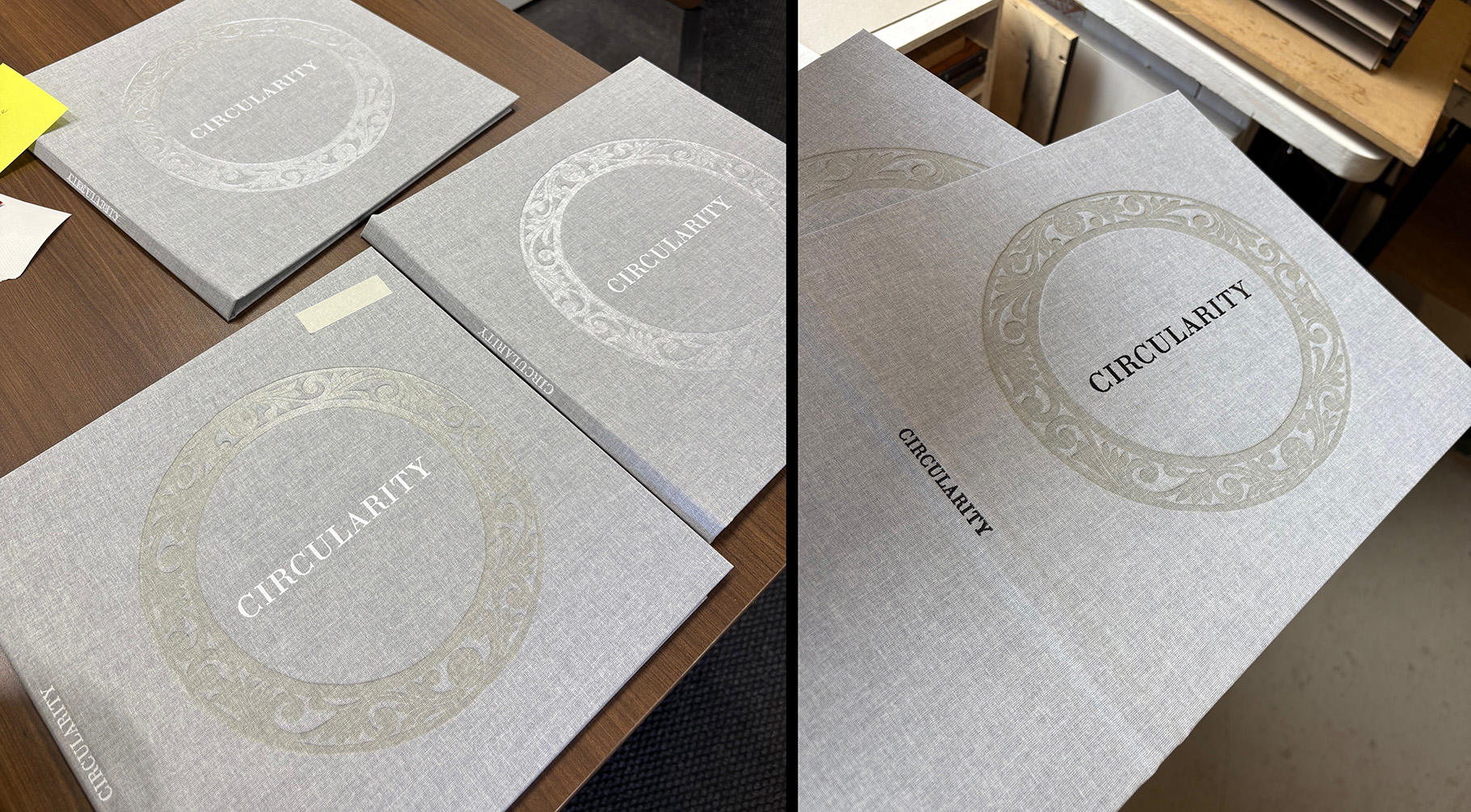
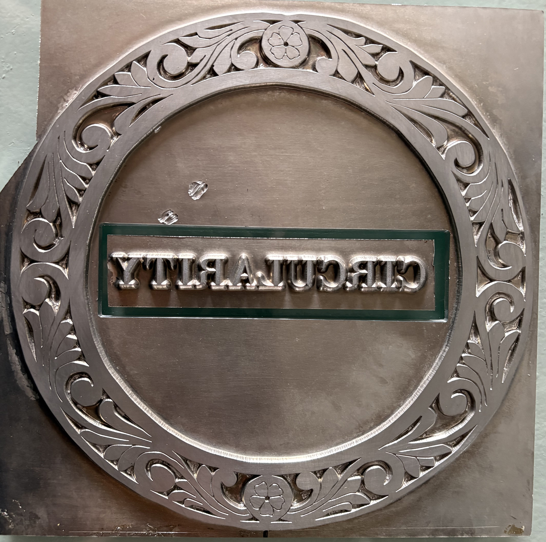
I in turn was quick to propose using the outer ring of the Puritan linocut as a collar around the title page text. As you can see from the very first image in this post that the ring from Puritan and the word CIRCULARITY were debossed on the cover.
Production
Harley Smart at BookArt must be a patient man. It probably was pretty evident soon after I made initial selections on the BookArt website on August 8, 2024, that he needed to be. I wasn’t sure how many copies I wanted. As stated previously I expected the special editions would have a tipped-in linocut opposite all 15 haiku. It wasn’t until Nov. 11 that Smart was able to work up a price that stuck for an edition of 60 books, 30 with a single linocut tipped in.
At the time I asked about jackets, but Smart wrote: “Jackets were not included, apologies for not pricing those. At this size, I don’t recommend jackets as it requires our sheet size on the indigo is 26”, so we would only have 1.5 inches gatefold on the front and back cover.” There were still issues with the choice of paper, to which Smart said: “For now I would suggest to stick with the 100lb text but if we go to proofing, I could also pull a sheet proof for a couple pages on the 60lb cover for consideration.” He added that he would send some paper samples in the mail.
While I was working with Smart on choices of materials, the contents and the design of Circularity were completed, and Nicole Clark sent Smart a hi-res file of the book. On Dec. 31, 2024, Smart reported: “Had a quick look and the files all look good. We’ll be doing full prepress check as we pull proofs after the 6th when we are back to work.”
On Jan. 8, 2025, I mailed to BookArt a box with with all of the original linocuts to be tipped in.
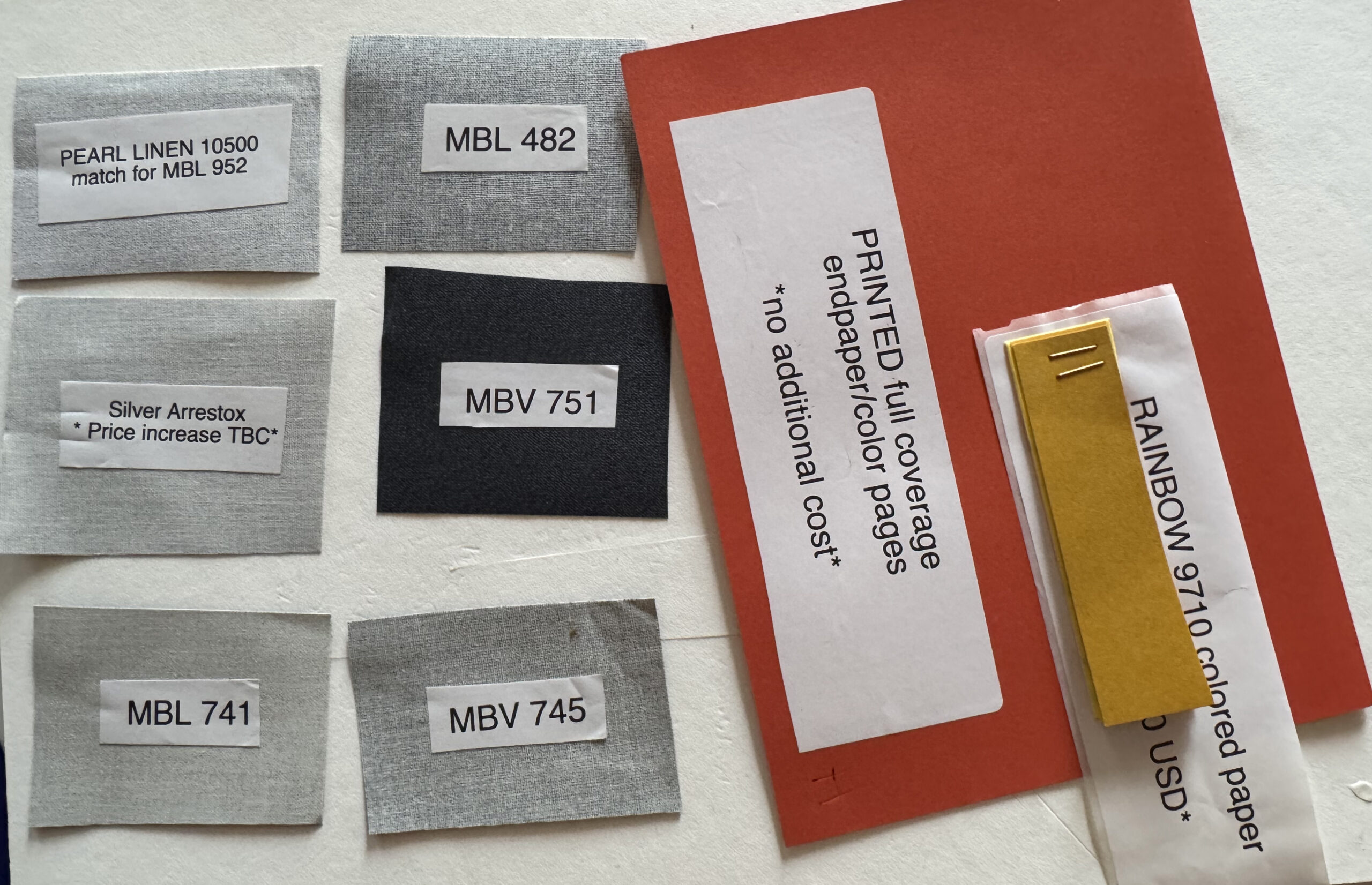
In January 2025 I received six samples of linen cover choices and a selection of colored endpapers. The RAINBOW paper for endpapers had a hefty price tag. So not surprisingly we opted for printed color endpages at “no additional cost.”
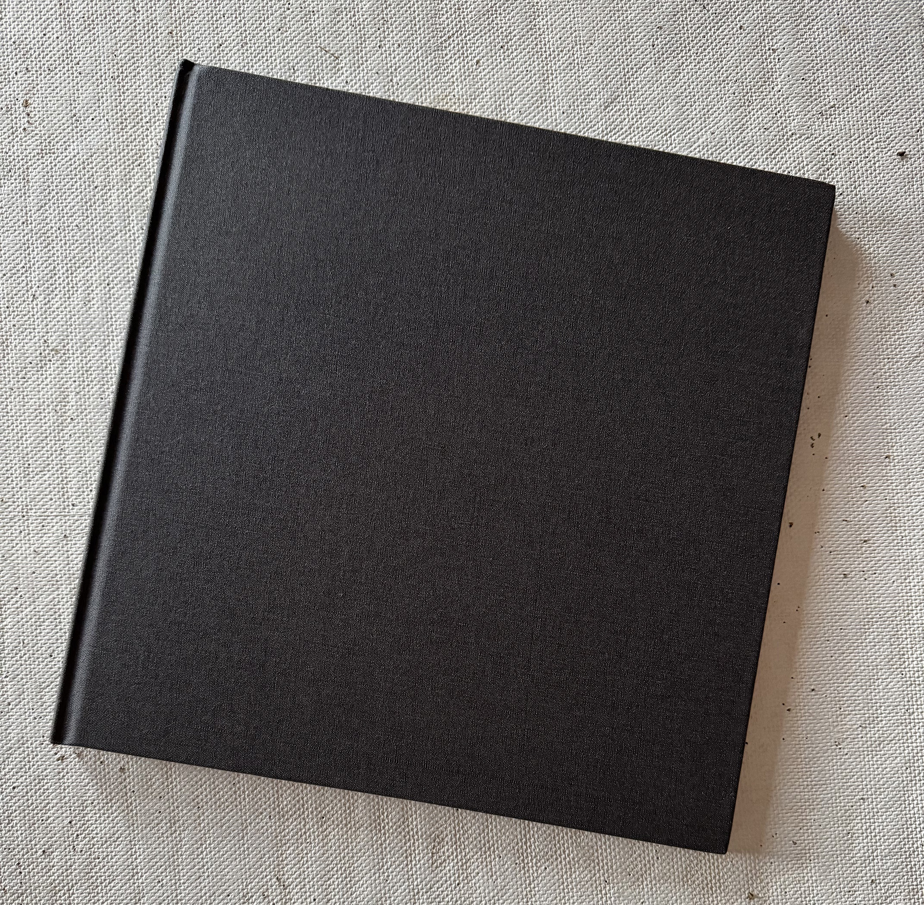
As to which of the six linen cover samples to select, designer Clark, poet Klein and I held a Zoom session. We agreed on MBL 741. We were surprised in February 2025, when Klein and I each received a prototype of our book. That wasn’t what we selected, I emailed Smart at BookArt. He replied with a question: “Can you please show me the color of the other side of the material in the photo that has the MBL 741 sticker? The stickers are placed on the starch-coated backside of the cloth.” But then he assured me he could still use the lighter “backside” of MBL 741. He’s used the backside of a linen sample before.
We almost became a victim of tariff-mad President Trump. On Feb. 3 Harley Smart wanted to know: “Can you confirm that you agree to still go ahead with the job despite the 25% tariffs that will go in affect tomorrow? I understand that this amount will be collected by the US customs.”
Meanwhile the box of my original linocuts were held hostage at the border. Smart wrote: “For the prints, I will call [customs] in again now. If possible to have it cleared today, and we pay the original $240 CAD duty, that will be fine. I’m concerned that the Canadian 25% tariffs may also apply, which would push the cost on that up to $529. What do you think, would you like me to ask them to return to you so you can have someone else tip-in those sheets (and I could credit additional $180 charge that we were billing for doing it), or we continue as planned?”
I didn’t take action, and the box of originals landed back on my front steps without notification that they were being returned. Was I ever grateful they didn’t disappear into the ether! Then Smart informed me he employs a runner (mule) in far upstate New York who takes materials back and forth across the border for him. So on March 3 I mailed the package of originals to the runner.
Three photos of foils for the wreath on the cover of “Circularity.” (L to R) 1–”smoke” clear foil, 2–standard clear, and 3–”pearl” clear. (BookArt photos)
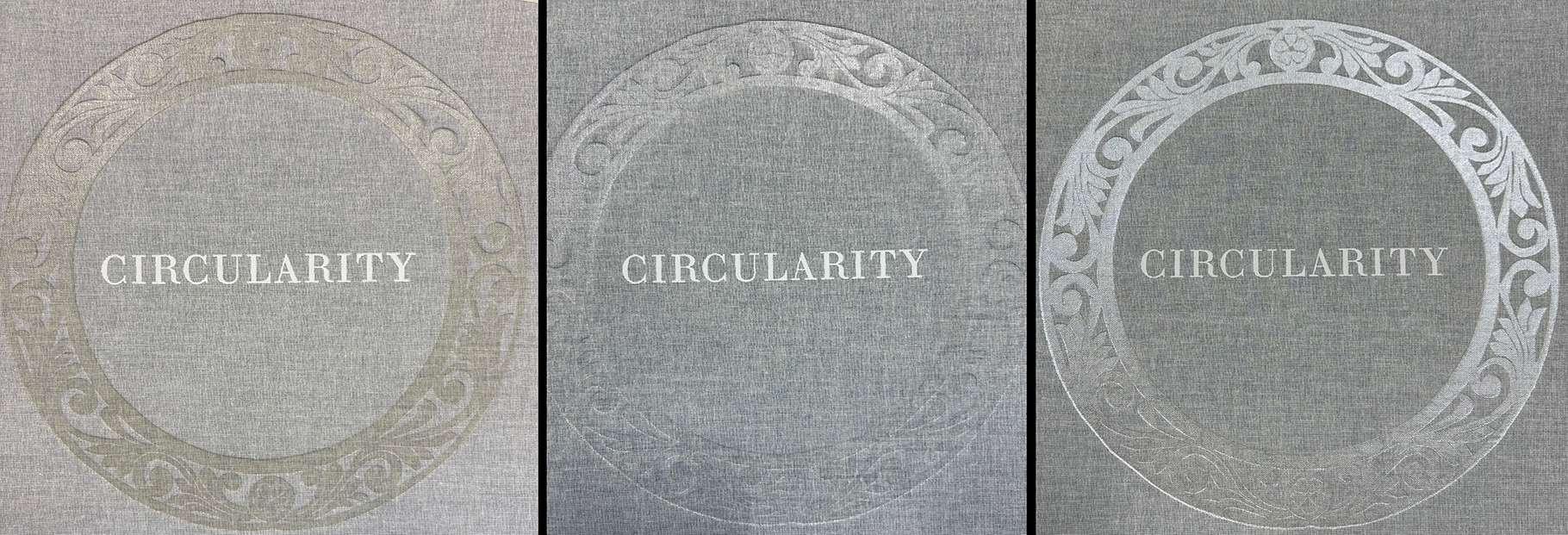
On April 21 Smart sent me photos of stamping tests. He wrote: “Here are the three options, please let me know which you prefer and they should finish this shortly for me: 1-“smoke” clear foil, which has a slightly darkened impression; 2- standard clear and 3-“pearl” clear foil–slightly brighter.” Nicole, Karen and I all preferred “smoke” clear. But we didn’t like the white lettering.
BookArt photos
We also did not like the word Circularity reading up on the spine. Smart said that was a French (Canadian) preference, but as you see on the photo on the right the direction was reversed.
Then three days later Smart sent a very short video of the book being opened to the title page with a tipped-in original linocut opposite it. And he wrote: “Here is preview of print tipped-in on top edge, seems to work nicely, not buckling as it might with thicker paper.” Pleased with the test, I asked him to proceed.
He did but soon (April 30) reported that he couldn’t complete the order of 60 books.
“Our stamping vendor unfortunately had a lot of waste when setting up the stamping of your cases,” Smart wrote,” and we were missing cases to finish your order (16 cases wasted of the 70 I delivered to them). I reordered the cloth needed, will build new cases once I receive, and take back to get stamped for the remaining 8 regular edition.
“Instead of waiting, I have shipped out 30 special edition and 22 regular edition. My shipping agent is crossing the border tomorrow with these (2 boxes)…. For the remaining copies, I’ll send these at my own expense asap….
“With the overage on your book, we do have 12 additional bookblocks available after completing the 60 edition, please let me know if you think you are interested in those or if we should recycle.”
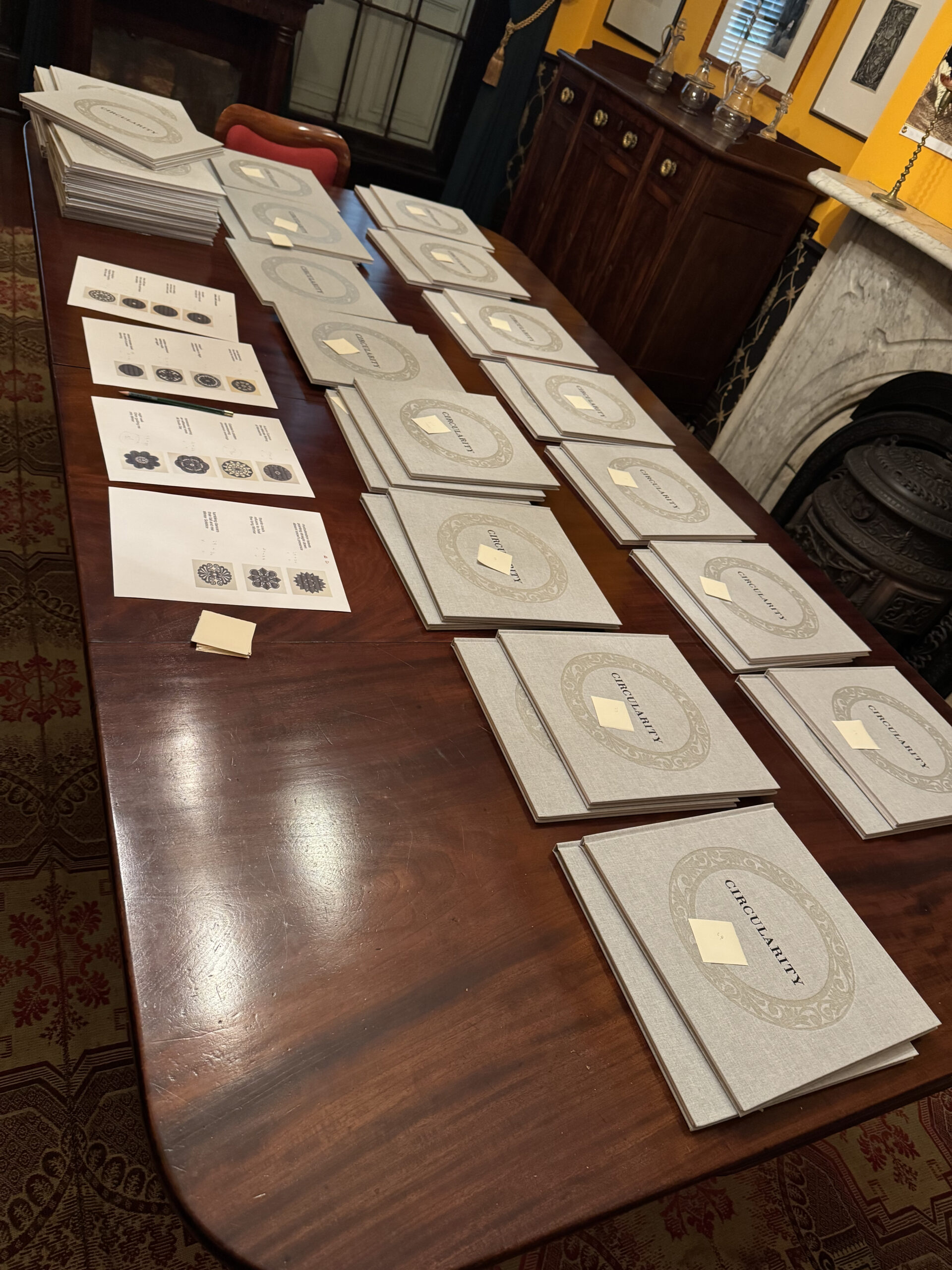
When the shipment of 52 books packed into two boxes arrived, I did an inventory on my dining room table (right). The 22 regular edition ones are shown in two stacks in the upper left corner of the photo. Referring to printouts of the haiku/linocut sequence, I made stacks of the books with tipped-in originals of the 15 different linocuts. If the count was correct, there should have been two books on each stack. But there weren’t. There was only one book with a Mughal print tipped in; while there were three copies with Black Doves tipped in.
This mistake I immediately reported to Harley Smart. Because eight more books were due to be made, that wasn’t really a problem.
On his May 22 email, Smart wrote: “Just a quick update the books are complete. We’re doing final inspection and packing tomorrow. They’ll be with my shipping agent shortly after, likely crossing the border Monday or Tuesday, with USPS delivery expected sometime next week.
“This has been a real learning experience on my end. I’ve been working on the project since last August and, unfortunately, made a few costly mistakes—including missing a size discrepancy in the stamp until press time, which required outsourcing and extra materials due to setup waste. The administrative side also ran longer than expected.
“In trying to keep the pricing competitive, and after absorbing these extra costs, my actual hard costs exceeded my original margin—resulting in a loss for the bindery. Book production, unlike a car repair, doesn’t allow for adjusted pricing once work starts.”
The last eight books arrived in late June just in time for my husband and I to drive to Karen Klein’s Cape Cod house, where we signed and numbered the books.
The Signing
The boxes from BookArt contained smaller boxes. Each of the smaller boxes snugly housed four Circularity books. After I did my inventory of the final shipment, I packed them back up in the smaller boxes. These I annotated with the numbers the books would eventually receive. The special editions (with tipped-in linocuts) would get numbers 1 thought 30. The regular edition (without the tip-ins) would be numbers 31 through 60. The special edition books would be numbered according to the sequence in which the linocuts appear in the haiku/linocut spreads. For instance, Matzo Mars was the first linocut to appear as you read their book. Therefore, the two books with tipped-in proofs of Matzo Mars would receive the numbers 1 and 2. So the two books with Abruzzi proofs tipped in would be numbered 3 and 4, because Abruzzi was the next linocut to appear in the haiku/linocut spreads. That’s how the books were ordered.
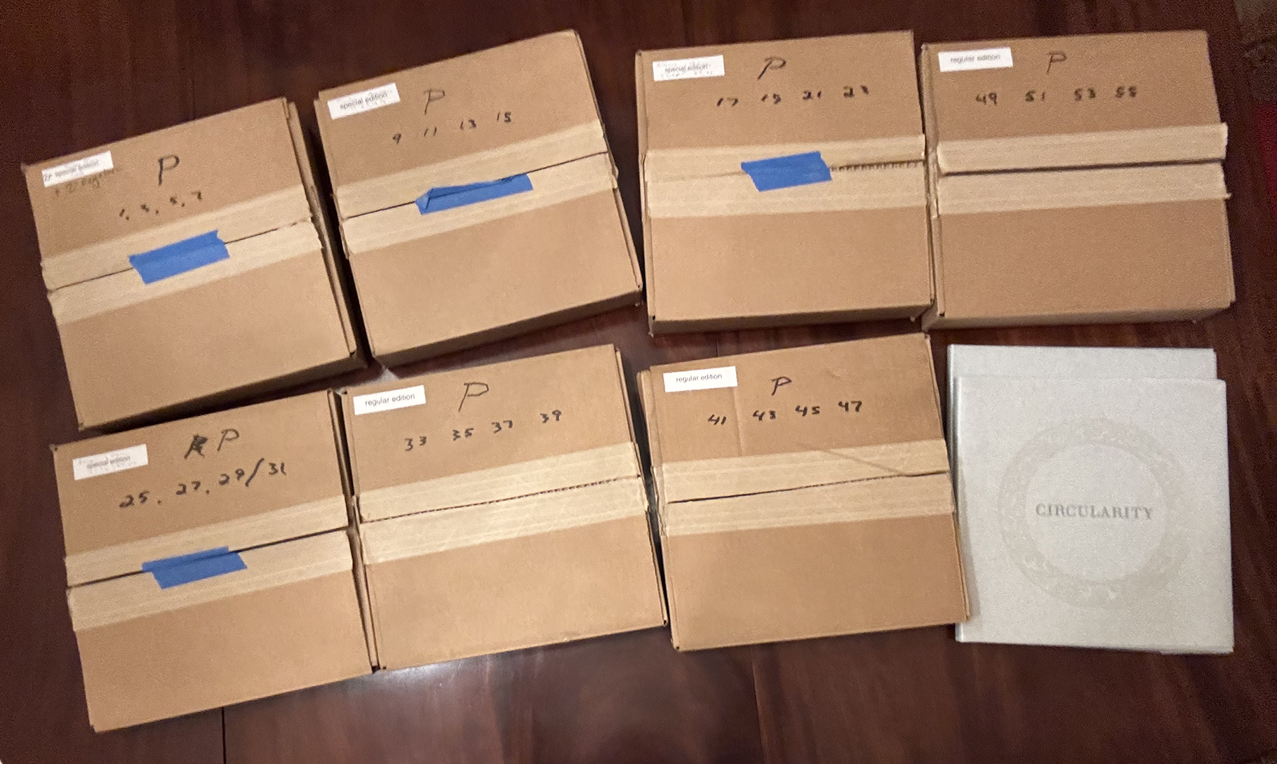
Because Klein and I evenly split the cost of production, we would each get 30 books: 15 special edition books (each with a different linocut tipped in) and 30 regular edition books. I would get the odd-numbered volumes and Klein would get the even-numbered ones. So as we signed them, the books were returned to the little boxes, and those boxes were clearly labeled “P” for Ponemone and “K” for Klein. Above are the boxes I took home with me. Note that the boxes were also numbered according to the numbers of the four books enclosed in each.
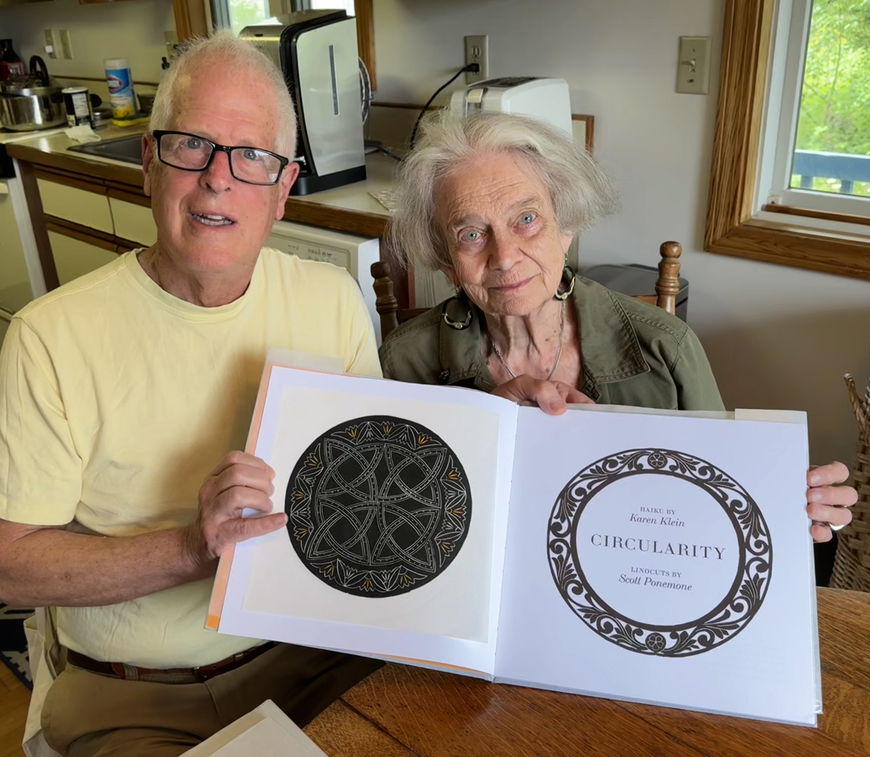
Karen Klein and I hold up a special edition copy of “Circularity” with a proof of “Abruzzi” tipped in. (Michael Frommeyer photo)
The Product: Physical
When the first finished copies of Circularity arrived in May, I can’t express how delighted I was to finally hold a copy. The physical quality was quite exceptional.
The front cover was perfectly stamped. The relief of the wreath was invitingly palpable. The construction of the binding was immaculate. Even the placement of the title on the narrow spine was just right. Internally, all of the tipping-in of the original linocuts was faultless. Nor could I find fault with the printing of any page in any book.
BookArt photo
This is the stamp that was created for the cover of Circularity. Notice how the title had to be made separately and positioned within the wreath.
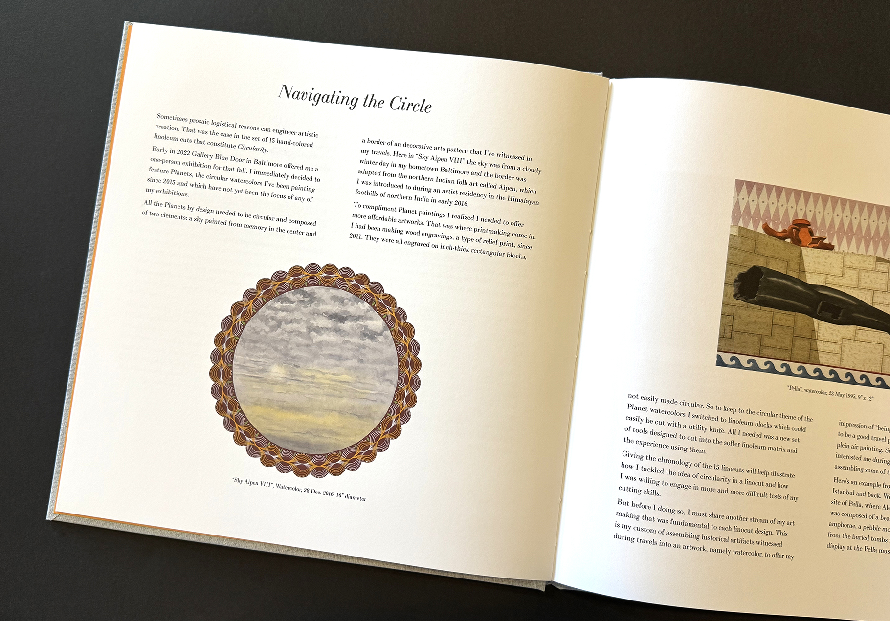
And I must also applaud Nicole Clark’s design. First off her decision to use the Bodoni type. My only request to her was to select a serif font because I wanted an elegant traditional look. She couldn’t have chosen better. As to the haiku/linocut spreads, she centered the lines of the haiku and used Bodoni italic. Plus the size of the type was carefully chosen so that the poem had a just enough weight to hold its own opposite the linocut. Even her layouts of the essay pages, as in the start of “Navigating the Circle,” were elegant and invitingly readable.
The Product: Metaphysical
Of course each reader will come to their own conclusion. I encourage a slow reading of the fifteen haiku/linocut spreads. Think about the oscillation of the cycle winter solstice to winter solstice. Think about the spiritual thoughts within each of mandala-shaped linocuts. And think about the difference of how thought is communicated by word and by image.
In my introductory essay I wrote: “Haiku are an assemblage of words and are intended to be read. By saying that haiku are “read” means that there’s a sequence–top line, middle line bottom line–and in English from left to right. They can be read without speaking or they can be read aloud. Even when read without speaking they have an implied sound….
“Linocuts have no sound, implied or otherwise. They are there only to be seen. They exist without language…. Words can be used to describe the linocuts, but the linocuts have no words of their own.
“It’s their otherness that make the haiku-linocut pairings work. They share a certain unapologetic truth in the elegance of their structures. Enjoy the sound of the haiku and the silence of the linocuts.”
Acquire a copy
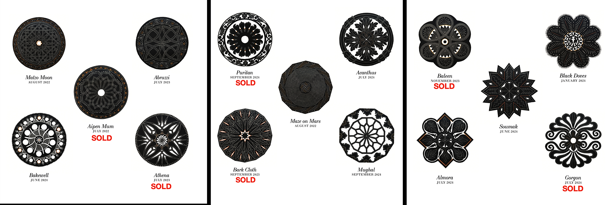
My 15 copies of Circularity without an original linocut are $100, well below the cost of production. Each of the special edition copies have a tipped-in, original hand-printed linocut. They are $350 each. Six of my 15 special edition copies have been reserved. Please consult the above chart to see which special edition copies are available. Kindly email me at p1m1@comcast.net
I can also forward inquiries to Karen Klein, who will also be offering Circularity for sale. She also has 30 copies of Circularity, including 15 special edition copies.
★ ★ ★
Trackback URL: https://www.scottponemone.com/circularity-the-pairing-of-two-talents/trackback/
One comment on “Circularity: The Pairing of Two Talents”
Leave a Reply
-
Accessions: Short Stories Dec 21, 2025

-
The Mike and Scott Show: No Reruns Nov 25, 2025

-
Griffin Chairs: Both naive and refined Oct 04, 2025

-
Circularity: The Pairing of Two Talents Jul 12, 2025

-
Frans Masereel: Workers’ Paradise in 1939 Europe Apr 11, 2025

-
Erich Glas: Through the Night vs. Leilot/Nights Jan 15, 2025

-
Gustav Wolf: His Monster Menagerie Dec 23, 2024

-
Linos: #5 through 15 Nov 01, 2024

-
Gustav Wolf: Confessio Aug 02, 2024

-
Justin Remo’s Big Finale May 21, 2024

-
Accessions: Short Stories Dec 21, 2025
-
The Mike and Scott Show: No Reruns Nov 25, 2025
-
Griffin Chairs: Both naive and refined Oct 04, 2025
-
Circularity: The Pairing of Two Talents Jul 12, 2025
-
Frans Masereel: Workers’ Paradise in 1939 Europe Apr 11, 2025
-
Erich Glas: Through the Night vs. Leilot/Nights Jan 15, 2025
-
Gustav Wolf: His Monster Menagerie Dec 23, 2024
-
Linos: #5 through 15 Nov 01, 2024
-
Gustav Wolf: Confessio Aug 02, 2024
-
Justin Remo’s Big Finale May 21, 2024
Pingback: The Mike and Scott Show: No Reruns