Linocuts: Making of Athena
Introduction
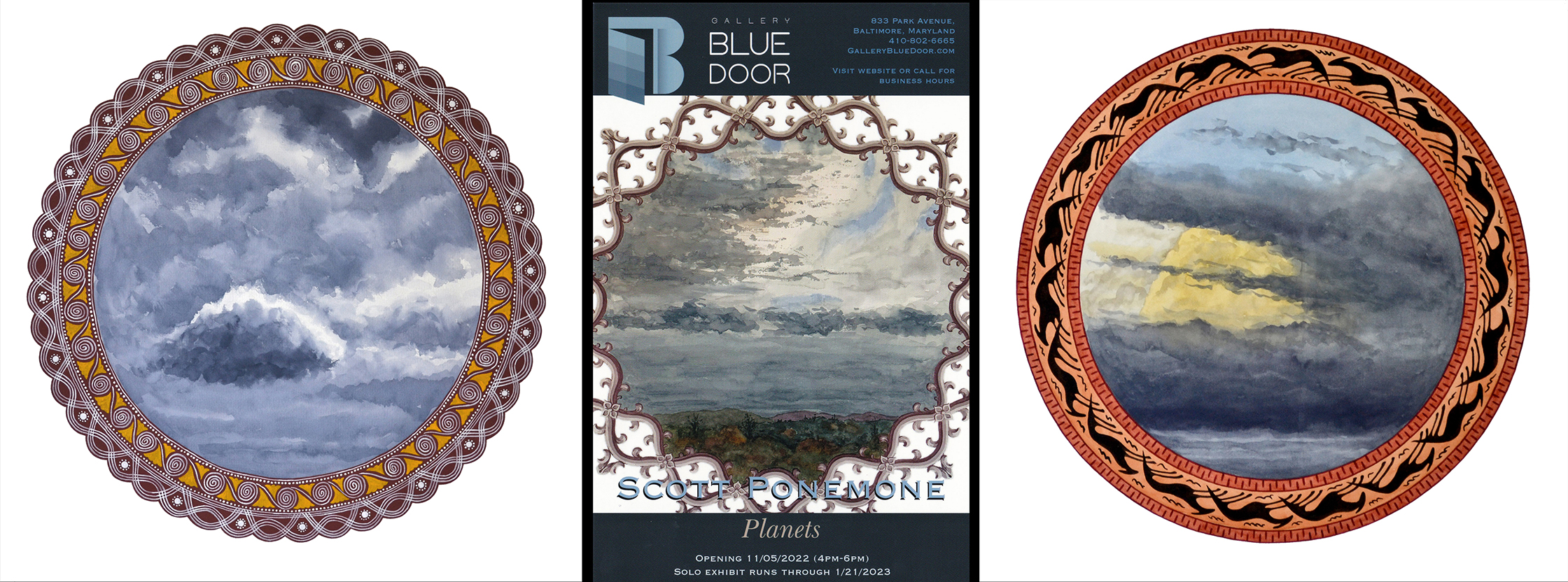
I wouldn’t have created circular linoleum cuts had I not been offered an exhibition at Gallery Blue Door in Baltimore last fall. The gallery director Scott Philip Goergens proposed that I show my circular watercolors that I call Planets. Above is the show card and two of the watercolors that I exhibited. To compliment the watercolors I wanted to included wood engravings as a way of having more affordable items, i.e. to use a cringe-worthy mercantile term: lower price points. But to make wood engravings compatible with Planets, they need to be circular….which is a problem.
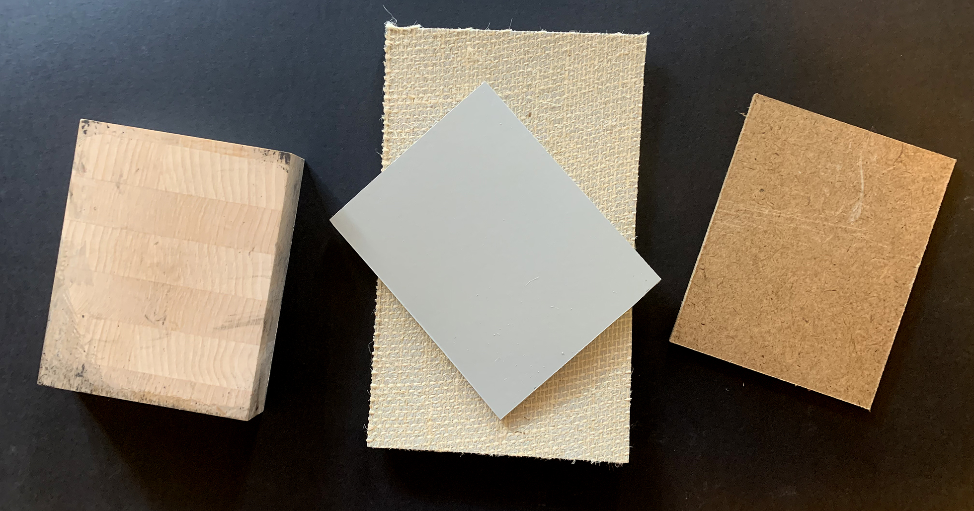
Traditionally blocks made for wood engraving are in fact made of wood. Usually like the block (left), it is laminated from hardwood, maple in this case, and is nearly an inch thick. And they are rather expensive. If I wanted to do a circular image 8 inches across, the block (8″ x 10″) would cost over $70 and then the surface to be inked would need to be made round either via a bandsaw or with a lot of time-consuming cutting away of the surface. However, an 8″x10″ piece of unmounted linoleum (grey top and burlap-backed bottom as seen in the middle) costs about $10. It can be easily be made circular with a mat knife and then mounted on a piece of hard board (R) to make it rigid.
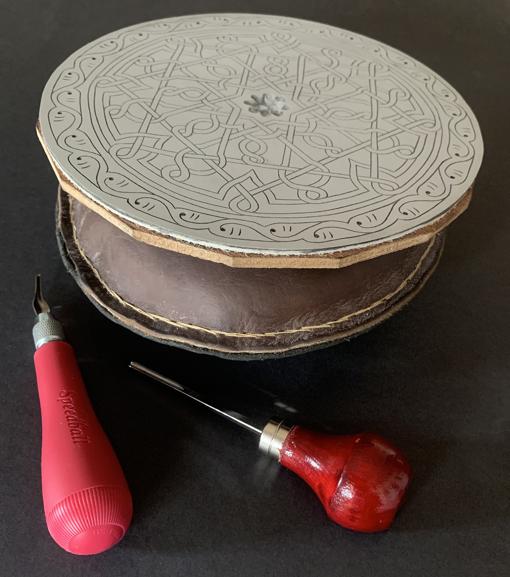
The linoleum block to my print “Matzo Moon” rests on a leather pillow beside a pair of linocut tools.
On the right is one of my finished linocut blocks that I had laminated onto a piece of hardboard. Below it is a leather pillow, stuffed with dried beans, that I made in 2011 when I took a course in wood engraving at Maryland Institute College of Art. The pillow provides a surface that allows the block to be easily pivoted. Being left-handed, that means I hold a cutting tool in my left hand and use my right hand to turn the block as needed. If I hadn’t laminated the board to the linoleum, I couldn’t use the pillow as the linoleum block itself is too flexible.
The set-up mirrors that for wood engraving. The tools, however, are specific to linoleum printmaking. Because the linoleum is quite soft, the tools gouge out material. The Speedball cutter here is fitted with a #1 blade that is V-shape for a fine line. The blade on the wood-handle cutter has a narrow U-shape for a somewhat broader removal of material.
In short I chose to use linoleum because I could easily make the blocks round, in the spirit of my Planets watercolors. And I mounted the linoleum blocks onto wood so I could cut them in much of the way I did when making wood engravings. In fact my finished linocuts look very similar to my wood engravings. Both rely on white lines to create most of the image. White-line imagery is one of the characteristics of wood engravings. Or to put it another way, my linocuts are wood engravings that just happen to have a matrix of linoleum, not wood.
ATHENA
“Athena,” which I printed in June 2023, became my fourth circular linocut. The other three were created in the summer of 2022 and were shown publicly in October 2022 with the opening of my Gallery Blue Door exhibition. This ART I MAKE post is the first to take readers through the process of linocut production.
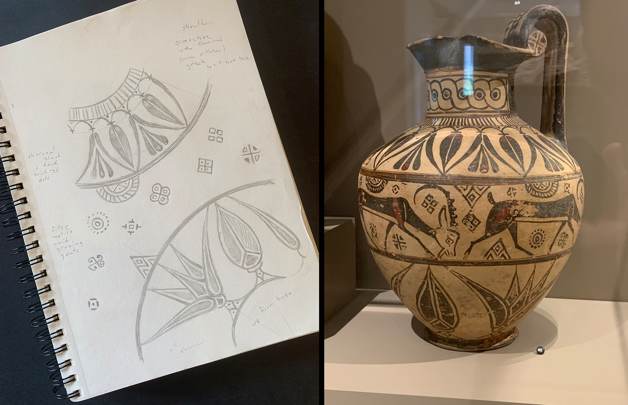
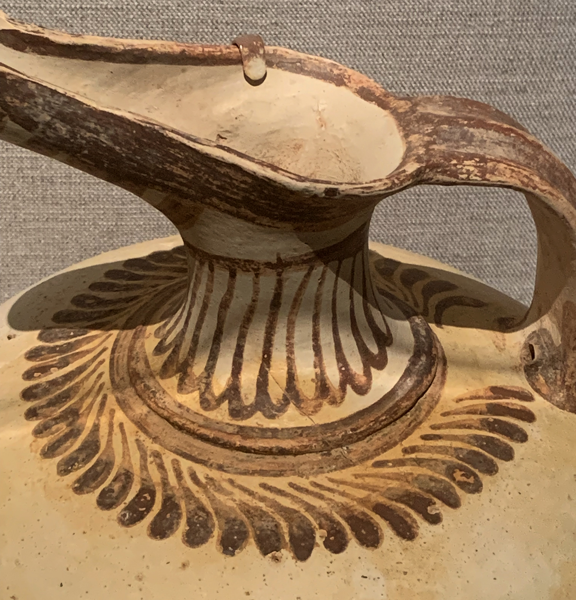
According to the Walters, the pitcher (right) is an “oinochoe” used for serving wine. It was probably made in Asia Minor, 625-600 B.C.E. The label reads: “The horizontal rows of decoration filled with wild goats and floral motifs reflect influence from civilizations of the ancient Near East.”
In 2003-4 I was working on a series of watercolors based on objects on view at Baltimore’s Walters Art Museum. I concentrated on its displays of ancient Greek and Roman decorative arts and European medieval religious art. The idea was to sketch objects or parts of them and use the resultant pencil drawings to combine those elements into a single image. On viewing the “oinocheo” I chose to draw the floral motifs of alternating lotus buds and flowers that were painted above and below the course of goats.
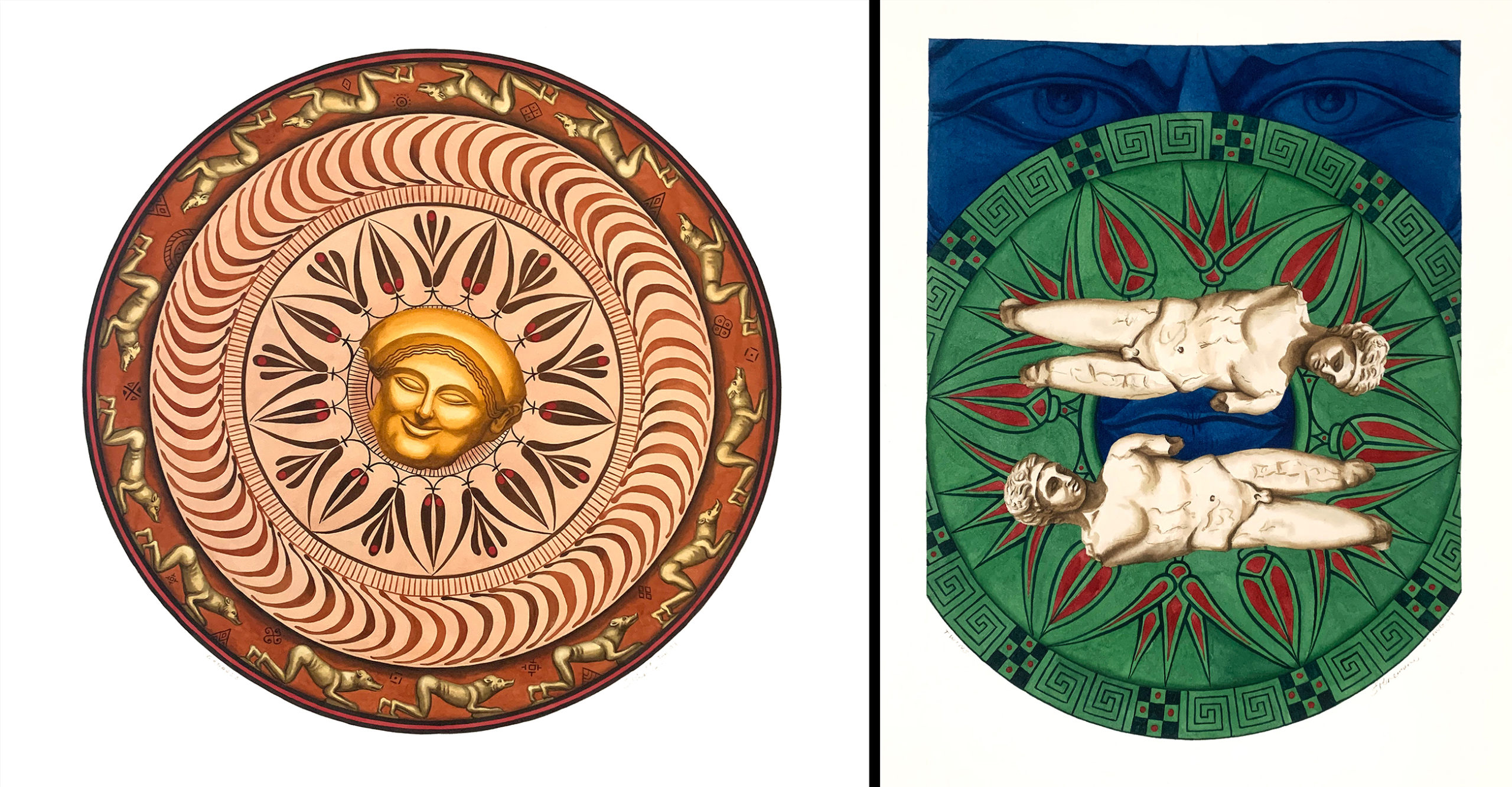
(Right) “Goddess,” watercolor, 28 Jan. 2004, 20″ across; (Left) “Twins,” watercolor, 23 Aug. 2004, 14.5″ x 11″
“Goddess” (right) was shown as part of my 2005 one-person exhibition at Schiavone Contemporary Art gallery in Baltimore. (“Twins” was painted after the Schiavone exhibition.”) All of the watercolors there were based on sketches from the Walters. The bud-and-flower motif from the “oinochoe” was featured in each painting. In “Goddess” it was the motif above the goats and in “Twins” it was the motif below the goats.
For my new linocut, I chose the motif below the goats.
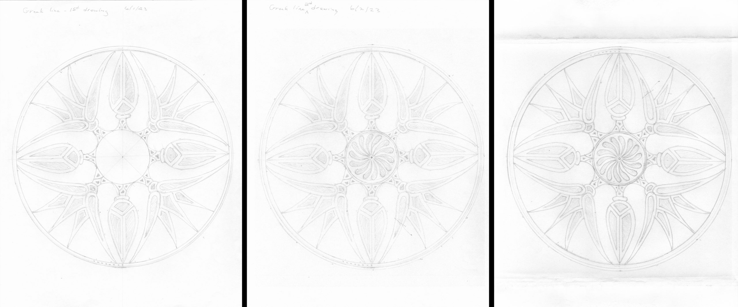
From left to right is my sequence of preparation drawings for “Athena.” I first just drew the bud-and-flower motif by dividing the circle into 45˚ segments, allowing the motif to repeat four times. This was just pure guesswork as to whether the size of the motif relative to the overall size–7.625″–of the circle was good. I thought so and so didn’t do another variation, say by making the scale of the motif smaller and, therefore, increasing the number of repetitions.
Satisfied so far, the next step was: what to do with the empty center circle. Instead of drawing on the pencil sketch, I scanned the drawing into the computer and then printed out several copies to try out a few ideas.
I turned to another early Greek pitcher, choosing the feathery collar below the neck. The middle drawing above is the second attempt to place that motif into the center circle. The first try had an odd number of repeats and looked unbalanced. The second try, as shown, looked better even though it had 14 repeats instead of 16, which would have been a better proportion, i.e. 2x the 8 elements of the bud-and-flower motif. Adding 2 more repeats to the inner circle probably would have looked crowded; so I left the number at 14.
The next step was to scan that middle drawing and then in Photoshop reversing it horizontally so that the printed image would match the orientation of the middle drawing’s center circle. (The bud-and-flower motif was symmetrical and didn’t need that precaution.) The image on the right above is a printout of that reversal. It was taped on top of a piece of transfer paper onto the linoleum block. I followed the lines with pencil and traced the image onto the block.
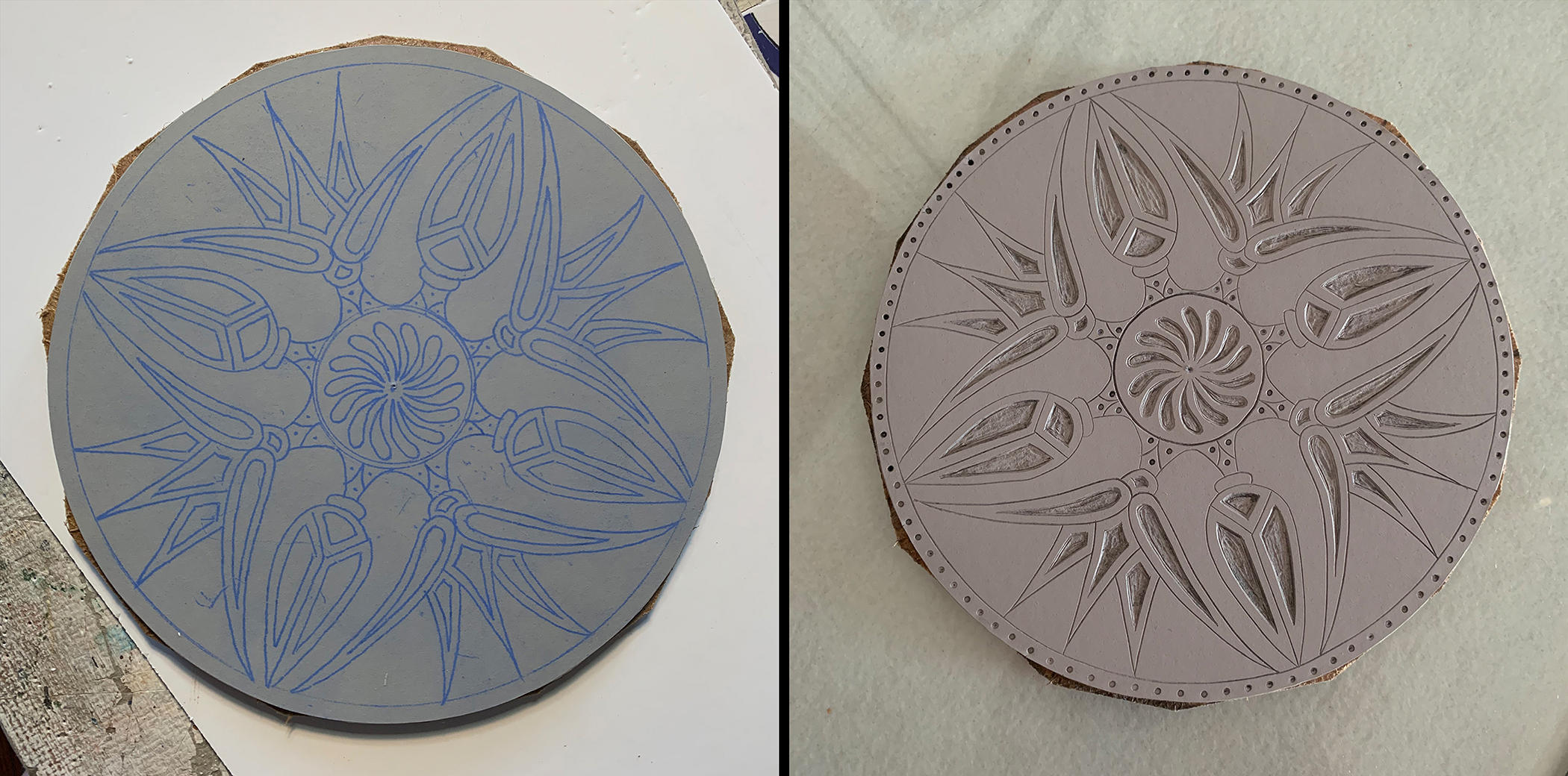
The transferred image appears on the left, but that image leaves out several steps. It was only after tracing the image that I cut the linoleum block into a circle, and only then did I trim a piece of hardboard to closely fit under the linoleum. Using contact glue, I laminated the hardboard to the linoleum. The photo on the right shows the completed cut linoleum block. The Speedball #1 blade was used to cut the lines and various wider tools were used to scoop out the recesses. The small dots of the border and in the stems of the buds and flowers were created by a hammer blow to a nail set tool.
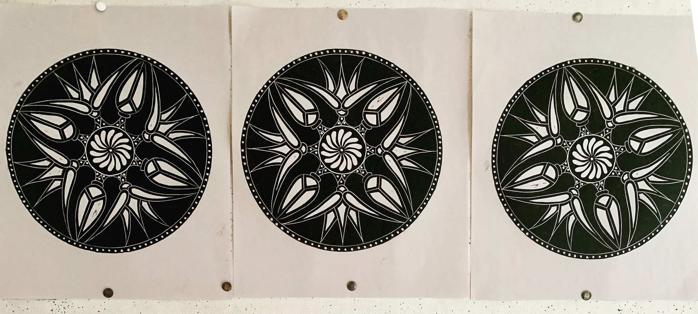
Because the image was circular, the next question was: “Where was the top?” One thing for sure, despite how I first sketched it (and that was simply a product of geometric decision making), I did not want the buds pointing to the top, bottom and 90˚ left and right. With that orientation the buds with the outer petals of the flowers created a strong Christian-like cross. (Look back at the three drawings.) There’s nothing wrong with Christian symbolism except when you do not intend it.
So I made three proofs on newsprint, pinned them up and posted them on social media. In the middle image the flower replaces the bud as top, bottom and 90˚ left and right. In the left proof the flowers are moved to the left about 22.5˚. In the right proof the flowers are moved to the right about 22.5˚. The overwhelming choice was “middle” although one person wrote: “If you want symmetry, middle. I prefer far right image.” Another person wrote: “The one on the left seems to give the impression of a positive motion (clockwise).” “I like the symmetry of the middle one,” another writer said, “but if you’re going for discordance go with the right one.” And here’s one I really liked: “Middle, unless you are trying to make a political statement.”

Scott Ponemone, “Athena,” hand-colored linocut, completed 10 June 2023, 7.625″ across, ed. 20 with 4 artist’s proofs
In fact I chose the middle. This respondent best matched my reaction: “The Middle one is best. The other two seem to distort the circle and create unwanted motion. The middle one seems more stable and comfortable.” At times I have gravitated to the uncomfortable, having images somewhat skewed. If you scroll back to see the “Goddess” watercolor, note the goddess’s head is tilted and the ring of large “C” shapes create a sense of motion. However, in my four linocuts I’ve striven for a meditative viewing experience, for which symmetry helps induce. This “middle” orientation, as shown above, also helps create a sensation that the center comes forward and the outer areas, where there is less white, recedes. You may need to step back from your screen to sense that.
The chrome orange dots were painted with watercolor. This feature has appeared in all four linocuts. I chose to paint those dots to further emphasize the middle.
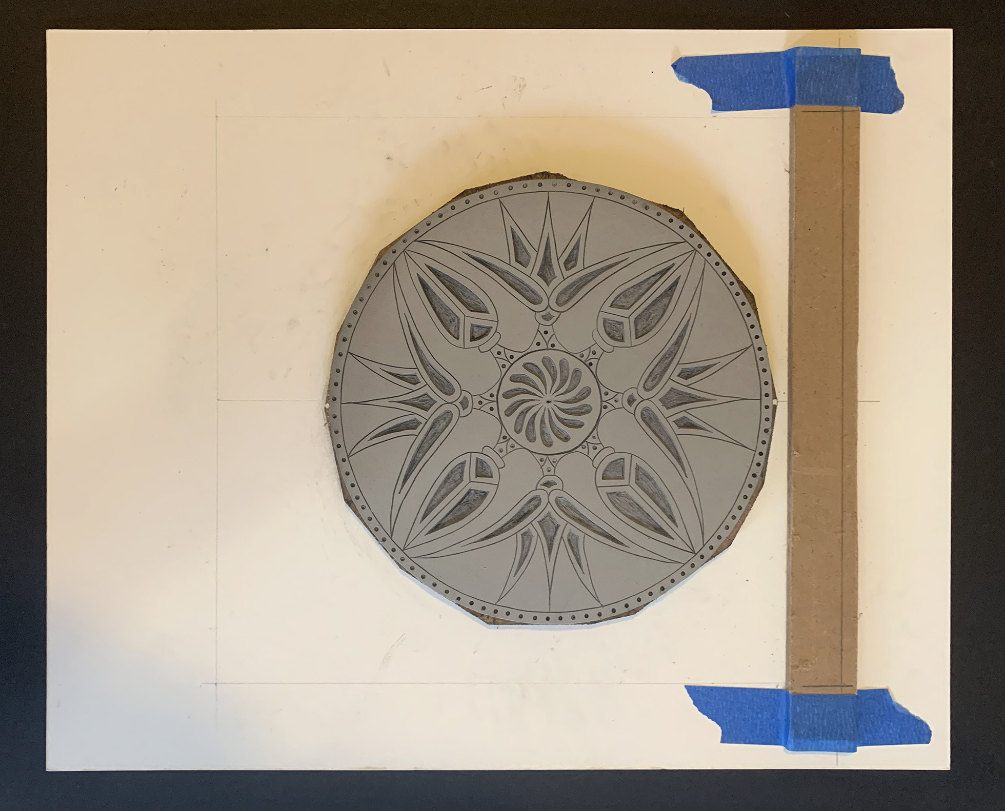
Above is the setup I made so I could both: 1) place the linoleum block with the proper “middle” orientation (note the white dots painted on the hardboard that are lined up with the center line drawn on the mat board) and 2) place each sheet of 10″ x 11″ Rives lightweight buff paper with proper margins each time. The top is to the right. The brown piece held by blue tape is a piece of hardboard. The lines drawn on it show where the top of the paper was to be placed. I used hardboard to elevate that placement, almost to the height of the block.
THe first three briefly
The following are quick hits on my first three linocuts.
Aipen Mum
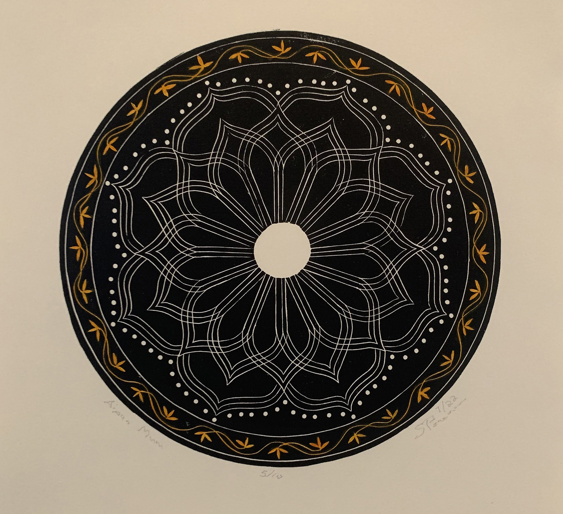
Scott Ponemone, “Aipen Mum”, hand-colored linocut, July 2022, 7.625″ across, ed. 10 with 2 artist’s proofs
“Aipen Mum,” completed in July 2022, was the first (second overall) linocut that I was satisfied with. It was the first to be laminated onto hardboard, a process that made it easier to cut and easier to ink up. It was inspired by the Aipen folk art of Uttarakhand, a state in northern India. I was introduced to Aipen in 2016 while at an artist residency organized by PECAH (Programme of Exchange in Culture and Art of Himalayas).
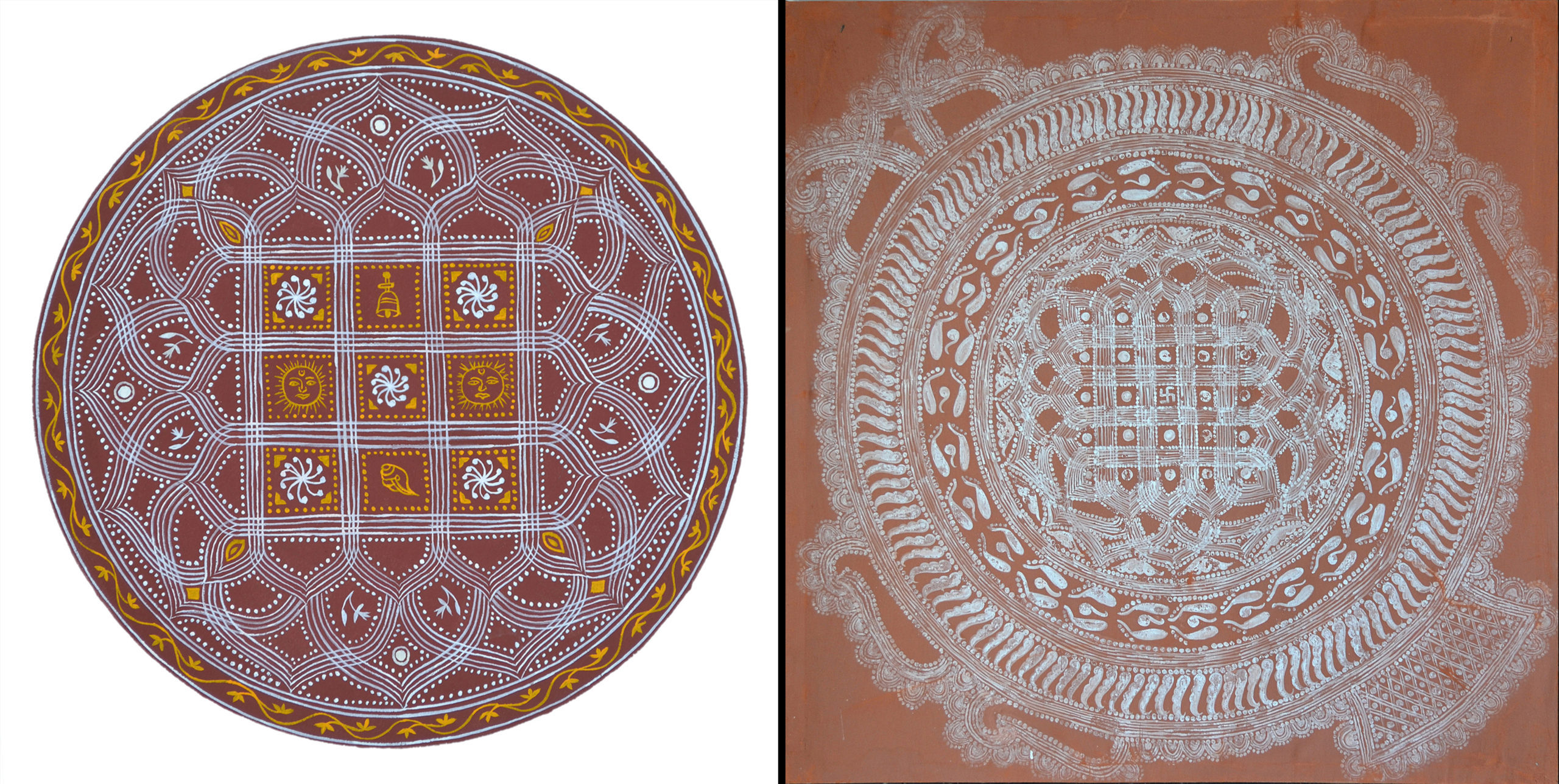
On the right is a 4.5′ example of Aipen as collected by Jugal Kishor Paitshali, a poet and an expert in the field of Kumaoni arts, folklore and music. During my PECAH residency the visiting artists visited him at his home outside Almora. On the left, is a 12″ roundel I painted in the Aipen style while at the residency.
Matzo Moon
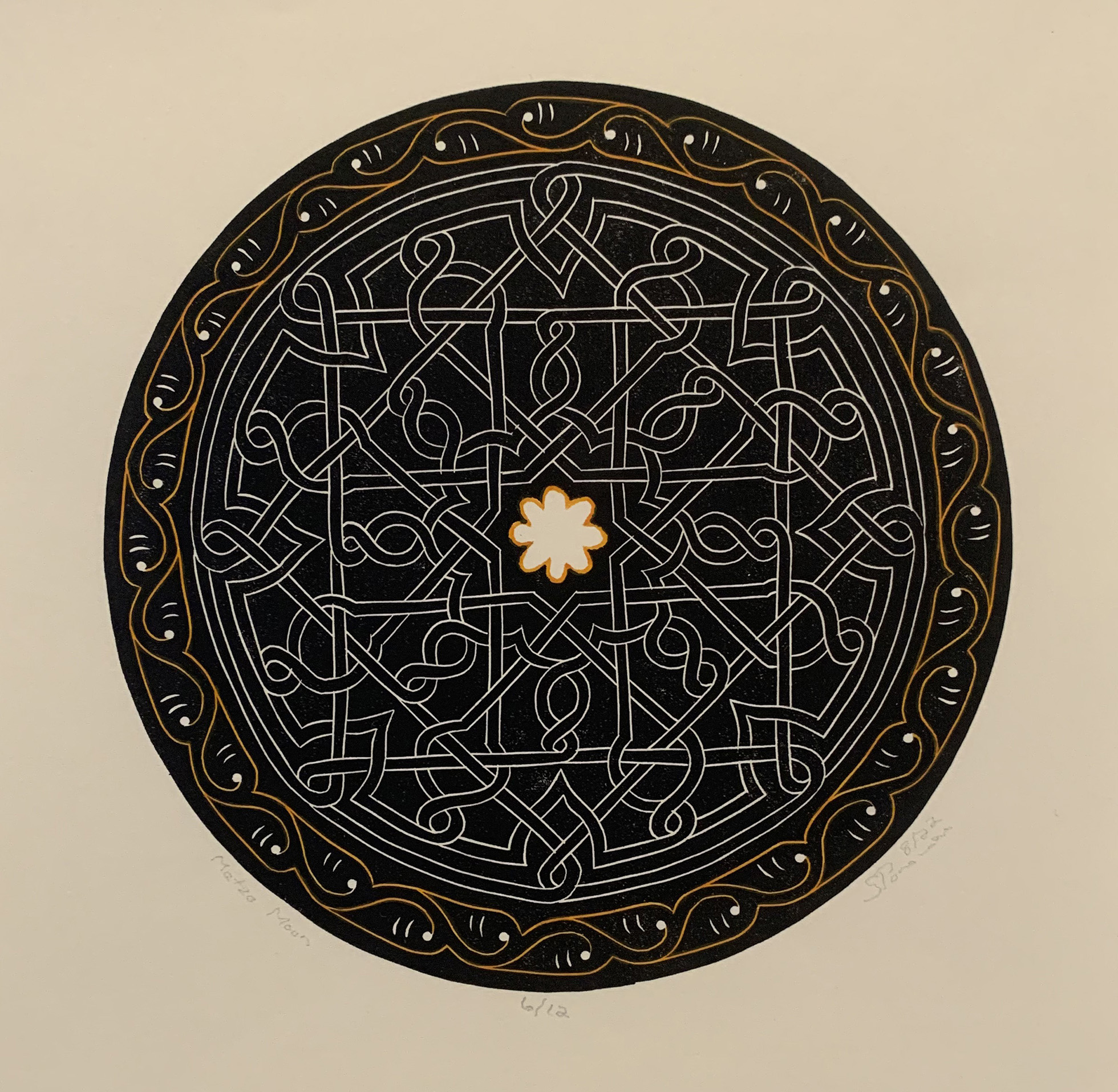
Scott Ponemone, “Matzo Moon,” hand-colored linocut, Aug. 2023, 7.625″ across, ed. 12 with 3 artist’s proofs.
As the name implies, in “Matzo Moon” I looked to Jewish traditional arts for inspiration.
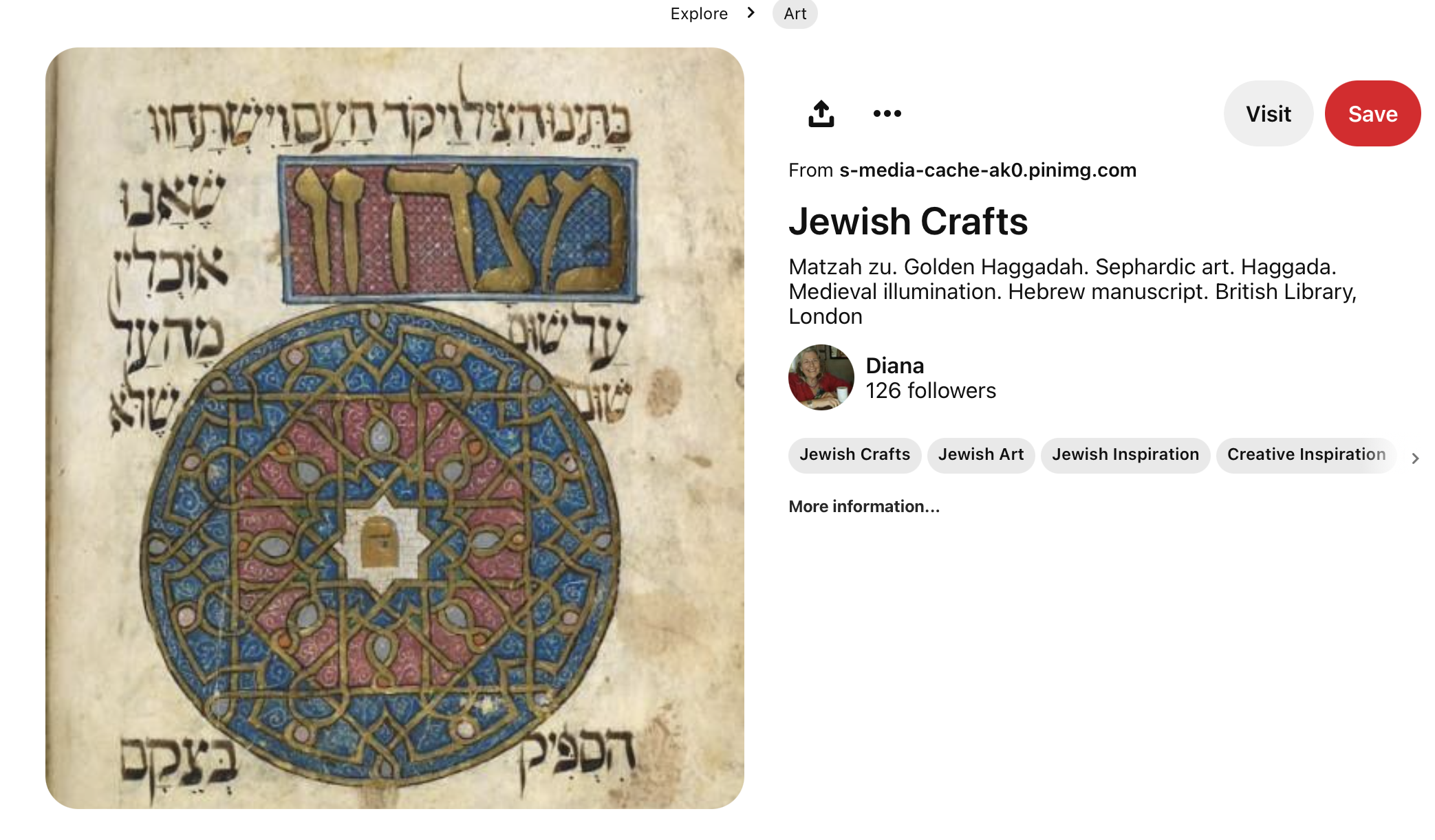
I came across this image in Pinterest.com from the Haggadah for Passover (known as the Golden Haggadah for the extensive use of gold leaf on many of its 56 miniatures). This illuminated manuscript in the British Library is said to have been made in c. 1320 in northern Spain, maybe Barcelona.
Maze on Mars
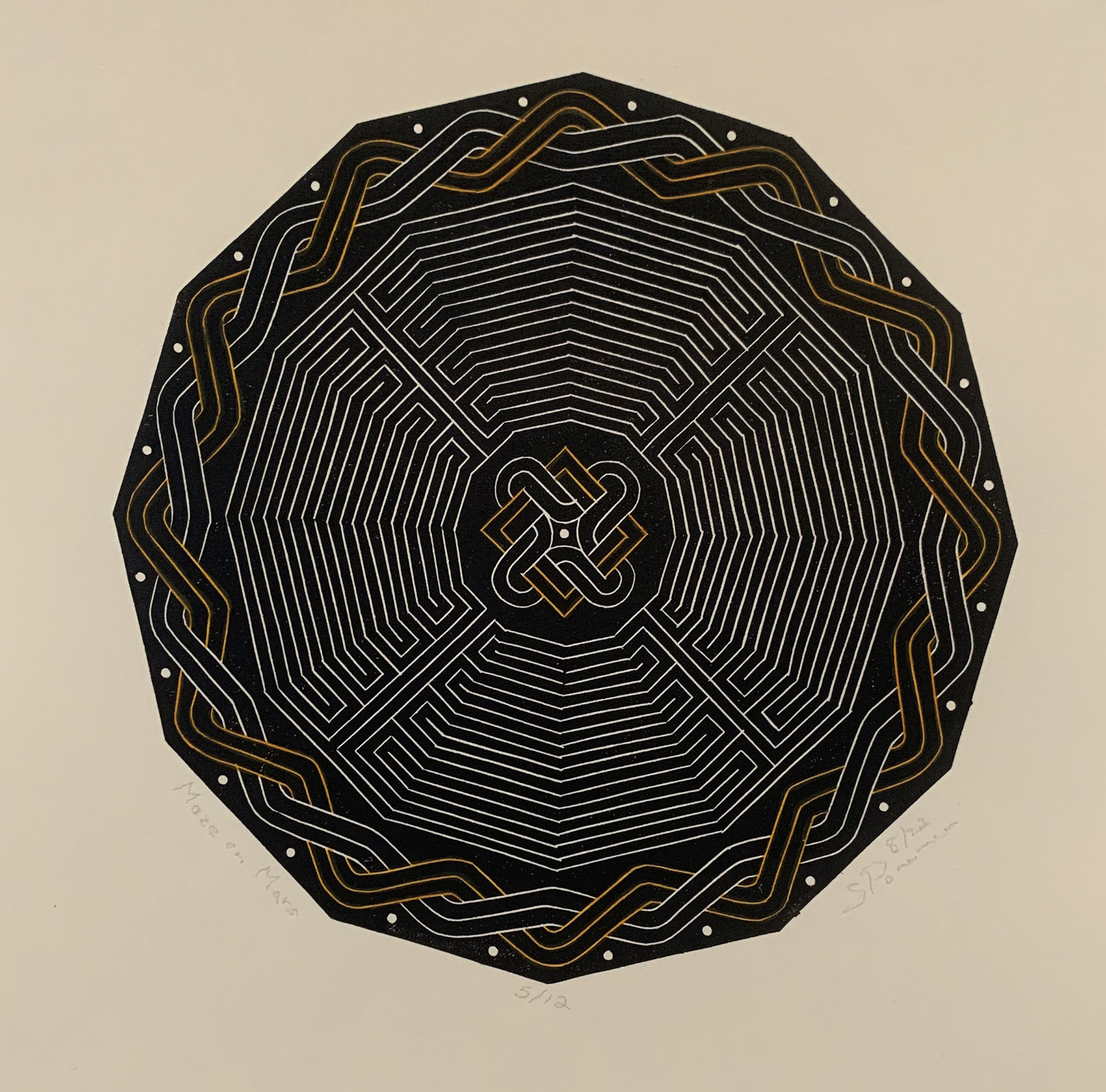
Scott Ponemone, “Maze on Mars,” hand-colored linocut, Aug. 2023, 7.625″ across, ed. 12 with 3 artist’s proofs
For this linocut I turned to another area of fascination: Roman mosaics. I’ve been fortunate enough to have visited Roman mosaics in situ in England, Hungary, Spain, Morocco and Italy. However, the principal motif above came from a book on Roman mosaics in Tunisia.

The image on the right is from “Mosaics of Roman Tunisia” (English edition published by George Brazier, Inc., in 1996). This fragment is installed in the Bardo National Museum in Tunis, Tunisia. On the left is my adaptation of the maze, turning it from a square to an octagon. I used it in a watercolor that I painted c. 2005. (Long ago I traded for a woodcut by a MICA student artist.) The hands are in the positions of sign language letters that spell from the top reading clockwise: “Time, no way out.” Someone entering the maze from the center will travel the whole path of the labyrinth only to find their self on the outermost ring with no way out.
NOTICE
Should you wish to own any of these hand-colored, very limited-edition linocuts, I’d be honored. Each is $250 (plus 6% sales tax if you are a Maryland resident) plus $15 shipping in the U.S. ($30 overseas).

Trackback URL: https://www.scottponemone.com/linocuts-making-of-athena/trackback/
2 comments on “Linocuts: Making of Athena”
Leave a Reply
-
Accessions: Short Stories Dec 21, 2025

-
The Mike and Scott Show: No Reruns Nov 25, 2025

-
Griffin Chairs: Both naive and refined Oct 04, 2025

-
Circularity: The Pairing of Two Talents Jul 12, 2025

-
Frans Masereel: Workers’ Paradise in 1939 Europe Apr 11, 2025

-
Erich Glas: Through the Night vs. Leilot/Nights Jan 15, 2025

-
Gustav Wolf: His Monster Menagerie Dec 23, 2024

-
Linos: #5 through 15 Nov 01, 2024

-
Gustav Wolf: Confessio Aug 02, 2024

-
Justin Remo’s Big Finale May 21, 2024

-
Accessions: Short Stories Dec 21, 2025
-
The Mike and Scott Show: No Reruns Nov 25, 2025
-
Griffin Chairs: Both naive and refined Oct 04, 2025
-
Circularity: The Pairing of Two Talents Jul 12, 2025
-
Frans Masereel: Workers’ Paradise in 1939 Europe Apr 11, 2025
-
Erich Glas: Through the Night vs. Leilot/Nights Jan 15, 2025
-
Gustav Wolf: His Monster Menagerie Dec 23, 2024
-
Linos: #5 through 15 Nov 01, 2024
-
Gustav Wolf: Confessio Aug 02, 2024
-
Justin Remo’s Big Finale May 21, 2024
Pingback: Linos: #5 through 15
Pingback: Circularity: The Pairing of Two Talents