Anne Desmet: Personal Tower of Babel
Introduction
If Anne Desmet, one of the most accomplished contemporary wood engravers in the United Kingdom, hadn’t responded to my inquiry as to whether the Flemish artist Frans Masereel made wood engravings–not woodcuts–for his wordless narratives, this blog post wouldn’t exist. I was preparing an online talk last year to members of the Wood Engravers’ Network on non-American wood engravings c. 1900-1950 in my collection, and I was hesitating to include Masereel. His broad cutting style in his early books, c. 1918-1930, made me assume he made woodcuts. But Desmet in her book “Scene though Wood: A Century of Modern Wood Engraving” (Ashmolean Museum, Oxford, 2020), referred to the frontispiece of Masereel’s “Book of Hours” (also called “Passionate Journey”) as proof that the artist made wood engravings.
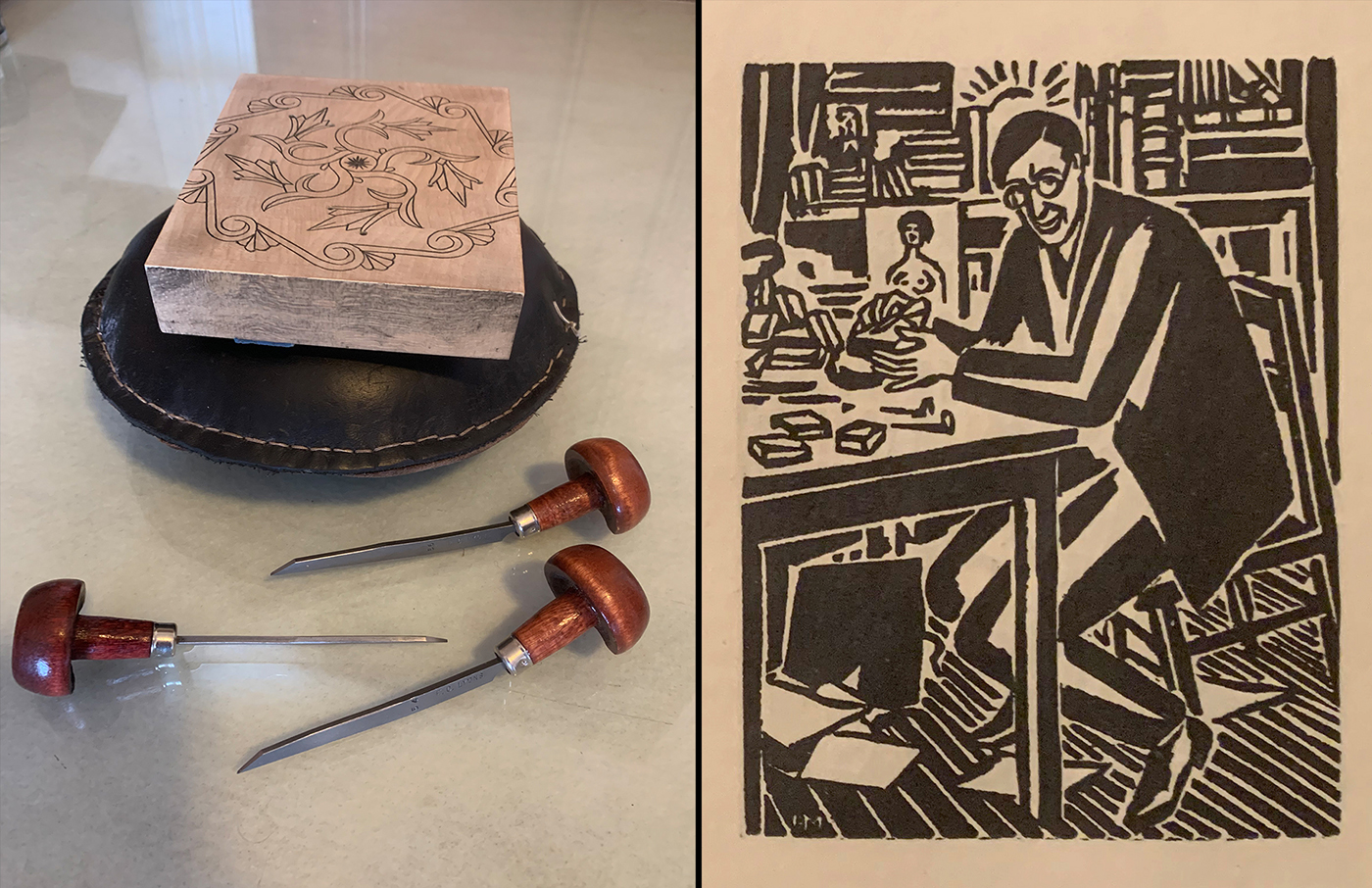
Above right is the Masereel frontispiece showing the artist at his work station. On the left is my set up for making a wood engraving: a maple block sitting on a leather (dried bean filled) pillow and three of my tools. Masereel’s work station appears to be very similar, especially in the size of his tools. (Note that the Masereel image is quite small. It measures 3 1/2″ x 2 11/16″ (8.9 cm x 6.8 cm).)
So I followed Desmet’s lead and presented Masereel as a wood engraver in my online talk.
This exchange opened up a dialogue with Desmet. So when I was preparing a subsequent online talk–this time on post-1950 wood engravings in my collection–I realized there were living wood engravers whom I admired and whom I could contact. Perhaps I could add a print of theirs. Naturally I thought of Anne Desmet. Scrolling through her extensive website (https://annedesmet.com), I was taken by her 2020 wood engraving “Wood Engraver’s Tower,” commissioned by the Manchester Metropolitan University Special Collections Library.
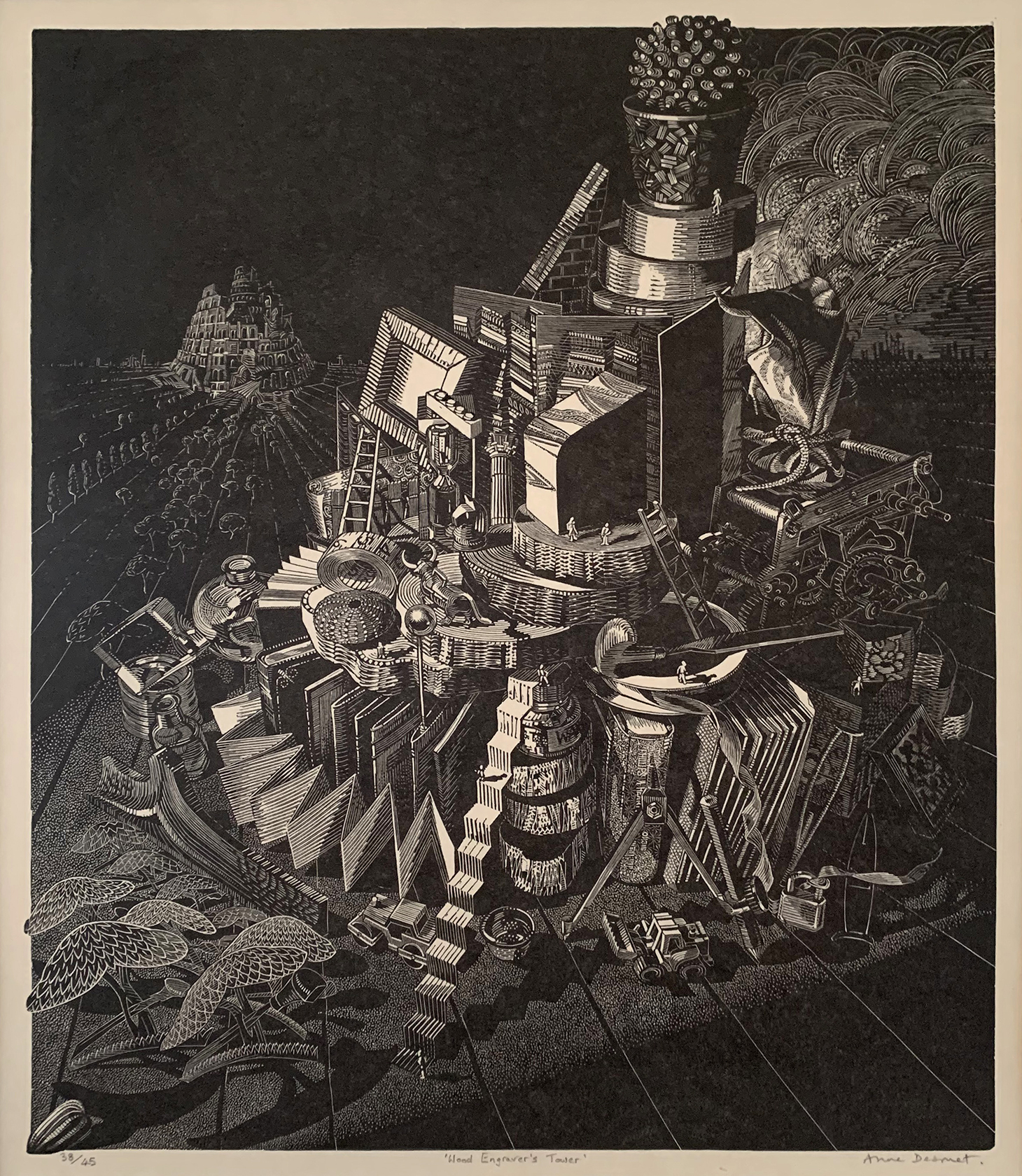
“Wood Engraver’s Tower,” ed. 45, Gampi Vellum paper, 11 3/4″ x 9 3/4″ (30 cm x 25cm)
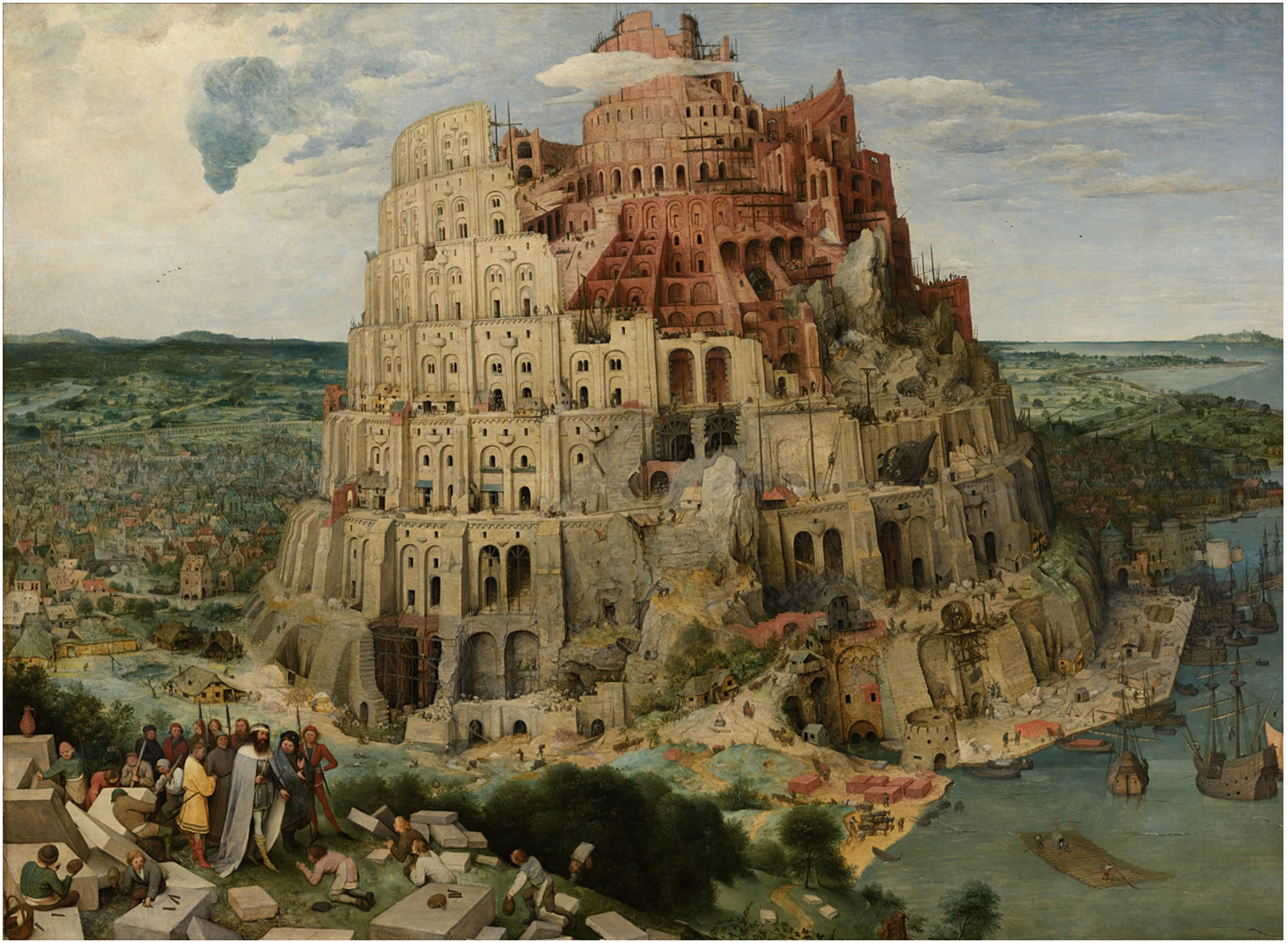
Pieter Bruegel the Elder, “The Tower of Babel,” 1563, oil on wood, 44.9″ x 61″ (114 cm x 155 cm)
I immediately loved the comparison with, in the distance, Pieter Bruegel the Elder’s 1563 painting “The Tower of Babel” at the Kunsthistorisches Museum Wien, and her own tower of many curious objects.
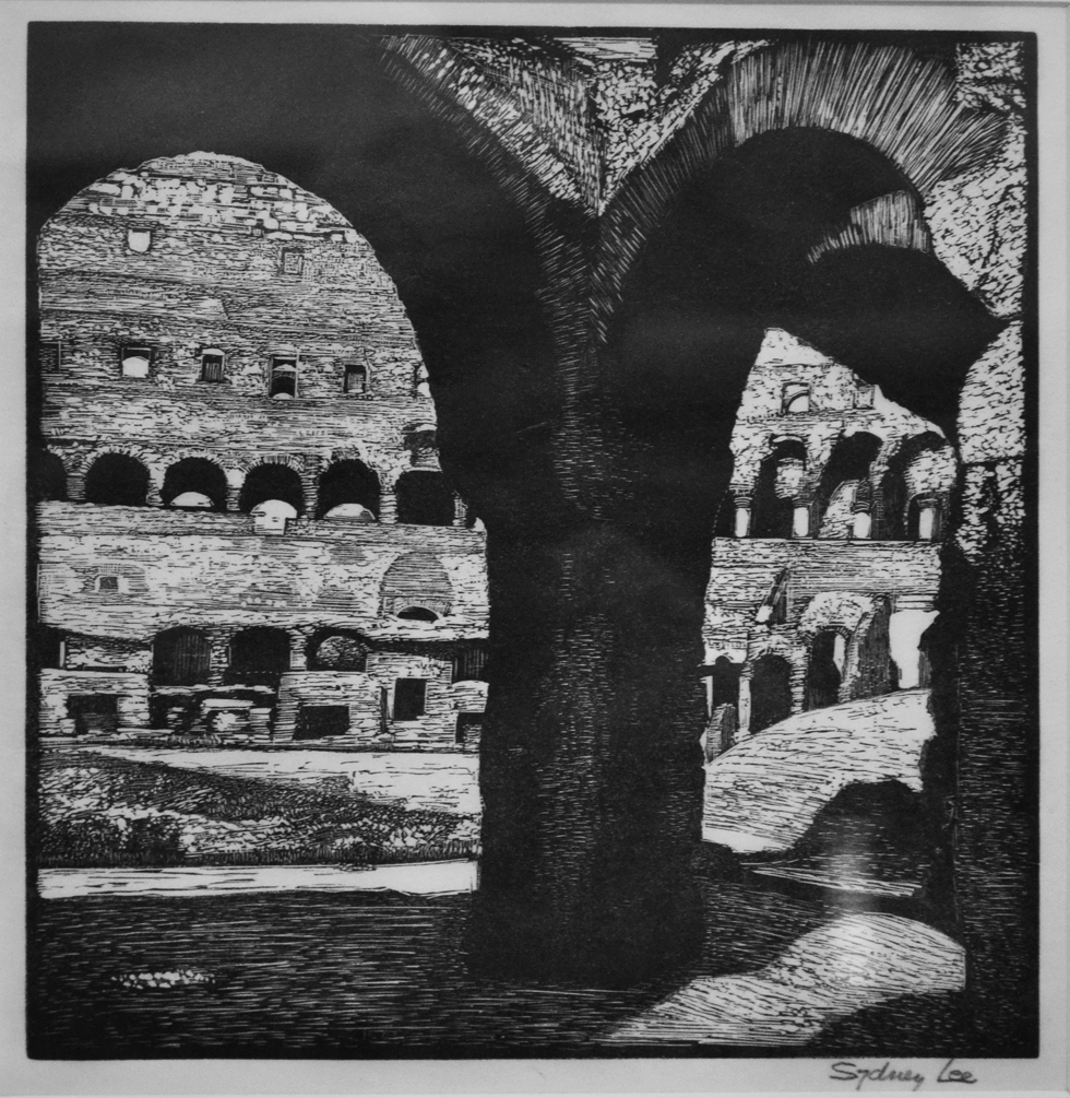
Sydney Lee, “The Colosseum of Rome,” c. 1926, 8 1/2″ x 8 1/4″ (21.6 cm x 21 cm)
So I boldly proposed a swap. In her “Scene through Wood” book she illustrated the page on the British artist Sydney Lee (1866-1949) with his 1926 wood engraving “The Colosseum of Rome.” I have been lucky enough to have been able to collect six Lee prints, four of them during visits to the UK in the mid 1980s. “The Colosseum” was one of them. (I made an ART I SEE blog post in 2012 on Lee prints. LINK) So I asked Desmet via email if she would be willing to swap a copy of “Wood Engraver’s Tower” for Lee’s “Colosseum.” Her response was an enthusiastic: “Wow! I’d love to do that, yes please!” So we did.
While the digital image of her “Wood Engraver’s Tower” created my desire to own a copy of the print, not until it arrived by post did I see it for the first time. I immediately realized there were many stories behind the components of her tower. Would she be willing to answer questions for a blog post? She readily agreed.
Still-life Tower
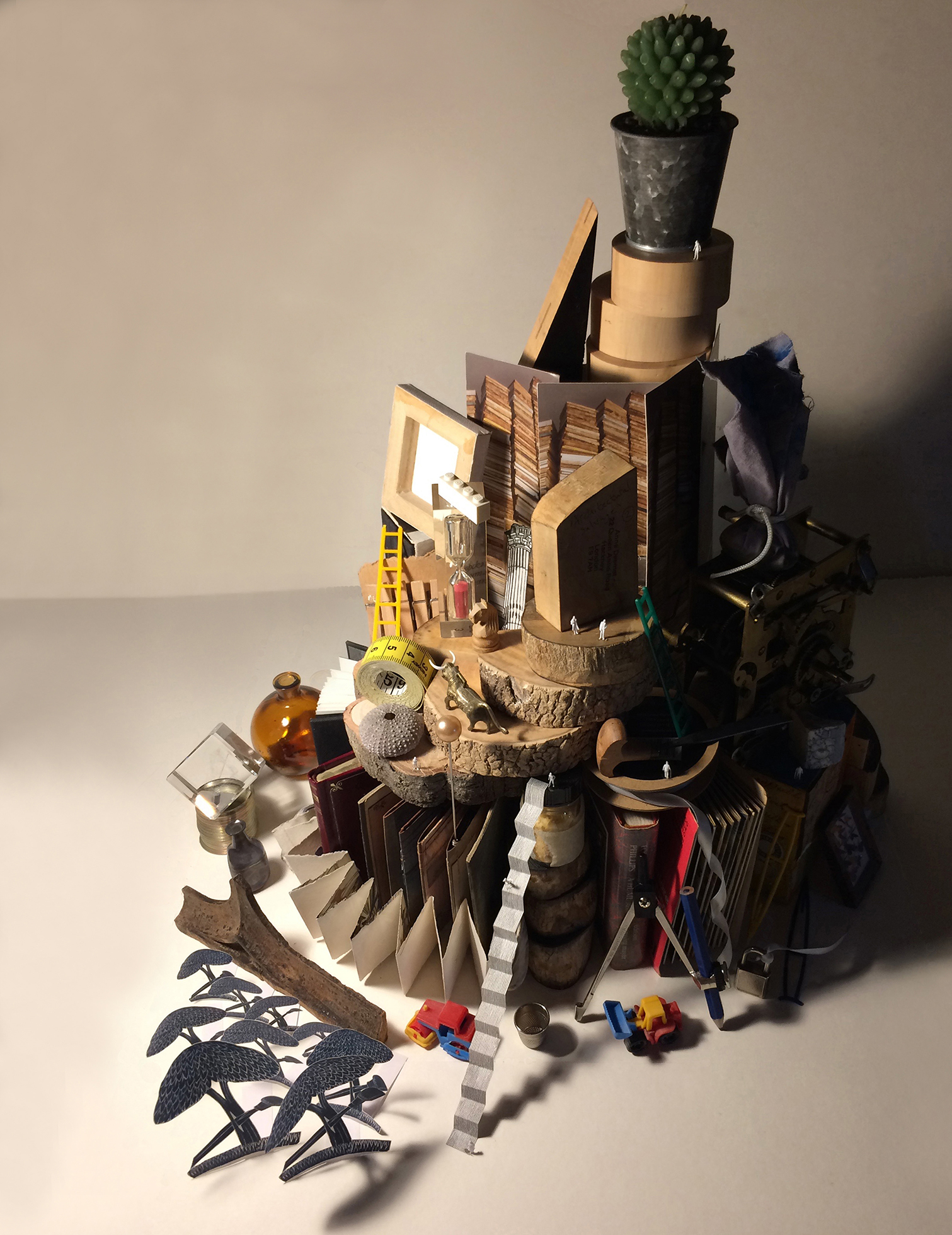
One of my initial requests for Desmet was for preliminary sketches. Her response:
There actually (unusually) aren’t any preliminary sketches for this piece because it was created entirely from a still life of objects which I assembled in my studio and then took many photographs in different arrangements of lighting until I got something that I could work from directly. There are one or two inventions that happened directly on the block–namely the “orchard” of tiny trees receding into the distance towards the mini Tower of Babel and the suggestions of buildings on the horizon line. Otherwise, everything in it was inspired directly by the still-life model I created and my photographs of it. I can certainly email you jpegs of some of those if you’d like to see them?
And she did!
The photos in this section are courtesy of Anne Desmet.
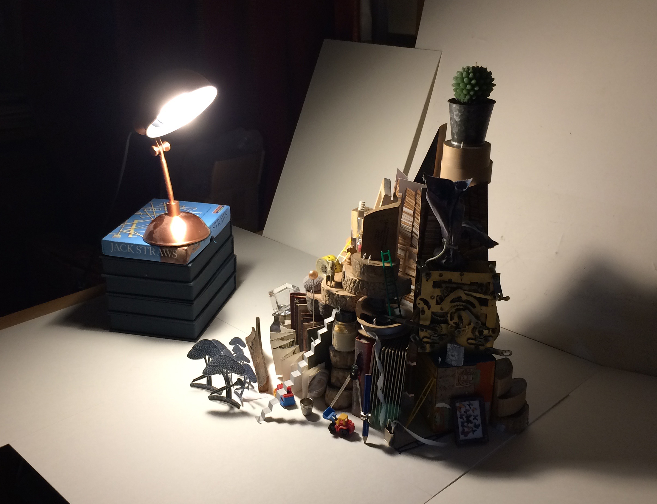
Desmet would work from black-and-white versions of these photos as color would be a distraction and hide the subtleties of texture she would need to cut into her block.
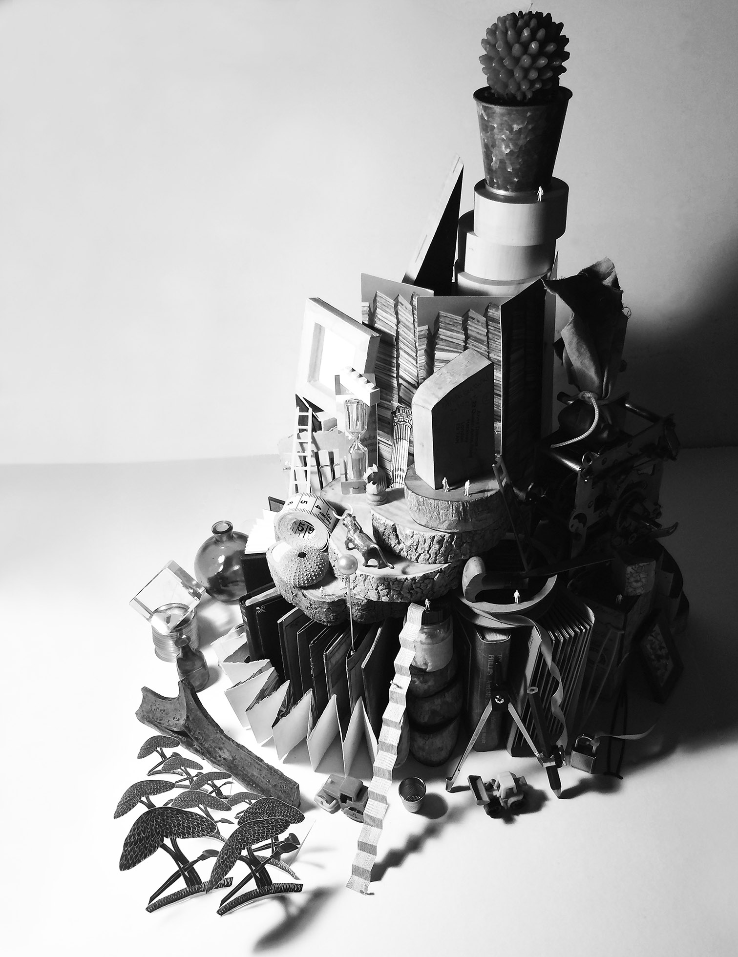
Since Desmet’s wood engraving would be in black and white, it would be a photo like the one above that she would use for outlining the various parts onto a sheet of tracing paper that in turn could be used to mark up her block.
Desmet also provided the history of the boxwood block that “Tower” would be engraved upon: “The block was given to the Society of Wood Engravers by the engraver George Tute. He bought it some 30 years ago from T N Lawrence & Son Ltd and donated it in 2019 to the SWE, which gave it to me by way of thanks for my curating the Ashmolean exhibition: Scene through Wood, a Century of Modern Wood Engraving. Then Peter Lawrence, former SWE Chair, informed me that Manchester Metropolitan University Special Collections Library intended to host an exhibition of items from the SWE Archive to celebrate the Society’s centenary and would be delighted if I would engrave this block with an image that could be used both as the poster for the exhibition and an ongoing emblem for the SWE Archive in the Special Collections Library.”
From the video
Desmet’s godson L.A. (Luke) Halstead created a 19-minute video “The Engraver” (LINK) that documents in 2019-20 Desmet making “Wood Engraver’s Tower.” Said Desmet in an email: “It records the whole process of the making of this print from the construction of the still-life model to the preparing of the wood to the drawing up the image and finally the engraving and printing of it with commentary by me about various aspects of it.”
I’ve transcribed parts of the dialogue and took screen shots from the video. All the quotes in this section are by Desmet.
Images in this section were used with permission of Luke Halstead, who shot and edited “The Engraver.” See www.lahalstead.com
Tower came about “to create an image that could be the poster child” for the intended (canceled by COVID lockdowns) exhibition to celebrate the centenary of UK’s Society of Wood Engravers and “to provide a kind of emblem for the archive of the society at Manchester”
“I wanted it to have something of the history of wood engraving and the technique of wood engraving and a bit of autobiography about me and my interest in wood engraving….
“The challenge that I set myself was to create a sort of Tower of Babel out of still-life objects in my studio. I don’t normally make still-life work at all. So I’m trying to choose items that have relevance to wood engraving but are also interesting surfaces that I could approach to the cutting in different ways that reflects that glass surface or foliage or wood, metal, cloth–the challenge is to render those convincingly in wood engraving.”
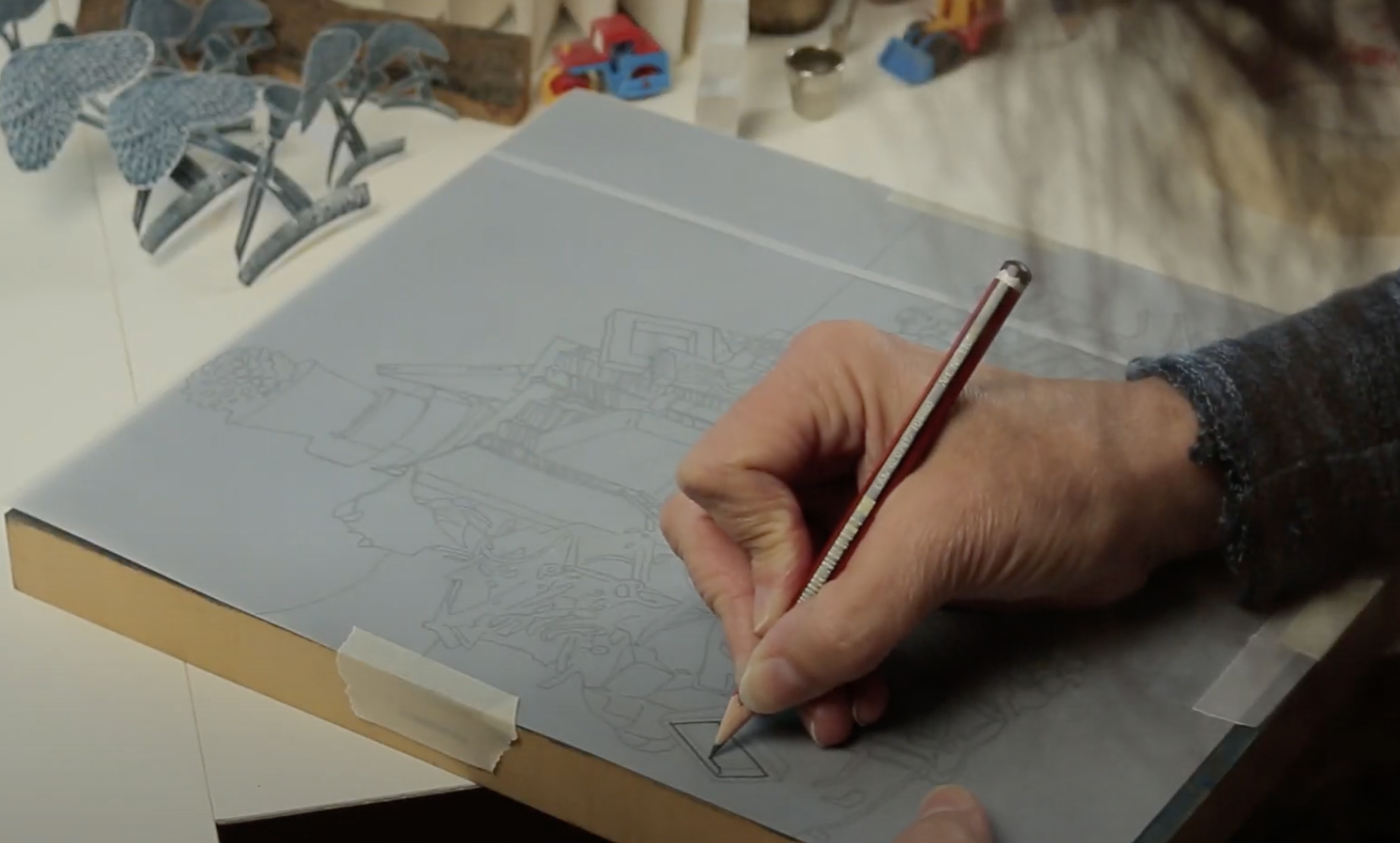
After Desmet traced the outlines of the Tower components onto tracing paper, she flipped the paper over and taped it to the block and then started penciling over the outline.
“So creating that model and then drawing from photographs from it is what I’ll be doing to embark on the engraving. Now that’s not a process that I normally would use. I normally would take an image from outdoors, you know, be it a building or a series of buildings or whatever and make sketches. But for this I’m constructing something that will be a bit trompe-l’oeil, a bit surreal, but will have a sense of a Babel Tower even though it will be made from all kinds of still-life objects. It is a bit of a challenge. It’s not something that I’ve approached before. It means I can sort of stage it and stage the lighting on it.”
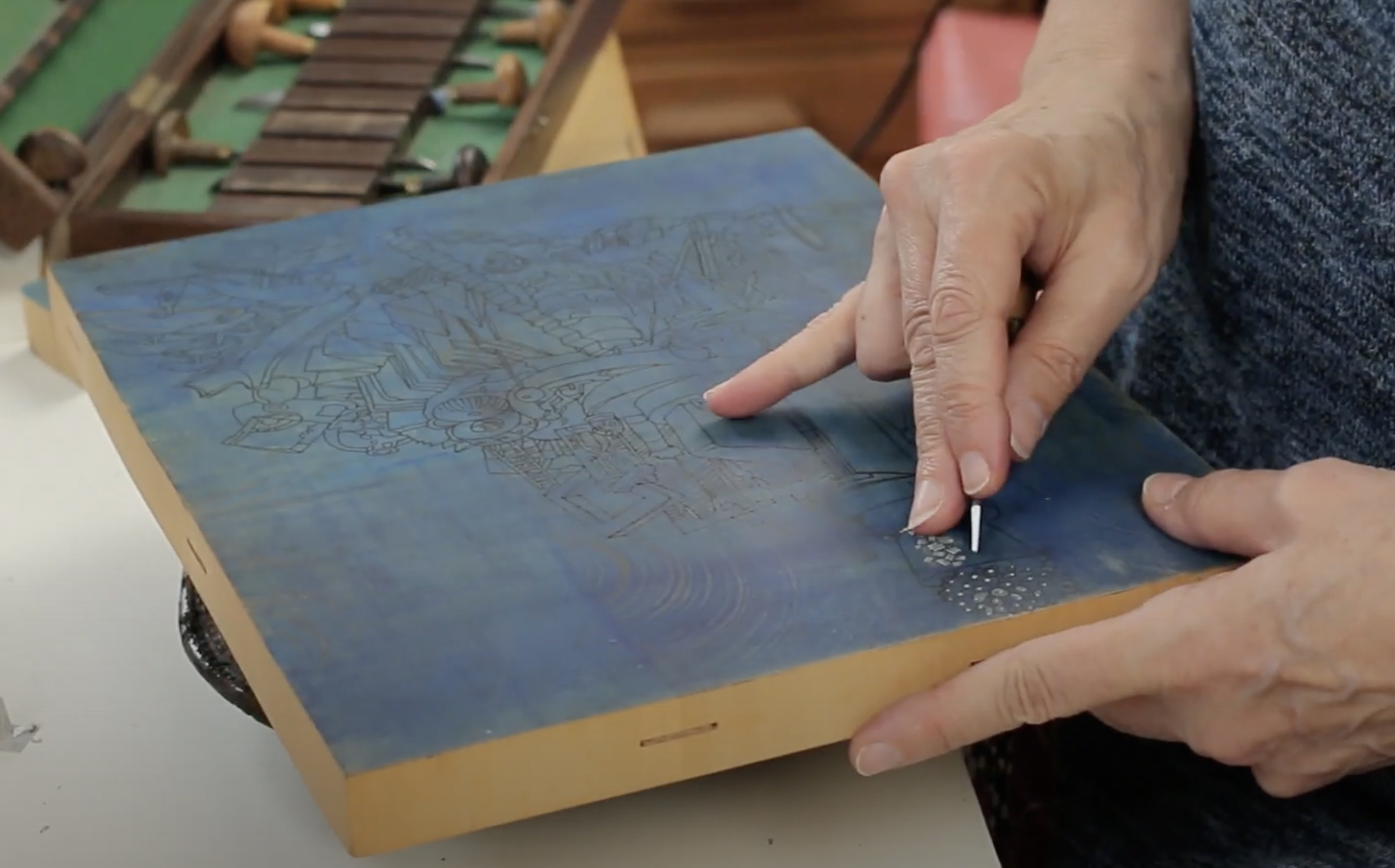
Desmet started cutting her “Tower” from the top. Her outlines are clearly seen on the boxwood block, which she had first darkened with ink.
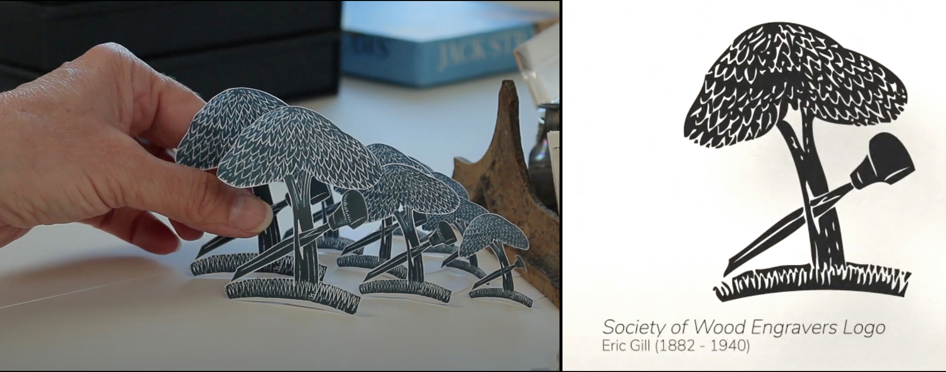
On the right is the logo that Eric Gill made for the Society of Wood Engravers. So Desmet made photocopies of his logo “to be like a little forest at the foot of my tower.”
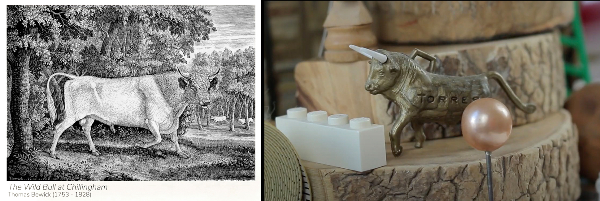
The Torres bull (from a Spanish wine bottle) was there to represent Thomas Bewick, the grandfather of wood engraving.
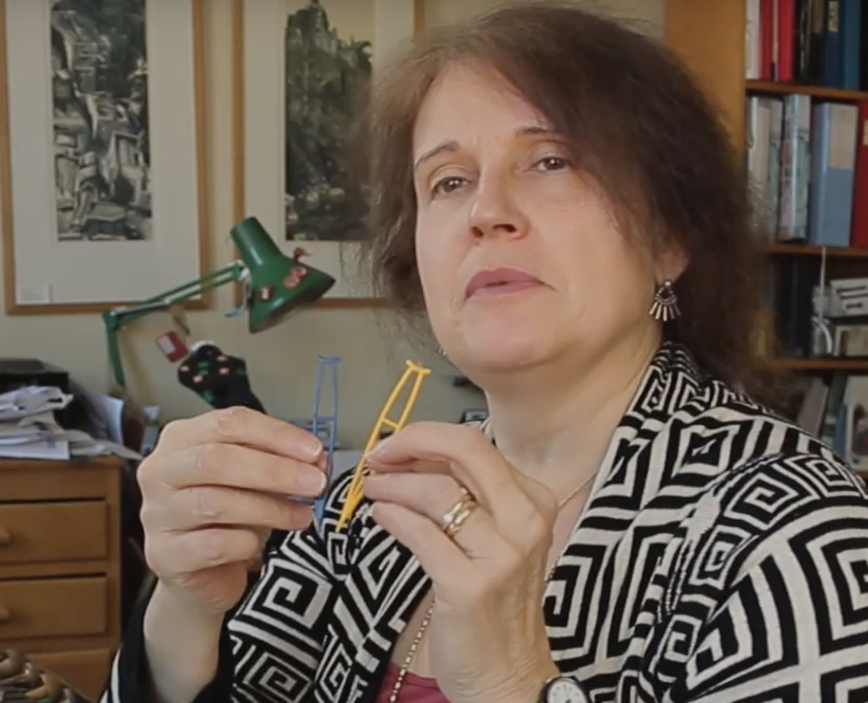
“The crutches are here as an autobiographic reference to my childhood. I was born with a disability of one of my legs and spent an awful lot of time having surgery for that in my childhood and lots of time learning to walk again and using these things. My time spent in hospital was the time that I learned to draw. I taught myself to draw, really, and my whole career as an engraver and an artist can really be traced back to that. But it was a way of staving off boredom in hospital and learning a skill, as it turned out, at the same time.”

The image on left is from the video, while I took the image on the right from Desmet’s wood engraving.
(Desmet will further mention her disability in a Q&A section to follow.)
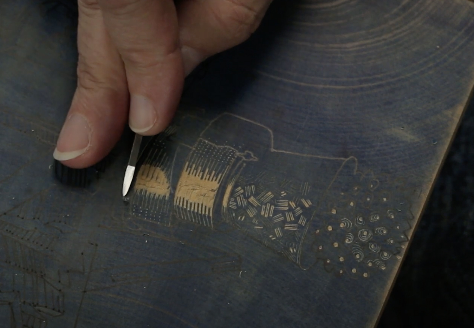
Desmet is shown cutting with a spitsticker, her favorite tool.
“I find that it’s really useful to have a strong, clear outline of an image when I’m engraving. I tend not to draw on the block the details and patterns of textures, just outlines. And then all of the light and darks of all the patterns, they happen kind of by intuition when I’m engraving.”
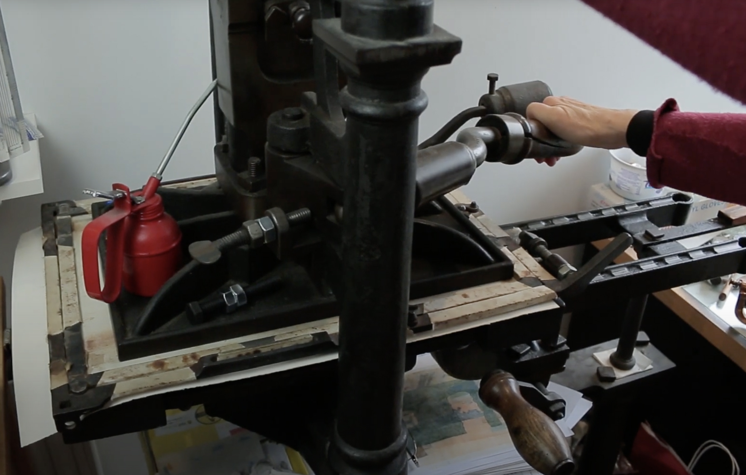
In the video Desmet is shown pulling a proof on her Albion press.
Creating her “Wood Engraver’s Tower,” Desmet said at the conclusion of the video, “has given me a lot of things to think about my work going forward. I think I might well start making more constructions here in my studio of kind of semi-architectural, semi-still-life things to make art work about. It could be the way to go.”
Q&A
After working from the video, I felt there were still some questions I needed to ask. Once again she kindly took the time to respond.
But my first question resulted from this statement of hers from the video: “A significant highlight early on, a career-changing event really, was that I got a scholarship to Rome in 1989-90 and had a wonderful experience living and working in Rome, and that’s where my interest in more architectural subjects arose.” Her scholarship was the British School at Rome Scholarship in Printmaking.
So my first question was about the influence of her year in Rome.
Q: Did the Colosseum in Rome somehow morph into your interest in the Tower of Babel? If so, why?
A. An early engraving of mine (from 1991) of Rome’s colosseum provided the building blocks for one of my earliest tower collages–one entitled “Leaning Tower” (also from 1991). Somehow stretching the colosseum into a tall structure seemed to enhance its already epic qualities and calls to mind Pisa’s famous leaning tower but also Brueghel’s famous paintings of “The Tower of Babel.”
Q: What was so fascinating about the Tower of Babel? Is “human folly” part of that fascination?
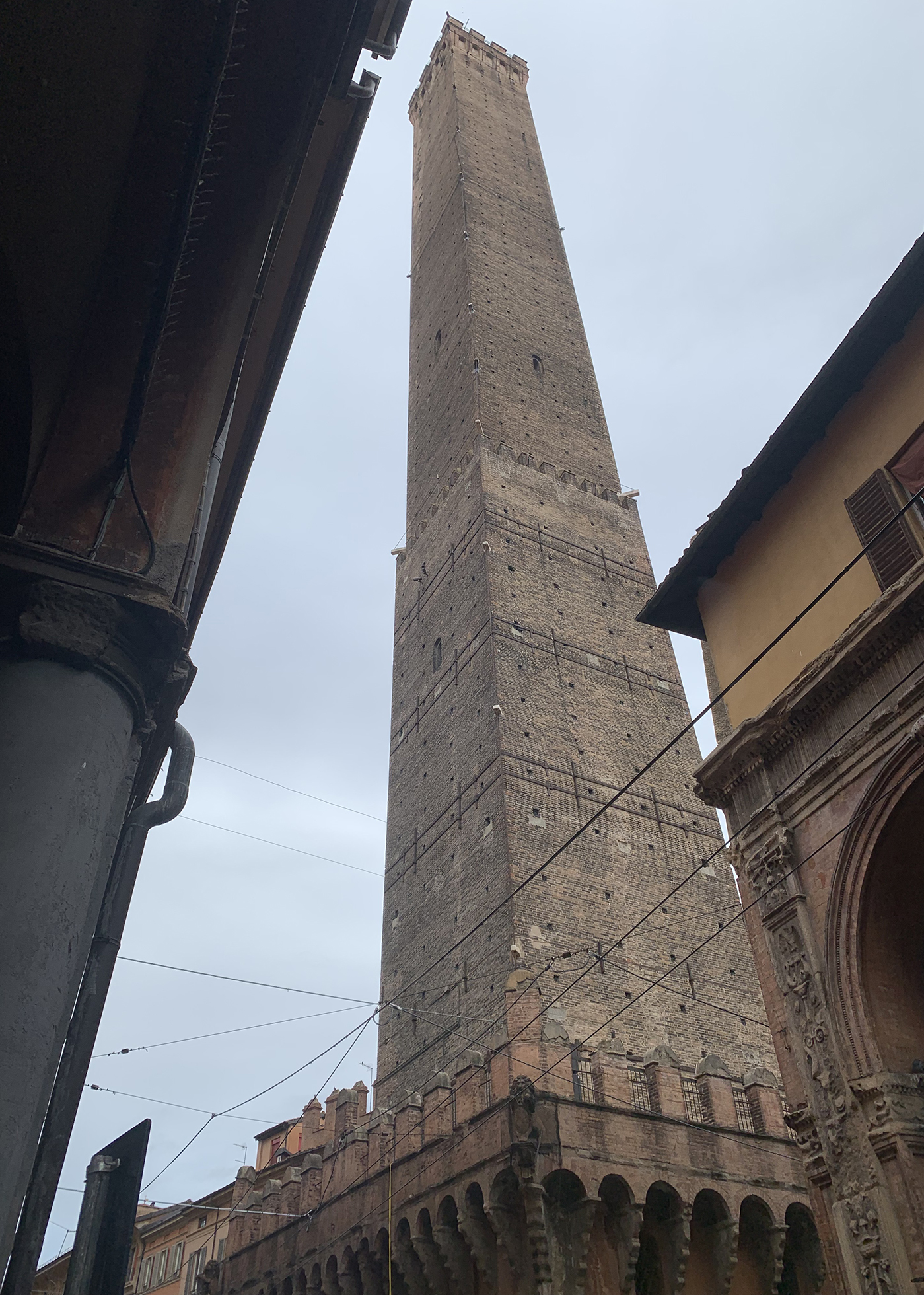
Torre degli Asinelli in Bologna was built 1109-19 and stands 97.5 meters high. (2022 Ponemone photo)
There’s something about those balances between aspiration and hubris, triumph and disaster, strength and weakness, that have always intrigued me and the myth of the Babel Tower seems to sum them up so perfectly and in visually glorious and epic ways. My first ever collage was made in 1990 and comprised torn strips of a self-portrait engraving (printed in black and orange variants) which I assembled as a sort of orange and black striped tower-like structure. I was already interested in the Tower of Babel–largely from a strong interest in historic depictions of it–but I became more interested in it during my year as a Printmaking Scholar at the British School at Rome (1989-90) when I had a travel grant to explore quite a lot of Italy. Towns such as San Gimignano and Bologna and Lucca, among many others, all feature medieval towers built by wealthy families as status symbols of their wealth and influence. Competing families would vie to create the tallest tower in the town with the result that, being on often unstable foundations, a fair few fell down and can be seen today as half-height semi-ruins. I feel that the same psychology exists today in, for instance, the banking industry and big business worldwide in which we see ever more enormous skyscrapers, each trying to outdo the others to be the very tallest, being built even now–with, it seems to me, the exact same motivations as those tower builders of earlier centuries. The Babel Tower seems still to be a perfect metaphor for all that ongoing human aspiration and hubris which is in some ways fantastic and in other ways tragic and depressing! There is also an ongoing idea of self-portraiture that runs through my tower collages–especially in the sense that they often reference towers, real or mythical, that stay upright against all odds and maybe with a significant lean or other damage. As a person with a significant physical disability (I was born with a dislocated hip which failed to respond to numerous surgeries and is still dislocated to this day) yet who continues to walk and be reasonably fit and active, I empathize with this idea of structures continuing to stand despite fairly overwhelming odds.
Q: Does your still life for “Tower” in any way make any reference to human efforts to reach a sublime achievement? Is there a moral to your “Wood Engraver’s Tower”?
A. The still life for “Wood Engraver’s Tower” was intended to reflect the history both of the technique of wood engraving–by referencing current and historic practitioners–and, yes, their often heroic efforts within their chosen medium. It also includes quite a few autobiographical references–such as the pair of tiny crutches. I am not sure that I would want to spell out any particular morals applying to any of my works as my own thoughts about them do change to an extent during the course of my creating them and also sometimes years later. Like my other Babel Tower images, this one is intended to conjure thoughts about human endeavour/aspiration/creativity/ingenuity/fragility though perhaps not so much hubris in this one. I am happy for it to be a sort of sounding board on which people can project and reflect some of their own experiences and ideas, which may well be very different to the thoughts I had in mind while I was making it.
Q: What has been the response, either critically in print or from fellow wood engravers?
A: The edition of this print is nearly sold out now, and so, yes, it does seem to have been well received by fellow wood engravers, museum curators, etc. It featured in my recent museum exhibition: “Anne Desmet–Kaleidoscope” at Pallant House Gallery in Chichester, UK, earlier this year. I personally think it is my greatest piece of wood engraving to date but others may have other views on that!
Q: In what way has making this print influenced what prints you made afterwords and how you went about doing so? More still-lifes?
Anne Desmet, “Land of Beacons,” wood engraving, 2022, 11.4″ x 7.5″ (29 cm x 19 cm) (Photo courtesy of the artist)
A: I have made another engraving still life subsequently, in 2022. Entitled “Land of Beacons,” it was inspired by the name of the Belgian chemist who invented the first modern plastic, Bakelite, c.100 years ago. He was Leo Baekeland and, according to him, the translation of his name was ‘Land of Beacons’. This engraving comprises a still-life tower–again taking the familiar Tower of Babel form–made from assorted waste-plastic bottles, toys and other bits and pieces I found lying around in my home. I set this tower within an imaginary landscape of melting ice caps so that the print could allude both to plastic pollution and to global warming. I had thought that “Wood Engraver’s Tower” would inspire me to make a whole series of still-life inspired compositions, of which “Land of Beacons” would have been the second of potentially many. But, in fact, I don’t think this particular print was as successful, visually, as its predecessor and I think I miss working from outdoor subjects as the artificial light on a still life, however dramatic, isn’t somehow as satisfying to me to engrave as the strong light of the sun casting a huge dramatic shadow on a wall. At the moment I am working on another Tower of Babel project but in this case, unusually, I am making a contemporary version of a section of Brueghel’s famous large Tower of Babel painting. I am engraving this section (a vertical slice through the composition) on several blocks which I intend to print as a group, one stacked on top of the other, so the effect will be of huge “bricks” creating their own idea of a tower but with the Bruegel composition linking each one.
Q: What’s the press shown in the video? Has it been used for your editions?
A: The press is a cast-iron Albion relief-printing press made in London in 1859. That makes it about 5 or 6 years older than my house and both are still providing excellent service! My husband (who is also a printmaker) and I bought the press in about 1993 and it’s been in our home-studio and is used for the printing of our wood engravings and linocuts ever since.
Q: Other than proofing, do you do your own editioning?
A: I nearly always do my own editioning except in three instances, all commissioned engravings, where the editions requested were for 250, 450 and 90 prints respectively–more than I’d enjoy printing. When I edition my own works, the editions tend not to be larger than 40 which is partly to do with how many of each print I think I can reasonably sell and also to do with the effort required to print them. As I get older and the printing part of the process gets physically more taxing, I am beginning to think that I should probably get more of my editioning done by someone else!
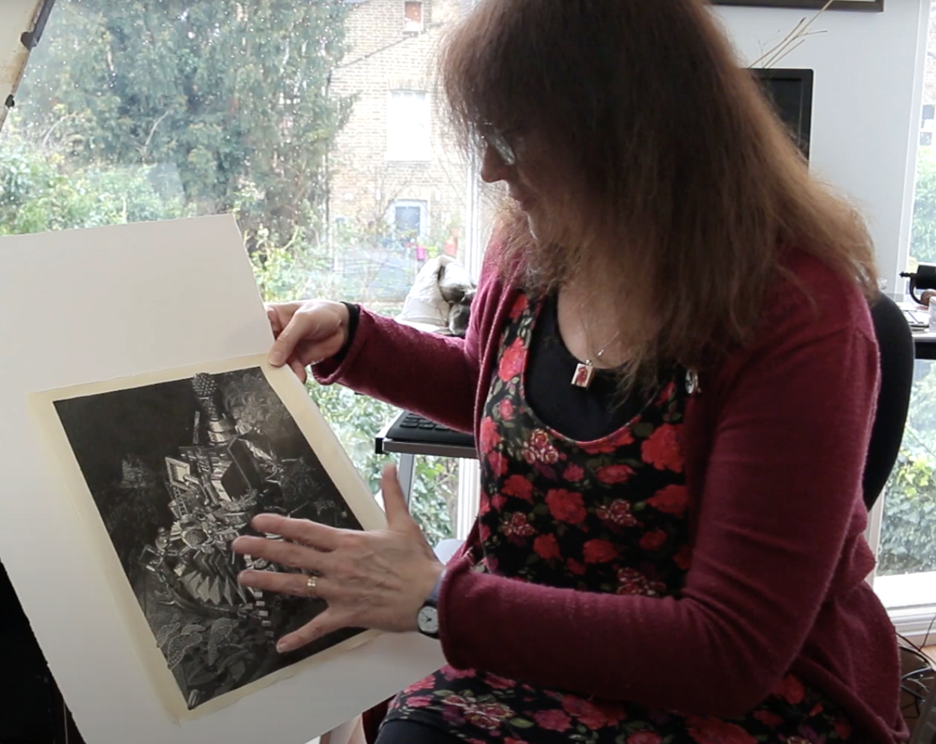
(She printed “Wood Engraver’s Tower” on 20-21 February, 2020.)
Key to the Tower
Anne Desmet also graciously provided a key to her “Wood Engraver’s Tower” and a document to explain all of the elements.
And after the document, I’ve placed another image of her finished wood engraving.
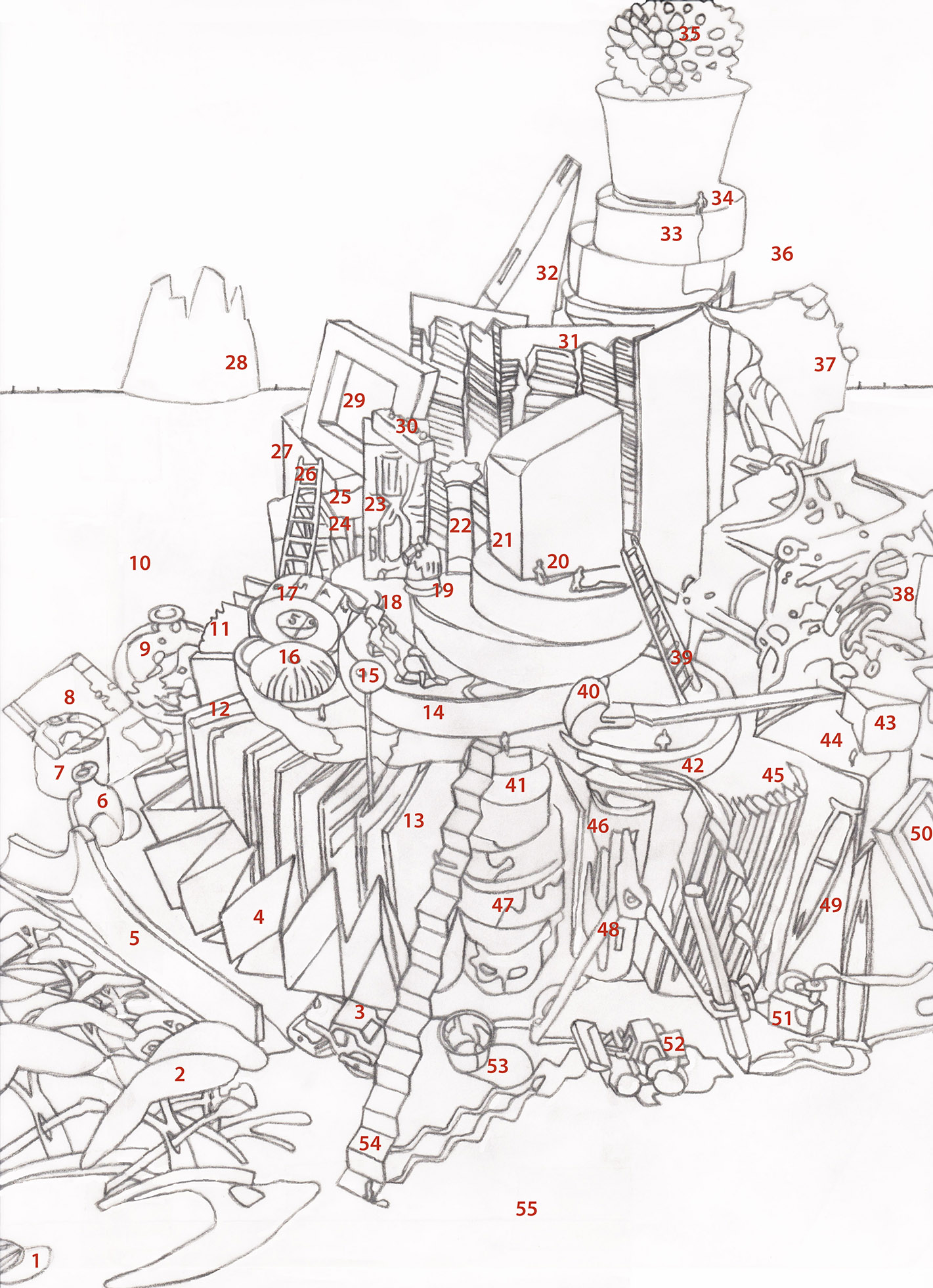
The numbers on this key appear to have been placed on top of the outlined drawing Desmet made of her still life, a drawing that she would reverse and trace unto her block.
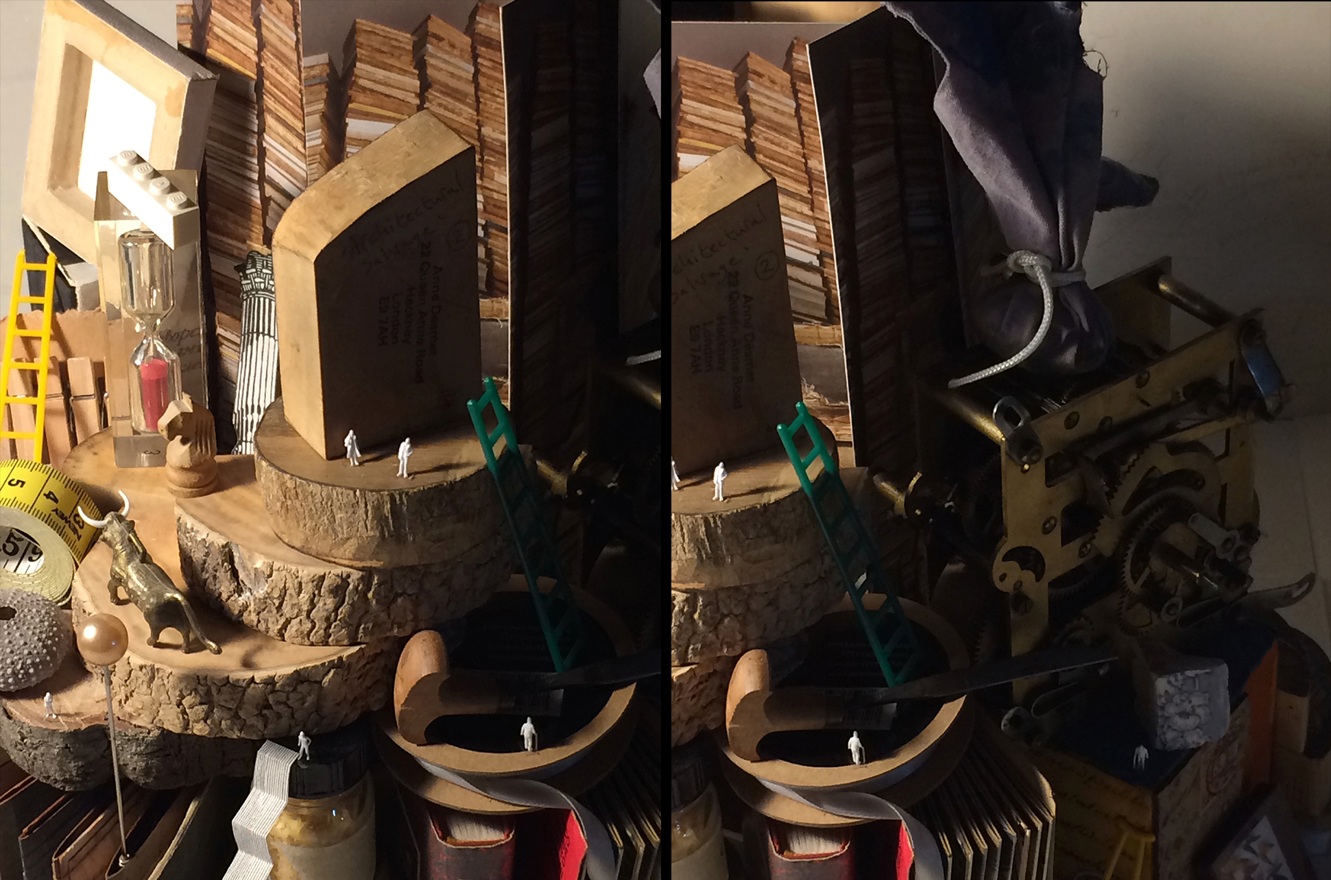
1 The image is designed to be read from the bottom-left-hand corner upwards, round, and back again. It begins with a sunflower seedcase to acknowledge George Tute and his spectacular sunflower engravings.
2 These paper-cut-out trees are derived from Eric Gill’s SWE logo of 1921 in the MMU collection. In creating the model for this engraving, I scanned the logo and printed it out at different sizes. I then cut out the trees to create a tiny copse.
3 The steamroller suggests the creation of a huge building. My husband and I have amassed a small collection of such toy vehicles over the years. This one has featured in other engravings of mine.
4 This tiny concertina-folded artist’s book is by Jean Lodge RE, my printmaking tutor when I was a student at the Ruskin School of Art, Oxford University (1983-86). This is the book’s unprinted side. Its inclusion refers to Jean and to my training as an artist.
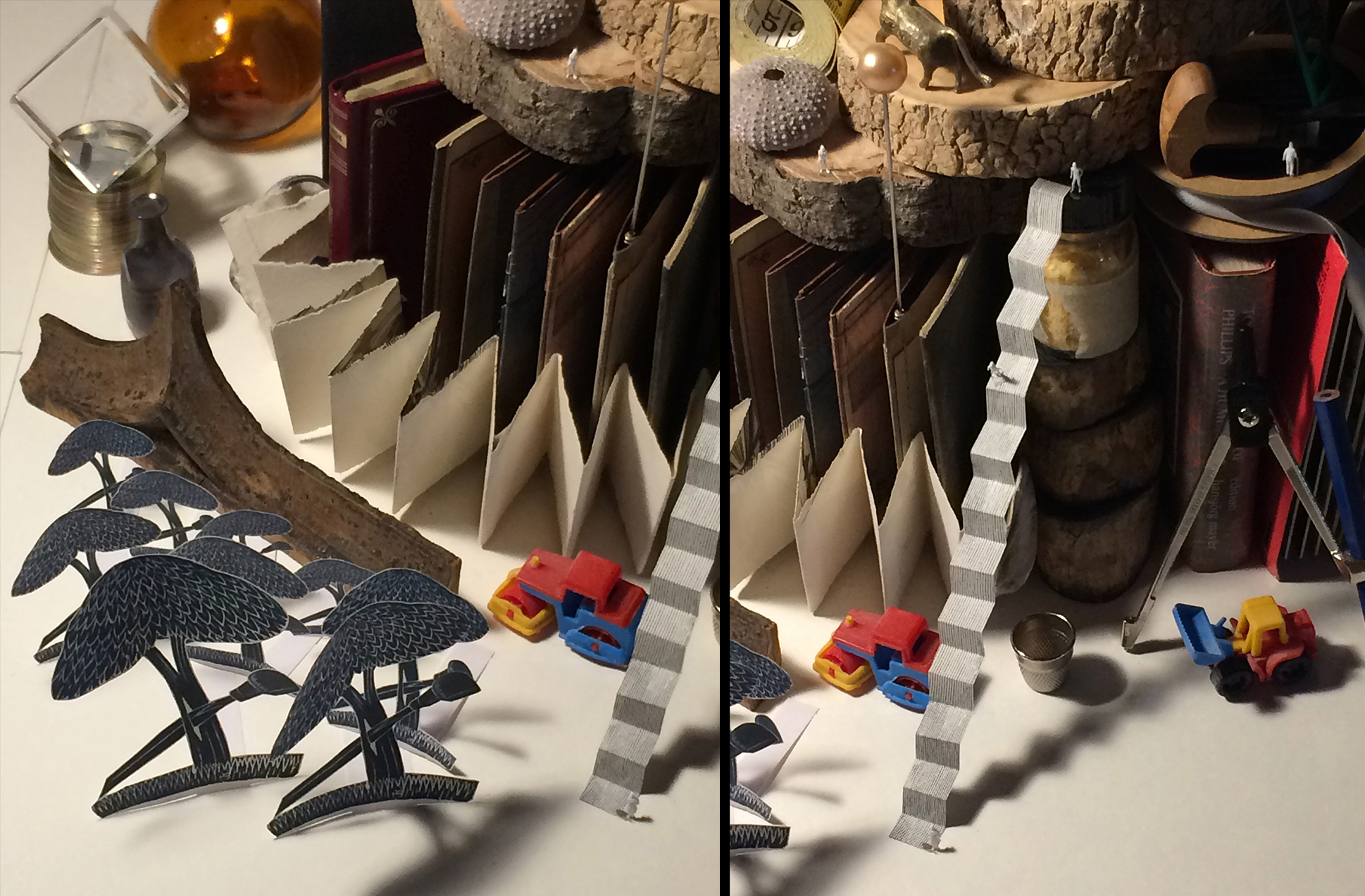
5 This fragment of tracery is from a window at St Luke’s Church in Liverpool city centre, which was bombed during WWII and now remains, roofless, as a war memorial. When I was a teenager, I rescued this piece of carved wood from the edge of a bonfire in the church grounds. It is included to symbolise my Liverpool upbringing and the wider subject of architecture, a predominant theme of my work for some 30 years. It also hints at the many historic churches featured in wood engravings over the centuries.
6 The tiny glass bottle (a reproduction of an ancient Roman one) alludes to the pull of the Grand Tour to artists over many generations. It hints at my Rome Scholarship in Printmaking, which saw me living and working in Rome in 1989-90. The bottle was a gift I made to my husband many years ago.
7 This miniature ’slinky’ toy may suggest coiled wire or an oil drum on a building site. It is a stocking-filler I gave to my husband (Roy Willingham–also an engraver) at Christmas a few years ago.
8 The ornamental glass cube is intended to recall the motifs and mathematical inspirations of Escher. It also connects to my mother as it belonged to her (she died, aged 91, in March 2020, just a few weeks after the engraving was finished). She was the first and always the greatest supporter of my work.
9 The round glass bottle also recalls Escher’s engravings of reflective surfaces and, more generally, to the joy of engraving objects of high contrast and wide tonal range.
10 The trees allude to my years of drawing in Italy with images of olive trees, pines and cypresses. They are designed to suggest a vast landscape or dramatic stage-set. The tree behind the glass cube reflects the form of the paper-cut trees in the foreground to create a link between the two groups.
11 This open book suggests a library as a repository of books.
12 This book too serves as a library reference. This particular book is of Vermeer’s paintings. It relates to my family history: my father was Flemish-Belgian. In the family home of my father’s cousins in Gistel, Belgium, I spent many happy holidays until the house was sold about ten years ago. That house had black-and-white tiled floors, old dark-wood furniture and a quality of light and age redolent of Dutch paintings of the Golden Age by Vermeer and De Hooch.
13 This concertina-folded book again aims to suggest a library and one of wood engraving’s many functions as book illustration, but also its use in the making of artists’ books and novels without words. It also relates to the four artist’s books of wood engravings I made, early in my career, which took a concertina format. The entire ‘foundations’ of the tower are made of books in order to suggest the key building blocks of any library.
14 Several planed but as-yet-unengraved boxwood and holly wood blocks are stacked up as elements of the tower. They represent the “stuff” of wood engraving. I hope they may also recall Tree Stump, one of many memorable engravings by Monica Poole. I have also attempted to replicate, on a tiny scale, some of the exuberant pattern-qualities in wood engravings by Gertrude Hermes, such as her One Person.
15 The hatpin with a bauble belonged to my mother. Here it suggests, perhaps, a streetlamp but also put me in mind of an engraving of an angler fish with its glowing “lamp” by Jim Westergard.
16 The sea urchin shell recalls Urchin by Paul Kershaw, an engraving I’m lucky enough to own. My own seashell was a souvenir of a wonderful family holiday to Cyprus in 1970, when I was six, on the scuba-diving boat of a Greek Cypriot, Andreas Cariolou. Not long before we met him (through my Uncle Francis, who was a keen scuba-diver and record-breaking glider pilot) Cariolou had discovered, in the bay of Kyrenia, the astonishingly well-preserved wreck of a 4th century BC Greek merchant ship, which can now be seen in the Ancient Shipwreck Museum in Kyrenia Castle.
17 The tape measure suggests the tiny scale of many engravings and gives a key to the real size of the elements in my tower. It is from my mother’s sewing box. She was an able seamstress and a distinguished neonatal surgeon in Liverpool. She prided herself on doing the most meticulous work before micro-surgery had been invented; this included the neatest sewing up of a patient after surgery. I am often asked whether there is a surgeon in my family because I have a steady hand for engraving. The answer is an emphatic “yes”!
18 The plastic bull is from a Spanish wine bottle. It is included to suggest Picasso and the whole modern art movement and also the famous Chillingham Bull engraving of Thomas Bewick.
19 The wooden chess piece (knight) relates to a comment by Peter Lawrence about how wood engraving is like chess because each “move” has to be carefully planned.
20 The miniature figures suggest that this is a vast tower, not an 18-inch model on my studio table. This is what wood engraving does best: Suggests a sweeping panorama in a span of just a few inches.
22 The Corinthian column is an engraving of an engraving. In the model, it is a detail cutout from a larger engraving of mine depicting the so-called Temple of Vesta in Rome. Like the tiny glass bottle, it aims to suggest the allure of the Grand Tour. It also hints at the peerless etchings of Rome by Piranesi.
23 The glass egg-timer recalls a recurrent motif in Madman’s Drum (1930), a novel in wood engravings by American artist Lynd Ward, a first edition of which was the first art purchase I ever made, in 1984. I taught myself to engrave, to a large extent, by studying Ward’s engravings in it. The egg-timer also suggests time passing and, by extension, the considerable time it often takes to engrave a block.
24 A row of clothes pegs suggests hanging up prints to dry in a studio, but also that this is a tower created by a woman as the pegs have an obvious domestic allusion.
25 A paper fragment printed with a Paisley pattern suggests the earliest use of endgrain blocks for the printing of repeat-pattern fabrics in India, particularly in Kashmir (where I spent a memorable six weeks in 1986).
26 The plastic ladder (from a game of Jack Straws) reinforces the idea of a building with many levels that could be explored.
27 This tiny cloth-bound slipcase contains three miniature books of Russian wood engravings. I was given it by Anatoly Kalashnikov, the great Russian wood engraver, when I had an exhibition at the Ex Libris Museum in Moscow (1995).
28 This Babel Tower is derived from Pieter Bruegel the Elder’s painting now in the Kunsthistorisches Museum, Vienna. It aims to reinforce the Babel qualities of the foreground tower and to give the composition a sense of spanning a vast landscape rather than a constricted interior. The city setting of Bruegel’s Babel is Antwerpen, in Belgium, and thus also relates to my family’s origins.
29 This tiny stretched canvas, viewed from the back, is included to suggest that this composition is not about painting but an entirely different art form: wood engraving. The unseen painting on the canvas’s front is of a “moomin,” painted some ten years ago by my daughter. Based on the Finnish storybook characters by Tove Jansson, which I have long-found inspiring, the moomin isn’t evident in the engraving but I like to know it’s there!
30 The Lego brick denotes generalised tower building but indicates that this is a small-scale model. It also refers to my son, once a passionate maker of Lego models, and my daughter who won her place at Cambridge having won a university competition to create a new language via the medium of Lego.
31 These bookmark-shaped postcards show images of stacked books. They are details of photographs of a Babel tower constructed from hardbacks by Tina Hill. The tower was her MA piece at the University of the West of England (2009). It was featured in Printmaking Today magazine for which I was editor (1998-2013). I included these cards of it because they relate both to the idea of a Babel tower and to a library.
32 I have created, on this triangular-shaped engraving block, a suggestion of an engraved brick wall to reinforce the idea of the still-life “tower” as a potential building. The brick-wall depicted refers to one of John Farleigh’s engravings in his illustrations to George Bernard Shaw’s The Adventures of The Black Girl in Her Search for God (1932).
33 These three boxwood roundels (without bark) were a gift from a student in one of many engraving classes I have taught at UK print workshops over many years. They are thus intended to suggest the continuation of wood engraving with new practitioners.
34 The tiny people are intended to give an illusionistic sense that the tower is of epic scale and that it could be climbed and explored. They are plastic figures intended for use in architects’ models.
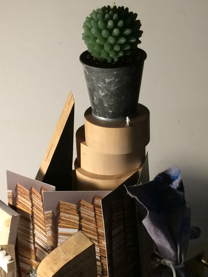
35 The geometric construction of this potted cactus, forming the finial at the tower’s apex, suggests the motifs and mathematical inspirations of Escher. The model is a cactus-shaped candle, a Christmas gift from my son to my husband.
36 The engraved sky was an afterthought. I had planned to keep the background black so that the foreground tower would loom out of darkness. However, I never have a completely fixed idea of how my engravings should look from the outset. I prefer to let the block ‘talk’ to me as I engrave. I came to feel that the sky needed an extra dimension and that the top corner of the block needed to be light. I began engraving random loops intending to create playful, stylised cloud forms. The cutting began to suggest the light and smoke of a fire or industrial chimney somewhere out of sight, which I liked. I intended these cloud/smoke forms to bring animation to offset the foreground’s stillness. Their tonal character aims to recall pre-20th century trade engravings for publications such as The Illustrated London News while, at the same time, being fully informed by the exuberantly fresh white-line engraving style of the 1920s.
37 The fabric “dolly,” tied with picture cord, is a recreation of an old-fashioned inking dabber for printing blocks prior to the invention of rollers. I made this some years ago to print a woodblock I was commissioned to create for the V&A. That was a facsimile of a Jack from a medieval set of playing cards. A video in the V&A’s Medieval and Renaissance Galleries shows me printing that block using this dabber. By extension, it is here intended to suggest historic relief printing practices.
38 The inside mechanism of a small clock suggests, like the egg timer, the passage of time but also the levels of intricacy–like the cogs and wheels of a clock–of wood engraving. This clock mechanism also relates to my wood engraved collages, for some of which I use convex clock glass to create three-dimensional illusionistic effects. I have collaged onto the faces of some actual Napoleon-hat clocks and this is the mechanism from one of those.
39 Ladders and staircases relate to my earlier engravings and collages in which they often feature.
40 The wood engraving tool refers to the technique of engraving. This is a multiple tool–with several teeth for cutting parallel sets of marks. It is a tool closely associated with the history of trade engraving but has been used to great effect by artists since–notably Iain Macnab and Clare Leighton. It is not a tool I use often though there are multiple-tool marks in this particular engraving.
41 This tiny lidded glass bottle contains granules of a special wax which can be used to fill small dents and depressions in an engraving block to render the surface smooth again.
42 This is a cardboard spool of silver-grey silk ribbon. When I was elected a Royal Academician in 2011, I was given my engraved, silver, RA medal hung on a length of ribbed silk. From time to time, I hang it, instead, on a length of thinner ribbon from this spool because its original ribbon is designed to be worn over a man’s shirt collar rather than on a bare neck. This spool therefore refers to my election as a Royal Academician. I am only the third wood engraver ever elected to the RA.
43 This fragment of blue pottery was found by my husband in our London garden. It refers to where I live, to my use of such fragments in collages, and also its flower motif reflects a perennially popular engraving subject.
44 This wooden cube is a collaged artwork by artist and cartoonist Ken Mahood. The collage incorporates fragments of letters and postcards and found paper ephemera and, as such, relates to the fact that the Special Collections Library is a repository for the SWE Archive containing letters and other hand-written ephemera.
45 This concertina-folded book is of Giotto’s paintings in the Basilica of San Francesco in Assisi. I bought it when I first visited Assisi in 1989-90. Giotto has long been one of many early Italian Renaissance influences on my work and on Western artists generally. Within the composition, the content of this and other books is intentionally not specified. The choice of books was important to me but compositionally they aim to suggest generic library books and the idea of a Babel (or babble) Tower built of words.
46 This book is a version of Tom Phillips RA’s A Humument.
47 These are small boxwood roundels ready for engraving.
48 The compass and pencil refer to the careful measured drawing which wood engraving often involves.
49 This pair of tiny crutches (from a game of Jack Straws) refers to my life experience of becoming interested in drawing via many childhood years spent in hospital having repeated operations on an abnormal hip. There are incidences of other engravers suffering from polio (Monica Poole and Peter Reddick), terrible war injuries (Blair Hughes-Stanton and Iain Macnab) and lengthy periods of illness (Paul Nash and Tirzah Garwood), the direction and nature of whose work may have been formed and changed by those difficulties. The crutches are intended to suggest those many artists whose work has been affected and informed by such challenges.
50 This is a tiny picture from my daughter’s old dolls’ house. It recalls 19th century butterfly collections (a suitable pastime for a woman in an era when wood engraving was not, generally, a career open to them). It also recalls a natural-world subject popular with engravers and may bring to mind Damien Hirst’s butterflies and, by extension, the YBA art movement–artists of which are of my generation but whose work and motivations sometimes feel worlds away from the art that moves me, hence the butterflies are shown in semi-obscurity.
51 The metal padlock and coiled ribbon recall the fabulous lock engravings of Edwina Ellis.
52 The digger truck suggests the construction of a huge building. It is a small plastic toy which has featured in several of my engravings to date.
53 The thimble might be read as a bucket, which you’d always find on a building site. It is shown at actual size which also indicates the real scale of the objects in the still-life tower.
54 The paper staircase with tiny figures aims to recall scenes on a vast unsupported stairway between heaven and earth in my favourite film–Powell and Pressburger’s: A Matter of Life and Death (1946), starring David Niven, in which the action moves from colour (earth) to black and white (heaven). The “heaven” scenes convey panoramic vistas within the limited rectangular screen, just as engraving can do on a tiny block.
55 The foreground is laid out like a stage with planking receding towards a distant vanishing point centred on the background Babel Tower. This composition recalls a SWE founder: Edward Gordon Craig, whose engravings were mainly set designs. He had a facility for suggesting epic vistas within a few inches of woodblock. The use of receding linear perspective also aims to recall the left panel of Paolo Uccello’s Battle of San Romano (c.1435-60) in London’s National Gallery, a work I admire, and the woodcuts of contemporary Japanese artist Nana Shiomi which also employ a stage-set composition.
###

Trackback URL: https://www.scottponemone.com/anne-desmet-personal-tower-of-babel/trackback/
Leave a Reply
-
Accessions: Short Stories Dec 21, 2025

-
The Mike and Scott Show: No Reruns Nov 25, 2025

-
Griffin Chairs: Both naive and refined Oct 04, 2025

-
Circularity: The Pairing of Two Talents Jul 12, 2025

-
Frans Masereel: Workers’ Paradise in 1939 Europe Apr 11, 2025

-
Erich Glas: Through the Night vs. Leilot/Nights Jan 15, 2025

-
Gustav Wolf: His Monster Menagerie Dec 23, 2024

-
Linos: #5 through 15 Nov 01, 2024

-
Gustav Wolf: Confessio Aug 02, 2024

-
Justin Remo’s Big Finale May 21, 2024

-
Accessions: Short Stories Dec 21, 2025
-
The Mike and Scott Show: No Reruns Nov 25, 2025
-
Griffin Chairs: Both naive and refined Oct 04, 2025
-
Circularity: The Pairing of Two Talents Jul 12, 2025
-
Frans Masereel: Workers’ Paradise in 1939 Europe Apr 11, 2025
-
Erich Glas: Through the Night vs. Leilot/Nights Jan 15, 2025
-
Gustav Wolf: His Monster Menagerie Dec 23, 2024
-
Linos: #5 through 15 Nov 01, 2024
-
Gustav Wolf: Confessio Aug 02, 2024
-
Justin Remo’s Big Finale May 21, 2024