STEFAN BERG: Buddy Bolden in Black & White
INTRODUCTION
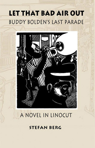
If it wasn’t for my Art I See post on George Walker, the Canadian creator of wordless novel Book of Hours (http://www.scottponemone.com/george-walker-wordless-novelist/), I would have never gotten to know the precocious work of fellow Canadian Stefan Berg. At the tail of my email interview with Walker, I asked him if he had any protégés, anyone he had helped get their own wordless novel published. He offered up four names and provided their email addresses. Three responded to my emails, and their answers appeared at the end of my Walker post. Stefan as one of them. A few weeks after my posting on Walker, I yielded to my curiosity and went online to purchase the wordless novels of the three who answered questions about Walker. All were excellent first efforts, but Stefan’s Let That Bad Air Out: Buddy Bolden’s Last Parade (The Porcupine’s Quill; Erin, Ontario; 2007) stood out.
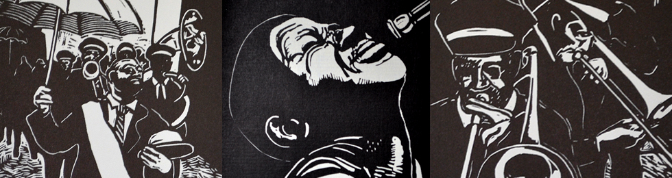
Instead of a depicting a series of events of months’ or years’ duration, he chose a single event, limited in time and location. But the grabber was not so much the storytelling, it was the visuals. Berg displayed a brilliant sense of black and white. When your narrative is carried solely by your imagery, making a powerful presentation in black and white is a serious attribute. Berg’s medium is linoleum cuts. His often stark cutting reminds me of the early work of the Flemish artist Frans Masereel. (A good discussion on Masereel can be found at: http://cambridgebookreview.com/tag/frans-masereel/ ) I turns out Berg lists Masereel as a major influence.
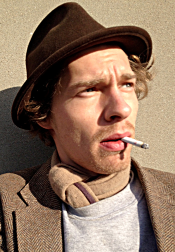
◁ Photo of Stefan Berg
Here’s a synopsis of Bolden as provided by Berg: “Charles ‘Buddy’ Bolden was born around 1876 in New Orleans. Very little is known of him. Bolden’s music was never recorded, and there is only one existing photograph. Yet he is considered to be the first bandleader to play the improvised music that has since become known as Jazz. … What we know for sure of Bolden is that, while playing in Henry Allen’s Brass Band during the Labor Day parade of 1906, his career came to a tragic end. A burst blood vessel in his neck, brought on by a life of hard living and hard playing, resulted in mental instability which caused him to be institutionalized for the remainder of his life. He died in 1931.”
In short, just like the title says, Berg’s Bolden depicts Buddy’s last parade. I immediately wondered if there was a copy of Bolden printed from the 70 original linoleum blocks. So I asked the author although I strongly suspected the answer was no. So I wasn’t surprised when he said: “I was 21 when I printed the Bolden series. … I was never trained in printmaking, and being young, inexperienced, and poor I regretfully did not produce an entire fine art edition box set, or hand-bound book like George.” (Bolden was published shortly before Berg received a BFA from OCAD University, Toronto–formerly the Ontario College of Art and Design.)
In another email he explained what he did have regarding original prints form Bolden: “Originally I printed 26 of the 70 blocks from my novel as a fine art edition for the purpose of exhibitions. I later printed three more blocks ( #1, #51, and the final image of a skull ) to strengthen the narrative, as told in 29 blocks. (Note : these three prints are on different paper.) I can provide you with the set of 29 prints, (black ink on manufactured Japanese paper, impression 4×5 inches ) each matted, 8×10 inches.”
In yet another email, he said: “I don’t have all of my blocks from Bolden because after printing the edition, I continued to carve into some. I also cut some up into small excepts of a block, and a few I exhibited as relief carvings–sculpture in there own right. I still have almost all the blocks, but they are altered from the original state. I did, however, destroy a few failures.”
Not wanting a stack of matted prints, I then asked him if he had a proof set that would fit into a box. Fortunately he did, and the linen box they fit in. So I purchased his one and only proof set.
During our back-and-forth emails, Stefan sent me jpgs of some of his working drawings for Bolden. At that point I realized that he might be willing to do an email interview for an Art I See post. As you see, he agreed.
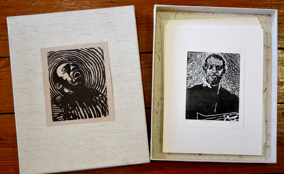
The boxed set of Stefan Berg’s uddy Bolden set of 29 proofs. Berg kindly included a matted linoleum cut of the book’s cover image. It was from his fine art edition of 10 prints. (This and all following images–except the Glenn Gould image and Berg’s sketches for Bolden–are photos by Scott Ponemone.)
INTERVIEW
What got you interested in making relief prints?
Relief printmaking is a fantastic combination of drawing and sculpting. I came across the work of Leonard Baskin while working in the library at University.
What prints and printmakers inspired you?
Baskin’s etchings and wood engravings, portraits of his favourite artists such as Corot, Géricault, Eakins, these are my favorite prints, along with Frans Masereel’s wordless novels Passionate Journey and The City. And everything I have seen in print by Antonio Frasconi, Hopper, and Morandi.
[Wordless novels by Masereel were often first printed in Paris or Geneva with a French title, in Munich with a German title, perhaps in a U.S. edition in English. And one title was not necessarily a translation of the others. For instance the book Berg refers to a Passionate Journey was first called Mon Livre d’Hueres in French, Mein Studenbuch in German, My Book of Hours and Passionate Journey in English. The titling for The City was consistent, however. It began as La Ville, then Die Stadt, before becoming The City. For a complete Masereel bibliography see Masereel, by Roger Avermaete, Rizzoli, New York, 1977.]
I imagine this all began while you were an undergraduate. Where was that?
I attended OCAD U. It was there where I met George. I was never a student of his, but we befriended each other, and since he has been a valuable mentor.
What part if any did George Walker play in your development as a printmaker, as a wordless novel maker?
George is the visual editor of a wordless novel series published by The Porcupine’s Quill press. It was George who suggested I create a series of cuts and showed me Masereel’s Passionate Journey. I liked the ambiguous way this novel suggested to me a narrative by free association. It’s relationship to the silent film, montage cinema, animation and collage gave it an instantaneous nostalgia. We spoke of the potential of contemporary wordless narrative. George guided me through my project on Bolden, advising every step of the way, how to challenge the form and make it my own. He didn’t want a follower, he wanted to share his interests. With a lot of encouragement form George, I managed to cut approximately 85 blocks in four months, then we talked about publishing.
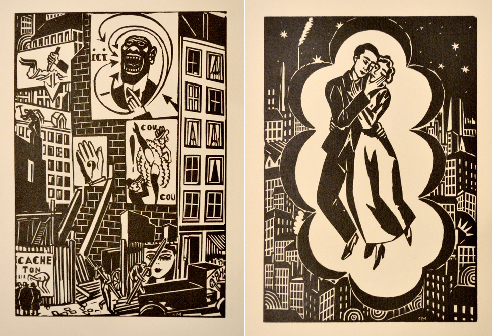
Two images from Masereel’s La Ville, Editions Albert Morancé, Paris, 1925.
What wordless novelists inspired you and why?
Masereel’s Passionate Journey and The City were both major influences. The narrative is less prescribed or obvious than say comic books, which literally describe one’s movement or progression of time. With Masereel a week could pass in one flip of the page, or a year or a country. This element of the passage of time interested me. His cutting style was another major inspiration. The matter-of-fact direct graphic image stood out against others. It’s directness is what makes the story flow. You get the information so quickly you don’t feel you need to slow down. It’s rendered into a motion picture in a sense–I mean–the most sophisticated of flip books.
Graphic novels were already hot when you were working on Bolden. Why didn’t you go that route, i.e. with dialogue balloons and pen & ink drawings scanned into the computer?
George’s mandate (and therefore The Porcupine’s Quill’s) is a demand for relief. I didn’t object to this because I love carving blocks. One can achieve an aesthetic one could not in any other means. Revealing your whites, working in reverse, flipping the image … your working backwards the whole time. This may seem tedious to most artist’s but I found the time element, the space for contemplation, and revision very valuable.
Furthermore, the reason for choosing relief printmaking to illustrate my story is not only to pay homage to the artists who started the tradition of the wordless novel but also to help revive interest and appreciation of the rich qualities of line and texture available with relief printmaking, an aesthetic digital art cannot duplicate.
Why did you choose linoleum cuts over relief prints on wood?
The physicality of the woodblock carving immediately captured my attention as an art formed by hand, like sculpting or painting. But wood has grain and can really get in the way of a fluid cut, while lino is cheap and uniform. I had little experience with either and opted for the more accessible medium. I had lino readily available to me; both of my parents are designers. I cut most of my images on free linoleum floor samples.
How did you work out your sequence of images.?
Drawing. I drew day and night, from life and photography, and consistently altered my narrative until it fit.
Did you do a story board?
I would pin my drawings to my bed room wall, and slowly I created a full scale, interchangeable story board and reordered them nearly every day. I would cut and paste my drawings, layering foregrounds, mid-grounds and backgrounds using a photocopier to reduce and enlarge the scale. Transferring the drawings onto the blocks, the carving process created space for a second revision of each image.
What was your process in working out any particular image?
I overlaid images using tracing paper. I cut and paste images via collage, photocopies….
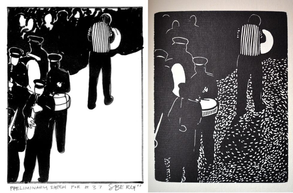
While Stefan didn’t provide me with images of his Bolden story board, he did send me four sketches. This helped me see how Stefan worked out his presentation of black and white. Note how the street, white in the sketches, became activated with small white marks swimming in a sea of black in the finished linoleum cuts. The sketch (Above, left) appears to be the working image that resulted in the lino on the right, which is labeled “AP #13” from the proof set he sold me. This image appears on page 23 of his book. (Below) The sketch on the left resulted in the image on the right that appears on page 71 in the book.

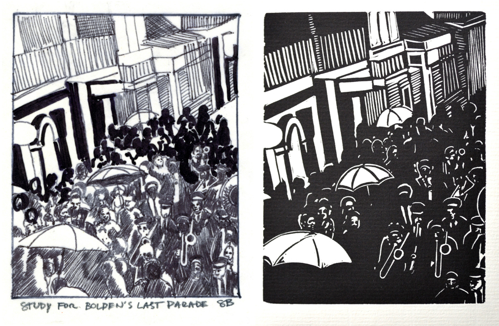
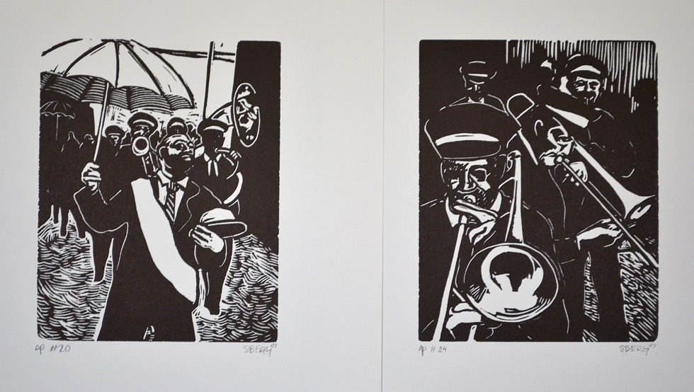
(Above) the sketch “for #59” ended up looking like the print on page 115 in the book. (Below) The study on the left became the image on page 33 in the book. Here the jumble of marchers and onlookers became a unified wedge punctuated be three umbrellas and the caps and brass of the band members.
How did you transfer that image to the linoleum or did you draw directly and/or improvise on the linoleum?
I silk screened my drawings onto the block, however during the cutting process I made a lot of alterations.
How did you come up with your choice of subject matter?
I was turned onto the Bolden story after reading Coming Through Slaughter by Michael Ondaatje.
What was your connection to jazz and New Orleans?
I grew up listening to jazz, Oscar Peterson, Miles Davis, Monk. … The New Orleans influence was the band The Happy Pals. I “came to age” around the Happy Pals, who have been playing at Grossman’s Tavern in Toronto for 45 years. They are a institution in our city. In my opinion they are as close as one could get to the sound of New Orleans, living in Canada.
One of the things that stands out about your Bolden book was its very narrow timeline and location? How did that come about?
Instead of adapting the prose-poem-historical-fiction by Ondaatje or creating a bio pic of the Bolden legend, I foresaw a wider view of the culture of the parade in New Orleans. Because there is such a strong relationship to wordless novels and silent films, I inevitably foresaw creating my own 16-mm montage of a historic parade which of course I could only dream of for there was no existing footage. There is no surviving recordings of Bolden, and only one photograph. So there was a lot of space to imagine.
What source material did you use?
I did research in order to get a real feel for the environment; I took out books on the history of New Orleans; I also made a point of listening to the music–Kid Thomas, King Oliver–and internalized the sound. At the time I was going to Grossman’s, to hear the Happy Pals–to church if you will–and drew the band in performance. This was in fact the greatest resource. Film footage from the late 1950s of the Eureka Brass Band marching on Claiborne Avenue gave me a sense of how my story would look on the page.
How much did you improvise from it?
I freehand drew everything, but I certainly used “stock” material to help visualize the environment, the crowds, even Bolden, his posture. His face at times takes a different form, that’s because I was using so much material as aid. In a sense the whole project was a massive collage of existing images, repurposing them through the medium of drawing, relief carving.
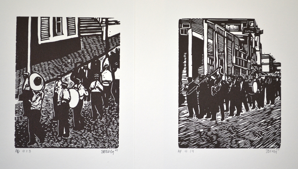
Here begins a series of prints from the set of Bolden proofs I purchased from Stefan. They are shown in the order that they appear in the book.
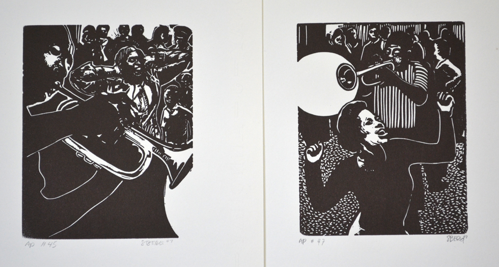
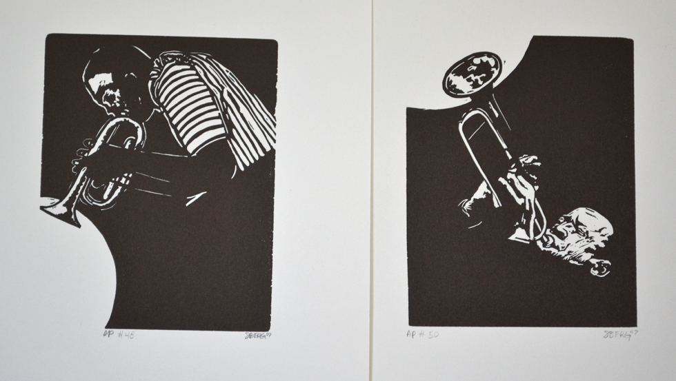
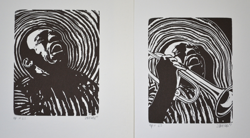
I love the white circle you use to illustrate the sound of Buddy’s playing (see AP # 48 and AP #50 above). How did you arrive at that?
I think of white as noise in contrast to black silence. I was looking for a way to express the sound of Bolden’s cornet, as distinct from others. I think my mom told me to do it.
When during the process of creating your Bolden work that you knew it was going to be published?
The possibility was on the table from the beginning; however, there were no guarantees. I created the entire book as essentially a manuscript, at which point the PQ considered it. It wasn’t a commission of any sort, it was a leap of faith.
What part did Walker play in producing, editing and publishing Bolden?
George and I met a few times in the process of creating the suite, regarding narrative and composition. He told me to think about the process as if I were shooting and editing a film, to try to do things wordless novelists would not have done or be able to do (for instance an aerial view would have been potentially inconceivable for an artist of the early 1900s to imagine).
What was the critical response to Bolden the book?
It was a hit. The book sold out! The book launch at David Mirvish (a high-end art book store in Toronto) was packed. I had the Happy Pals (New Orleans band) parade throughout the neighborhood into the store. Bolden made the Toronto Star with a full-page, double-spread article and two large images, plus one on the cover page. The original prints have been exhibited nationally and internationally.
The Drabinsky Gallery [Yorkville, Ontario] showed my artist prints from the book the following year [2008] in an exhibition curated by Tek Yang. In 2010 Graphic Novels In the Purest Sense was exhibited at the Edwards Art Gallery [of the Holderness School in Plymouth, NH], followed by The Art of The Wordless Graphic Novel, curated by David A. Berona at the AVA Gallery and Art Center [Lebanon, NH], featuring the Bolden suite along side works by George Walker and Frans Masereel. Bolden received press in Uppercase Magazine, Calgary, and Art New England, Boston. I gave an artist talk at OCAD University, and I attended the Toronto Comic Arts Festival for the following four years.
Did it make you into a celebrity, and in what circles were your celebrated?
In a sense, for 15 minutes I was celebrated. I didn’t tour the book around the world or anything like that. I moved to Berlin and focused on painting prolonged portraits akin to Lucian Freud.
What happened after Bolden buzz wore off?
George has encouraged me to create a second novel, of which I have attempted many times in the past eight years.
Did Bolden put pressure on you to produce more wordless novels?
Yes, but I’m a very driven individual with a uncompromising creative streak. I decided I would learn how to paint from life, and this was exactly what I did. I abandoned the wordless novel for years. But now I’m ready for a new project, and I’m glad I waited. I had a lot of ideas come and go, and in a mature way I have distilled and consolidated the potential for a second novel. It only took eight years.
Did you attempt any before now?
Following Bolden I attempted to write my own story. I also tried collaborating as well. I attempted a series of wordless short stories. And two individual full-length narratives. I created a number of short wordless narratives, but nothing stuck, until now.
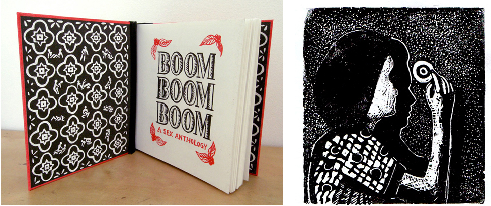
Inside cover of Marta Chudolinska’s book Boom Boom Boom and (right) Berg’s print to illustrate Bee Sting in that book. (Images courtesy of the artist)
What was the subject matter of your attempted wordless short stories?
The first was a story of voyeurism, inspired by Hitchcock’s Rear Window, and Jacques Tati’s Play Time. The working title was called Boom Boom Boom. This title was later used for a collection of short erotica that was published by Marta Chudolinska. My second story, somewhat inspired by Catullus, was called Bee String, and appeared in this publication (images above).
The first full-length attempt was a narrative inspired by The Unknown Masterpiece by Balzac, made into a film by Jacques Rivette called La Belle Noiseuse. I am a painter, and I had an intense relationship with one of my models. I was working through the loss of this relationship by doing such a story. The working title of this was Moments of Perception.
The second was not really an interpretation, more like a response to the life and work of Jack Chambers.
Why do you think none of them panned out?
I’m still tinkering with them. This applies to my current Glenn Gould project. The last thing I wanted to do was create an adaptation. I was challenged to use the wordless narrative in a new way, and these attempts were visual tests. I think they have all helped in building an understanding, I just didn’t find them suitable to print.
Tell me about your new project for a second wordless novel.
I am responding to the event of Gould’s interpretation of Bach’s Goldberg Variations of 1955, the making of it at his cottage on Lake Simco.
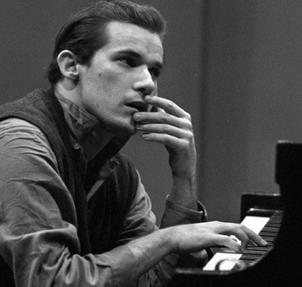
The 1955 photo of Gould by Dun Hunstein is courtesy of Sony Music Entertainment.<
What is the story line?
Gould spent a solitary period at his family cottage; this is the scene in a sense. But I am more or less drawn to focus on my own sense of place as subject, and I interpret sound in white and silence in black. I can’t say more for it would spoil what is exciting to me about the project.
What drew you to this story?
I grew up on the same hill as Gould. My experience of the Canadian landscape is interlocked with my sensations from Gould’s recordings. Perhaps it is because I grew up listening to his music or intuitively relate solitude and snow with Gould.
Will it also be in lino?
Yes. I am experimenting with using a stippling gun and Dremel, and so the softness of lino will help.
Where are you in this project? (Any images of drawings to share? Story board?)
I’ve drawn out some images. But I plan on working at my cottage. I intend to do the whole project in isolation in a self imposed “residency.” There will be no story board intentionally. It’s a personal response; the narrative is conceptual or inherent.
Tell me more about your “residency.”
Throughout the summer I will go to my cottage to cut. I will cut without drawing; however, I have a good sense of the images already in my head so I wouldn’t say it’s free style. Then there is the option of printing in Brussels at the Masereel residency [Frans Masereel Centrum in Belgium].
What are the publishing prospects for a limited and/or trade editions?
I am designing this project as a fine art book, hand bound, high end; and I will try to mass publish with the PQ. You never know what will happen, and I personally don’t like to have that sort of stuff in my head while I begin something new. My focus is on a quality fine-art-book. This book is part one of a larger project, an exhibition which includes a collaborative sound piece, sculptures, video and paintings.
Is George Walker in any way involved in this new project?
Well, I’m meeting him to discuss his involvement.
Why are there no Gould images to share at this time?
As I mentioned previously, my Gould project is sight specific: a conceptual response taking place within the parameters set by a residency this spring. So there is no preliminary imagery. The project is intentionally improvised, intuitive, responsive.
Also I’m a little reluctant to say too much for I have had many book ideas and half finished manuscripts come and go. Now finally arriving at something I feel confident about, I’d like to pass the halfway point of no abandonment.
Berg did later offer: “I will stay in touch and show you the development of my Gould project.” I then asked if he would keep a journal during his Gould residency. He replied:
I am writing my Gould ideas frantically as they come, on scraps of paper and the back of reference photos, things that jog my memory. This will be a great impetuous to keep them together, I will keep a Gould journal!

Trackback URL: https://www.scottponemone.com/stefan-berg-buddy-bolden-in-black-white/trackback/
One comment on “STEFAN BERG: Buddy Bolden in Black & White”
Leave a Reply
-
Accessions: Short Stories Dec 21, 2025

-
The Mike and Scott Show: No Reruns Nov 25, 2025

-
Griffin Chairs: Both naive and refined Oct 04, 2025

-
Circularity: The Pairing of Two Talents Jul 12, 2025

-
Frans Masereel: Workers’ Paradise in 1939 Europe Apr 11, 2025

-
Erich Glas: Through the Night vs. Leilot/Nights Jan 15, 2025

-
Gustav Wolf: His Monster Menagerie Dec 23, 2024

-
Linos: #5 through 15 Nov 01, 2024

-
Gustav Wolf: Confessio Aug 02, 2024

-
Justin Remo’s Big Finale May 21, 2024

-
Accessions: Short Stories Dec 21, 2025
-
The Mike and Scott Show: No Reruns Nov 25, 2025
-
Griffin Chairs: Both naive and refined Oct 04, 2025
-
Circularity: The Pairing of Two Talents Jul 12, 2025
-
Frans Masereel: Workers’ Paradise in 1939 Europe Apr 11, 2025
-
Erich Glas: Through the Night vs. Leilot/Nights Jan 15, 2025
-
Gustav Wolf: His Monster Menagerie Dec 23, 2024
-
Linos: #5 through 15 Nov 01, 2024
-
Gustav Wolf: Confessio Aug 02, 2024
-
Justin Remo’s Big Finale May 21, 2024
Pingback: Walker & Berg: Updates on Wordless Novelists |