Arieh Allweil: The Book of Amos: Part 1
introduction
This ART I SEE blog post focuses on The Book of Amos by Jewish artist Arieh Allweil (1901-1967), who first published it in 1940 while living in Palestine (also known as Eretz Israel before Israeli independence in 1948). The book was a remarkable achievement because Allweil not only cut 34 linocuts to created the book’s full-page images, he also used the linocut technique to create much of the Hebrew text. Moreover he printed, cut and bound the pages himself. This herculean effort, while notable, would not have been sufficient had his illustrations not exhibited tremendous energy and imagination.
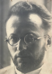
Arieh Allweil, 1930 (Photo courtesy of Ruth Sperling and Nava Rosenfeld.)
If his Amos had been an isolated accomplishment, Allweil would deserve lasting renown. But Amos was part of a huge creative outpouring. Between 1939 and 1944 Allweil illustrated and published five other books: From a Tour of the Land (1939), Anonymous Jew (1939), The Scroll of Ruth (1939, revised 1943/44), The Scroll of Esther (1942) and The Scroll of Lamentations (1943). Then beginning in the late 1940s he produced illustrated editions of the Passover Haggadah.
I introduced Arieh Allweil’s remarkable story in a blog post on August 14, 2020. (LINK) It details his 1901 birth to a metal worker’s family in Galicia (then part of the Austro-Hungarian Empire), his artistic education in Vienna and activities with the avant-garde Kunstschau group, his membership and leadership in Hashomer Hatzair (the Zionist youth movement), and his residency in the Bitanya Ilit kibbutz, which he helped found in 1920.
My initial Allweil post also noted his efforts to design his own Hebrew font for his books. I quoted Max Brod in his essay in the book Allweil (Sinai Publishing, Tel Aviv, 1955) that Allweil “has devoted much time to a new styling of the Hebrew letter; and here as well he continues the old tradition of our Haggadah writers and woodcut masters, in whose fine and ever fresh shapes our letters found their source of their inspiration.”
The first post would have have not been possible without the generosity and assistance of Ruth Sperling, Professor of Genetics at the Hebrew University of Jerusalem, and Nava Rosenfeld, a retired architect–both daughters of the artist. Nor could I have written it without the help and writings by two eminent scholars: Galia Bar Or and Galia Gavish. Bar Or curated the exhibition Arieh Allweil: Letters, Figures, Landscapes at the Mishkan Museum of Art at Ein Harod and wrote the accompanying catalogue. Gavish is an artist and curator who has written two books on the artist: Arieh Allweil: Prints & Calligraphy and Arieh Allweil: From Bitania to Vienna and Back . (Bar Or’s book is available in English online: LINK)
The images from The Book of Amos are presented courtesy of the Estate of Arieh Allweil.

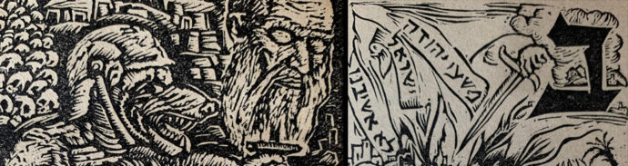
Two-page spread from Allweil’s “The Book of Amos”
The intent
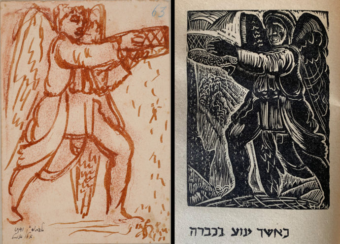
When an Israeli book dealer sent images from The Book of Amos, the linocuts immediately won me over. The wonderful thing about relief prints is the great energy that’s possible between the black of the inked marks and the white of the negative (unprinted) spaces. Add that to vigorous draftsmanship and noble story-telling and you get images of great strength. Moreover, Allweil printed his images directly from the linoleum blocks. It might seem minimal, but printing from the blocks adds a 3-D quality to the image that reproductive printing can’t produce.
So with the blessing of daughters Ruth Sterling and Nava Rosenfeld, this post (Parts 1 and 2) presents for the first time online the complete illustrations to Allweil’s The Book of Amos. But as you see from the two-page spread above, each plate is accompanied by a caption, which places the image in the context of the biblical story of the Prophet Amos. In short I needed a translator. Fortunately, the first person I approached via email was Iddo Gal, grandson for artist Erich Glas, and he accepted the task. Gal was not only essential in my blog account of Leilot, Glas’s woodless Holocaust narrative (LINK) but introduced me to Galia Bar Or, who in turn introduced me to Ruth Sperling.
A pair of two-page spreads from “The Book of Amos” with a full-page image on the left side and (right) with images interwoven around mid-sized Hebrew text and (left) with an historiated initial.
Allweil’s Amos illustrations were not limited to his full-page plates. He also created images around the large letter that began the nine chapters. Similar to illuminated medieval manuscripts, such illustrated letters are called historiated initials. And on six pages with mid-sized Hebrew letters he interspersed small images of fruit, vegetation and even buildings. Even his title pages exhibit this melding of text and image.
So my request to Iddo Gal was to translate all of the pages that Allweil illustrated in some way. In short I was asking him to translate nearly the whole story of Amos even though my focus really is the pictures. I didn’t request translations to the ten pages with small text and not any illustrative content.
The Translation
Iddo Gal is an Associate Professor in the Department of Human Services, University of Haifa, Israel. While translating Biblical Hebrew is not his profession, he gamely accepted my request to translate much of Allweil’s Amos. He accompanied his translations with a series of comments:
“First, not being a biblical scholar, I did some background research and realized there are many translations to be found over the Internet, covering the complete Bible, of which The Book of Amos is but a small part. These overall seemed quite consistent (perhaps they copy some stuff from each other…), but differ in various nuances. After some comparisons I settled on mainly using the translation offered on the Chabad website (LINK) because The Chabad religious movement is a reputable and established Jewish organization, and active in most world countries. I assumed that if there have been any problems with their translation, they would have been noted and fixed by now.
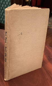
My copy of the revised edition of Allweil’s “The Book of Amos.” The book measures 23 cm x 15 cm (9 1/8″ x 5 7/8″)
“Also, the Chabad website offers not only the Hebrew source and English translation, but also the possibility to show the Rashi Commentary for the text. Rashi (Rabi Shlomo Yitzchaki, a medieval scholar) has been the most recognized interpreter of the Jewish Bible (Old Testament) and other major Jewish texts. I encountered his work even as a young pupil when I was in a (secular) high-school where we also had to learn the Bible. Hence, when having to decide how to translate the text fragments under each of the 34 illustrations, in some cases I consulted Rashi’s commentary to better understand the underlying meaning and what Amos wanted to tell us in his terse words. You will see that in a few places I offer an alternative translation or interpretation in parentheses, to hopefully better cover the underlying meaning.”
Then Gal wrote about the difficulty in translating Hebrew into English:
“Even a cursory reading of the [text] will show that the translated text (in English) is much longer than the source (in Hebrew). This may be surprising for readers. So I wanted to offer some explanations (based in part on my own work in the academic world): (1) Hebrew is a Semitic language that is about 25% shorter than comparable English because of unique syntactical and grammatical features and using a system of prefixes and suffixes which enable one word or phrase to carry the meaning that in English require more words. (2) The Hebrew in the Bible is even shorter–an ancient language, of a form usually not spoken but written, and very different than modern Hebrew. The ancient Hebrew is usually very terse and tries to convey in a few words rather strong metaphors or idioms, some of which may on first reading appear opaque or require interpretation (this is why Rashi and many other scholars have involved themselves with the Bible). Thus, the translation cannot be word for word, but has to convey the underlying meaning of the phrase or sentence. Doing that in modern English requires even more words.
“Let me also note that the translated text in English is ‘softer’ and does not always carry the visceral message or emotional impact implied or intended by Amos’ original text, which, if you put aside the formal or flowery tone, in a few short words punches you in the stomach, or heart–as befitting a serious prophet trying to impress upon the lay public his urgent messages and dire prophecies….
“I thus think that Allweil’s work is especially noteworthy (even for me as a secular person) because it helps to mediate and visually illustrate what Amos’ terse words may have meant or implied. I think this is why he [Alweil] chose the rather peculiar wording of ‘decorated text’ (or ‘illustrated text’) which appears in his opening [opposite the title page].”
Image making
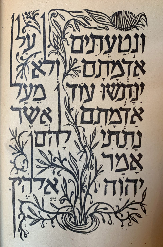
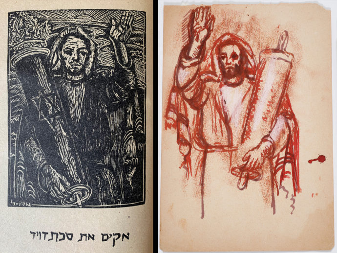
The last text and image page in Allweil’s “The Book of Amos.”
The text page opposite with the plumb line image
I am not taking a closer look at the Hebrew font Allweil created for his books, starting with Amos. That’s a whole different realm of scholarship. But Ruth Sperling sent me an email that illustrates how he exaggerated the shapes of his letters to fit the context of their usage”
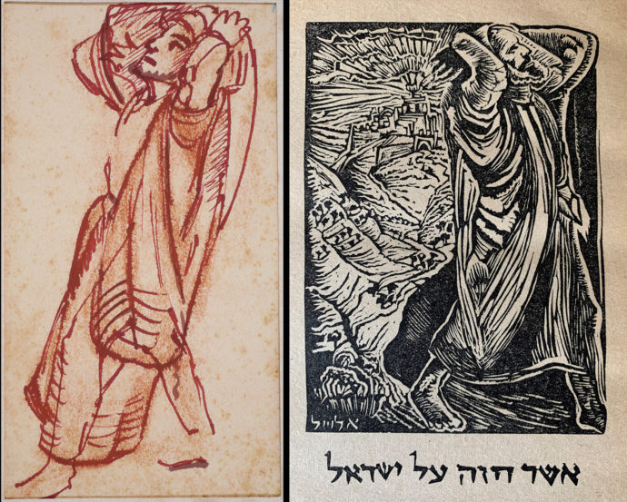
Drawing courtesy of Ruth Sperling and Nava Rosenfeld
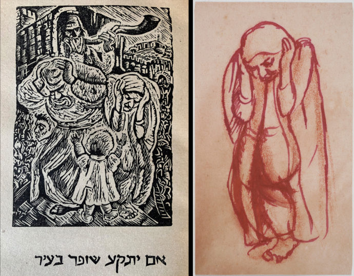
Drawing courtesy of Ruth Sperling and Nava Rosenfeld
Drawing courtesy of Ruth Sperling and Nava Rosenfeld
This drawing used two tones of red ink plus white chalk. (Drawing courtesy of Ruth Sperling and Nava Rosenfeld)
The printing
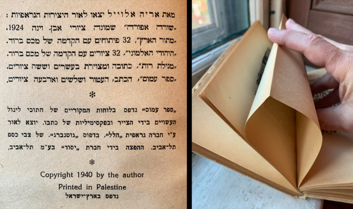
(Left) The colophon in “The Book of Amos.” (Right) I press down on a French fold used in Allweil’s Amos.
When my copy of Amos arrived from Israel last spring, I held it in my hand, turned the pages, “read” the sequence of images, and made an assumption as to how they were printed. That assumption was based on the fact that–except for the very first and last pages–all of the pages were actually two pages joined at the top edge with a thin line of paste or a single sheet of paper folded along the top edge. As shown in the photo on the right, if you press down on the top edge of a leaf, the pages separate. This is what is known in the book industry as a French fold. This technique is almost used exclusively for fine-print illustrated books, where the illustrations are printed directly from the original matrix–whether it was a litho plate or stone, an intaglio metal plate or a relief (wood or linoleum) block. So based on the use of French folds, I assumed that the full-page illustrations–that appeared to be a product of relief printing–were original prints and not reproductions.
Hoping for confirmation of that assumption, one of the first pages that I asked Iddo Gal to translate was the colophon (above left) that was placed at the end of the book. The information I sought was in the four lines between the asterisks. (The top six lines listed other books and portfolios that Allweil had created by 1940). Those four lines read:
“Book of Amos printed with the original plates of linocuts made by the painter and facsimiles of his writing. Published by graphical company “Hillel” at ‘Gutenberg’ print, of Zvi Caspi Tel Aviv. Distribution by ‘Yesod’ company Tel Aviv.”
So indeed, the full-page plates were original linocuts. But what did “facsimiles of his writing” mean, and what about pages that had shared text and images, i.e. those with historiated initials and those with images woven into and around the text?
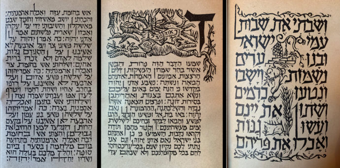
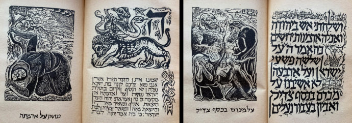
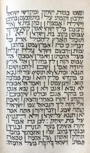
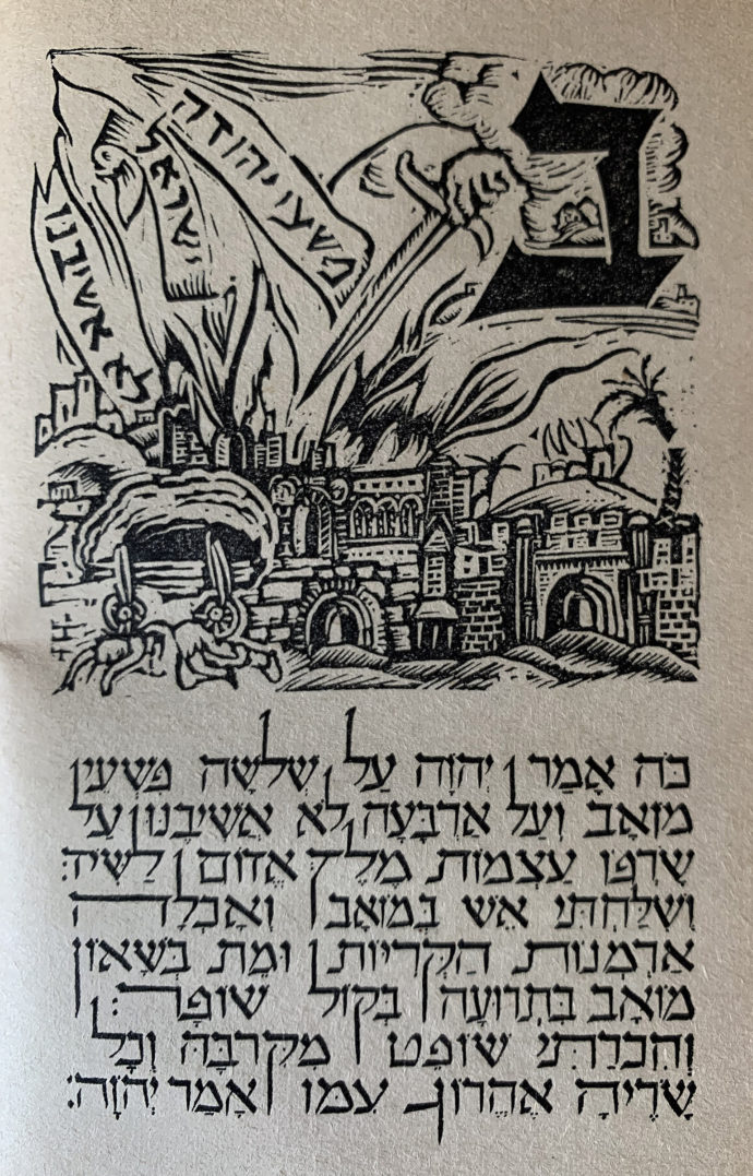
Text in Amos appeared three different ways: (From right) mid-size text with images added in, small text with separate image with large initial, and just small text.
All three of the pages above contain a Hebrew font that Allweil designed. One notable feature of this font are the descenders that drop into the space of the line below and ascenders that rise into the space of the line above. That’s a pretty good indication that the text was not created by metal Linotype (the typesetting machine in use in the mid-20th century for letterpress printing) slugs that adhere to the line.
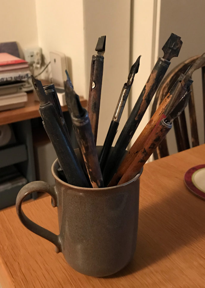
Pens used by Arieh Allweil. (Photo courtesy of Ruth Sperling and Nava Rosenfeld.)
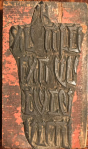
An original linoleum bloc that Arieh Allweil created for “The Book of Lamentations.” (Photo courtesy of Ruth Sperling and Nava Rosenfeld.)
I asked Ruth Sperling in an email to explain his use of “facsimile.” She replied: “The word ‘facsimiles’ is actually written in Hebrew just with Hebrew letters: פקסימיליות. This was 1940 [when Amos was first published]. Now, the lettering was not all carved in linoleum. I think the pages with large letters were. The pages with smaller letter text I think were written by pen. He had different sizes and shapes of pens. Some I still have. He used to buy the ink for that from a person who was writing the Tora scrolls, in Hebrew termed “Sofer Stam.” The large letters were carved in linoleum and were written carved as mirror images of the final pages.” As an example, She provided the image of the original linoleum block used to begin Chapter 3 in The Book of Lamentations.”
Note that the original linoleum block from The Book of Lamentations (right) is actually a composite. After the linoleum was cut to create the letters, it was trimmed very close to the lettering and glued onto a block of wood. This process would not only add stability to the linoleum but, perhaps more importantly, raise the image to what is know as “type high,” which is .918 inches high. This height is standard for letterpress printing. Even if Allweil used a manual proofing press to produce his pages, he likely would have had to adhere to the type-high standard.
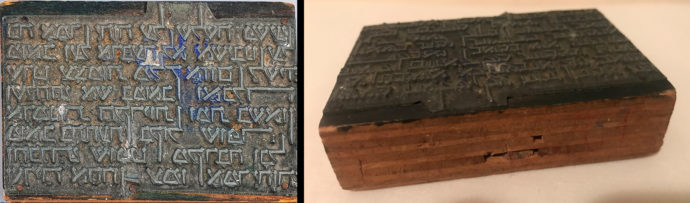
Two views of the block used to print the small “facsimile” type part of the page that begins Chapter 2 (Beit) of Allweil’s “The Book of Amos.” Notice the nail heads that show how the magnesium plate was nailed to the wood block. (Photos courtesy of Ruth Sperling and Nava Rosenfeld.)
The block above was used to print the bottom half of the page that begins Chapter 2 (Beit).
For how Allweil turned his pen-and-ink Hebrew lettering into printable “facsimiles,” I consulted with George A. Walker, Associate Professor at the Ontario College of Art and Design University where he is an instructor in book-related arts. Walker has created seven hand-printed wordless narratives in wood engravings, his latest being Mary Pickford: Queen of the Silent Film Era.
In an email, Walker said: “I believe the word ‘facsimiles’ refers to the process of making a zinc or magnesium plate for letterpress printing (aka photoengraving). We now use polymer plates for this but in the 1940s making plates this way was very common.” In another email, he added: “I would also point out that cast Hebrew text (if there was any) was probably made on a Ludlow machine and not a Linotype.”
Chances are that all of Allweil’s full-page linocut images were a product of a linoleum block mounted on a wood block to create a combined thickness of type high. Because the spacing between the images and captions vary and oftentimes the caption is somewhat askew from the image, the captions appear to have been cut separately in linoleum and mounted on wood, either on the same block of wood that held the image or on a separate block. If the latter, then the blocks would have had to have been clamped together so the image and caption could have been printed in a single pass in the press.
Pages with mid-sized letters and interwoven imagery were completely created on a single linoleum block that was then mounted on a wood block. Pages with only small type began as a pen-and-ink drawing that was then photographed as a line cut (to get strictly blacks and white, as opposed to a half tone with its Ben-Day dot pattern). From the line art a full scale negative would have been created and then used to expose a photo-sensitive magnesium, zinc or copper plate. That plate would then have been mounted on a block of wood.
The pages that share small type with an historiated initial, therefore, must also share the techniques: linocut for the large initial and imagery and metal reproductive type for the text … all mounted type-high (.918) on a single block of wood or on separate blocks of wood held together so the page could be printed with a single pass on the press.
NEXT
For the biblical story of Amos and all of Arieh Allweil’s pages, please go to Part 2. (LINK)
Trackback URL: https://www.scottponemone.com/arieh-allweil-the-book-of-amos-part-1/trackback/
Leave a Reply
-
Accessions: Short Stories Dec 21, 2025

-
The Mike and Scott Show: No Reruns Nov 25, 2025

-
Griffin Chairs: Both naive and refined Oct 04, 2025

-
Circularity: The Pairing of Two Talents Jul 12, 2025

-
Frans Masereel: Workers’ Paradise in 1939 Europe Apr 11, 2025

-
Erich Glas: Through the Night vs. Leilot/Nights Jan 15, 2025

-
Gustav Wolf: His Monster Menagerie Dec 23, 2024

-
Linos: #5 through 15 Nov 01, 2024

-
Gustav Wolf: Confessio Aug 02, 2024

-
Justin Remo’s Big Finale May 21, 2024

-
Accessions: Short Stories Dec 21, 2025
-
The Mike and Scott Show: No Reruns Nov 25, 2025
-
Griffin Chairs: Both naive and refined Oct 04, 2025
-
Circularity: The Pairing of Two Talents Jul 12, 2025
-
Frans Masereel: Workers’ Paradise in 1939 Europe Apr 11, 2025
-
Erich Glas: Through the Night vs. Leilot/Nights Jan 15, 2025
-
Gustav Wolf: His Monster Menagerie Dec 23, 2024
-
Linos: #5 through 15 Nov 01, 2024
-
Gustav Wolf: Confessio Aug 02, 2024
-
Justin Remo’s Big Finale May 21, 2024