Stefan Berg: Architecture of Music

This charcoal sketch by Stefan Berg would be transformed into the first linocut in my portfolio of “Architecture of Music.”
INTRODUCTion
I was so impressed by a paperback edition of a wordless narrative–Let That Bad Air Out: Buddy Bolden’s Last Parade (The Porcupine’s Quill; Erin, Ontario; 2007)–that I contacted the young Canadian artist Stefan Berg. In brilliant fashion via 70 linocuts he told the story of Bolden, a New Orleans horn player whose career came to an end when a blood vessel burst in his neck during a parade. So I contacted Berg in hopes he had a copy of Bolden printed directly from the linoleum blocks. There wasn’t one. In an email he said: “I was 21 when I printed the Bolden series. … I was never trained in printmaking, and being young, inexperienced, and poor I regretfully did not produce an entire fine art edition box set, or hand-bound book….” By on request he did create a one-of-a-kind portfolio of 29 proofs from Bolden. Upon receiving the portfolio in February 2015, I proceeded to write the blog post Stefan Berg: Buddy Bolden in Black & White (posted in April 2015) (LINK). There in Q&A fashion first he discussed how and why Bolden came about, but then he talked about future wordless narrative projects, particularly on the pianist Glenn Gould.
Asked why Gould, Berg said: “I am responding to the event of Gould’s interpretation of Bach’s Goldberg Variations of 1955, the making of it at his cottage on Lake Simco.” He added, “Gould spent a solitary period at his family cottage; this is the scene, but I am more or less drawn to focus on my own sense of place as subject…. I grew up on the same hill as Gould. My experience of the Canadian landscape is interlocked with my sensations from Gould’s recordings. Perhaps it is because I grew up listening to his music or intuitively relate solitude and snow with Gould.”
When this conversation occurred in the spring of 2015, Berg said, “I’ve drawn out some images. I plan on working at my cottage. I intend to do the whole project in isolation, a self imposed ‘residency.’ There will be no story board intentionally. It’s a personal response; the narrative is conceptual or inherent.”
So began a five-year dialogue with Stefan Berg as he worked on his Gould project both at his Toronto studio and at his family cottage. He would eventually name his project Architecture of Music.
I want to thank Stefan for providing images of his work throughout the years and keeping me abreast of his progress, no matter the pitfalls along the way. And I especially want to thank him for being candid enough for allowing me to share his creative process as expressed in his emails and answers to my many questions.
All images, including preliminary sketches, linocut blocks and finished linocuts, are courtesy of Stefan Berg.

Berg’s early sketches for his Gould project.
4 Years Briefly
In hopes on some day being able to blog about Berg’s Gould project, I had strung together years of his emails. He began by envisioning that the final product would be twofold: a signed limited edition book with images printed from the blocks and a trade edition of reproductions. As you’ll read, Gould took a lot longer to finish than he anticipated. In no way did that lessen his accomplishments. In fact his linocuts became more sophisticated as the years passed. If I’ve to be credited with assisting in his efforts, I served as a nudge. Here are quotes from his emails:
16 April 2015: “I am writing my Gould ideas frantically as they come, on scraps of paper and the back of reference photos, things that jog my memory…. This will be a great resource to keep them together, I will keep a Gould journal!”
9 July 2015: “Gould is going really well. I have been making large charcoal drawings (capturing the gestural element of Gould himself and in response to the music) and small ink works (capturing finer detailed imagery). I have no idea how these will translate in cuts.”
19 Sept. 2015: “I have been drawing a lot, I am ready to try transferring some drawings to lino and experiment with various approaches in cutting and printing.”
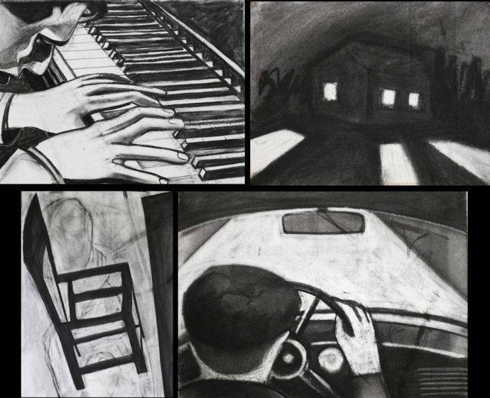
On 2 Oct. 2015 Berg sent me charcoal sketches for his Gould project.
2 Oct. 2015: “I have drawn about half of the images which currently make up my story; however, I have also edited and increased the total images in my story. My photographs are of drawings (charcoal on paper approx. 22 x 30 inches, pen and ink, and graphite) and a selection of blocks, ranging in different styles. Now I have a clear approach in mind for depicting my story stylistically. Through trial and error I have decided to discontinue drawing in charcoal, to draw with ink directly onto the block, and cut by hand as opposed to laser cutting. My deadline for December 31 remain (the completion of my story, and to transfer my images, and finalize the orientation and scale of my blocks where upon I will carve and print my blocks in a short period following.
Berg drew in ink directly on the linoleum blocks. (Berg sent me this image on 11 July 2016.)
“I have focused more on Glenn Gould’s idiosyncratic interpretations of classical scores, and his recording process, as oppose to the single event of Gould composing The Goldberg Variations. I have drawn a stronger relationship between sound and silence in black and white (negative and positive) by contemplating the significance place and solitude play within Gould’s creative process
“My narrative now acts in dialogue with Gould’s creative process, and reinterprets the public perception of him as an artist. The piano chair is one example of many Gould tropes used in my narrative. Throughout my research I have come to realize my own symbolism which defines Gould’s character and places the reader/viewer. My depictions of Gould in performance are (and will be) created from motion picture to help capture the tempo and rhythm of the figure in motion, to lend an energy and resonance found in his particular style of performance.”
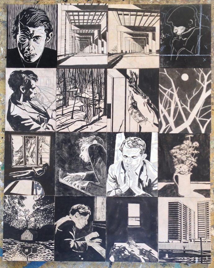
1 April 2016: “Thanks for asking about my project. I am in the stage of drafting 80 images to 5.5 x 6.875 inch blocks. I will begin cutting and proofing the first 10 to be part in a solo (painting) exhibition in June. I hope to have the suite of 80 cut by the end of July and printed by end of August.”
14 Dec. 2016: “I’m writing to give you an update on the Gould project: I have 50 blocks carved and am finishing up the last 20 to round out the narrative…. I’m beginning to schedule time in the studio to print throughout January and predict I will have the project wrapped up by the end of February.”
Berg sent proofs of these linocut on 16 Dec. 2016.
In December 2016 Berg first mentioned that he had started making “overlays” where he first printed a light-toned image from one block, then a full-black image from another block.
15 Dec. 2016: “I have only two examples of my overlay technique digitized, where I have superimposed multiple blocks.”
(left) A proof sent in December 2016 and (right) the print from the portfolio that arrived in February 2019. Note that the light-toned image changed. Initially it was a city scene. Later Berg chose to use a woods scene as the light-toned block.
25 June 2017: “I have had a few very helpful meetings this month, editing my final narrative. I removed a number of images from the story, and will be creating six new images.
“As for now the design for my Fine Art Edition will be a Portfolio, edition of 50 (of approx. 65 images, plus text etc…).
On 24 Oct. 2017 Berg mentioned that he was approaching publishers to print the trade edition and that he was “hoping to confirm something by June 30.”
“As for the fancy prints, I am designing the limited fine art portfolio as we speak, 50 prints, edition of 50, in a slip case, with some letter press text. (If you can believe it I cut 84 blocks.) I’ve edited my narrative down to 50 and I’m really happy with it….
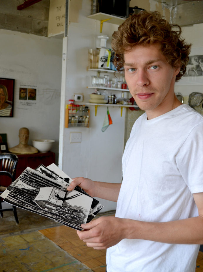
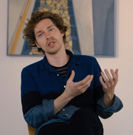
Stefan Berg in his Toronto studio holds sketches for his Gould project. (Photo by Scott Ponemone)
“I am going to be printing on BFK Rives, 115 gm I think, I really like the paper!
“I am trying to nail down a start date, and end date, and confirm a print schedule before I can comfortably offer pre-sales to interested parties–but I am hoping to start printing in March.”
June 2018: I traveled to Toronto and met with Stefan Berg twice, once in his studio and once at a breakfast place where he brought a printout of his revised sequence of Gould images.
25 July 2018: “I will be printing my portfolio by hand in my studio using my proofing press. By doing so I will have more control pressing the black-and-white prints, and I am very keen on experimenting with overlays and alternative processes. As a resolution I have designed a much smaller more manageable project (the selection I showed you over breakfast). My rough prescription is as follows:
I will print Architecture of Music throughout October and November.
I will print a total of ten portfolios.
The portfolio box will be approx. 12″ x 12″ x 1″.
Each box will contain a total of 30 sheets, each 11.75 x 11.75 inches BFK Rives 175 gms cream-white archival paper.
Each box will contain a letterpress Title Page, Artist Statement, Index, and Colophon with Acknowledgments & Credits.”
1 Oct. 2018: “My felts for the press have arrived. I have built a matrix for registration. My blocks are polished and ready to print. My texts are being edited, I will order polymer plates after having George [Walker*] review them. (I will be printing my text with George.) I put my order in for paper and ink and eagerly await its arrival. The portfolio box has been the most challenging item to confirm. I sent designs to two box makers via George and only just now received a reply from one after I had George followed up. I have the feeling the box maker is doing George a favour as I am only having ten made. but I sent my material request in and I should have a delivery date soon.
“Some minor changes to the sequence of images. I will be using the portrait block for the cover of the box and wood type for the title page. I am carving the final block now, after many variations, as I wait for paper and ink.”
*George Walker, Canada’s premier creator of wordless narratives in woodcuts, has at times served as a mentor to Berg. (LINK to my first blog post on Walker.)
2 Dec. 2018: “I am writing to inform you that I am nearing the completion of my portfolios. George helped me connect with a book binder who created 10 very beautiful portfolios boxes! I have two blocks remaining to print. I have sent my artist statement to a musician friend to edit. Once edited I will send away for a polymer plate, and set a date with George to print the text and title page
“The title page will be wood block type. The statement will be concise and include a colophon.
“I will be redesigning the book and pitch my manuscript in the summer once all portfolios are complete (once the limit of experimentation in colour, monotype grounds, and multiple colour overlays has been reached).
“I am wondering how I should edition the portfolios. The black-and-white portfolios will vary slightly in that a few images may be included and removed. As for the colour portfolios I believe the degree of experimentation will result in each being variable. I wonder if I should edition the ten as a variable edition of ten (VE 1/10).“
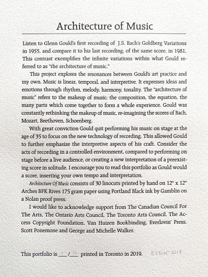
11 Jan. 2019: Berg sent me the text for his portfolio and asked for suggestions. His second paragraph began: “This project explores the resonances between Gould’s art practice and my own. Music is linear, temporal, and interpretive. It expresses ideas and emotions through rhythm, melody, harmony, tonality. The ‘architecture of music’ refers to the makeup of music: the composition, the equation, the many parts which come together to form a whole experience.” I thought that Berg set up a comparison between Gould’s art practice and his own. He described what “music” is for him. Yet he omits what “art” is for him. I suggested that he include that. But Berg disagreed. He believed that it was up the “reader” to learn how his “art” compared to Gould’s “music.”
February 2019: Stefan Berg’s portfolio Architecture of Music arrives.
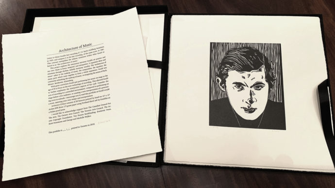
Stefan Bergs’ portfolio “Architecture of Music.”
Architecture of Music
Naturally I wanting to do a blog post now that I had my portfolio of 30 linocuts, a good number of which have the strength of line and imagination to stand alone as works of art. But Stefan Berg had too much going on to tackle my list of questions that I sent in April 2019.
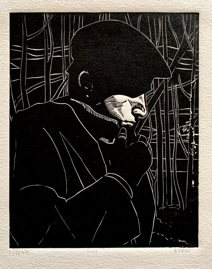
This is the eighth plate. It is numbered “1/10 VE” to indicate it’s the first of a veritable edition of ten. Berg reserved the right to very the prints in each portfolio. Also note that I photographed this print (and all others from this portfolio) with light coming from a low angle. This regime highlighted the impression that the printing of the linocut made on the paper.
On 4 June he responded: “Currently I am looking for a new studio, renovating my parents’ cottage and preparing paintings for the 2019 Toronto Art Fair, so A of M has been once again put on hold…. but I still intend on publishing a book.” Then six days later he requested that I hold off on a blog post and said: “I know you’re eager to share my portfolios, and for this I am grateful. Having been along for the ride from the beginning, you know I’m a very patient person. I’m honestly not finished. I certainly have a bit of Gould’s perfectionist nature in me as I continue my fifth year on the project.
So I let this hang for over a year. In August 2020 I checked in with him and got a positive response. He said: “I have finally completed printing the portfolios (this was interrupted by leaving my studio, however rather suiting to the project seeing as I set my press up at the cottage and so the portfolio began and ended there)…. I am not going to publish the work as a graphic novel. The portfolio is the finished project…. It’s a good time to do a post because I will have my portfolios available at the Toronto Art Fair on October 28th.”
Now it was my turn to delay. I didn’t send Berg questions for this post until early November 2020.
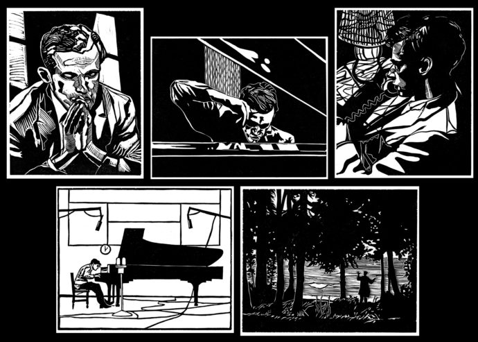
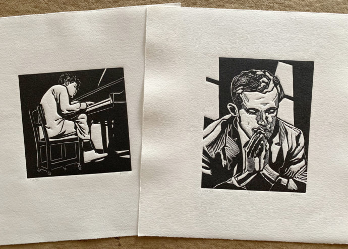
In the meantime, let me present (above) one of the most successful of the Architecture of Music linocuts. It’s simply marked as “VIII” in the series even though Berg liked the idea of leaving the sequence up to the viewer. It displays a wonderful use of white-line imagery that is dramatically broken by the brightly lit lower half of the profile of Gould. For me it’s easy to imagine this can also be viewed as self portrait of the artist.
Stefan Berg discusses work at his fall-2020 exhibition at United Contemporary gallery in Toronto.
Finally 25 November Berg sent me his first set of responses to my questions.
What attracted you to Glenn Gould? What part of his relationship to his muse did you want to tell? Why is that of interest to you?
Essentially Architecture of Music is an inquiry into the notion of interpretation and visual metaphor. The contrast between both Goldberg Variations and the polarity of Gould’s desire for solitude in light of his public fame are worth contemplating.
I created Architecture of Music in response to Gould for many reasons. My initial intrigue was his courage to maintain artist freedom and uncompromising desire for truth. Gould quit performing his music on stage at the age of 31 to focus on recording, and the practice of his craft. He foresaw that with the advent of recording technology and home sound systems the listener would soon become the composer, going so far as to say the concert was dead and even proposing he create a ‘do it yourself Mozart album’ in which the listener would choose from a sampler of tracks to merge and overlay. This is of course precisely what DJs do now. The idea of the simultaneous role of creator and listeners (or viewer) gave way to a wordless narrative where interpretation would be key.
I grew up in Toronto around the corner from where Glenn Gould lived as a child. His music was the soundtrack to my upbringing and my landscape. Gould was the perfect character to use in telling a story about solitude; a way into depicting my own time and experience in solitude, placing myself in Gould’s shoes, and placing Gould into my landscape. In his twenties, Gould spent a lot of time alone at his family’s cottage, and so I created this project at my family’s cottage to embody or reenact his experience.

These are number “II” and “III” from the portfolio. They are representative of Berg’s earliest images for his project.
Why present his story in black-and-white prints?
The contrast between positive and negative is why I chose to carve my images in relief. This juxtaposition grew conceptually to take on more and more meaning. The harmonic structure is found in architecture, in counterpoint to the melodic and organic found in the landscape.
I would encourage viewers to interpret my narrative as Gould would a musical score. Listen to Glenn Gould’s first recording of J.S. Bach’s Goldberg Variations in 1955, and compare it to his last recording, of the same score, in 1981. This contrast exemplifies the infinite variations and juxtaposition I am referring to.
Transition plays a significant role, Gould began to merge the boundaries between one variation and the next. Through transition (the flipping of each page) we experience a shift in place and time: day to night, winter to spring, urban to rural, interior to exterior, and (this is where I answer your question) the black line on white ground evolves into white line on black ground, to signify the moods reflected in both Goldberg Variations.
Another reason for black and white was to respond to the past, wordless woodcut narratives such as [Frans Masereel’s] Passionate Journey or [Lynd Ward’s] Wild Pilgrimage, which are timeless stories, essentially the same story I am re-telling.
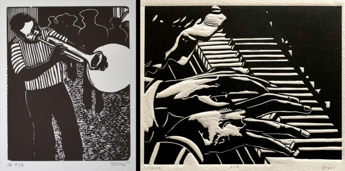
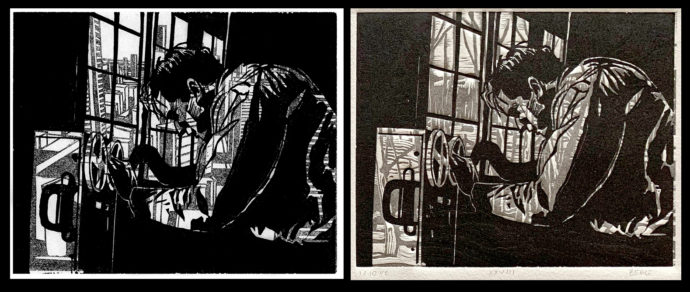
(left) A linocut proof of image #35 from Berg’s Buddy Boldin book, and (right) a linocut #XIX from “Architecture of Music”
Your first narrative in linocuts was about Buddy Boldin, another musician. There you gave the sound Buddy was making a shape (white circle). In Gould, you didn’t create a shape to his music. Why not?
The music in this story is inside Gould’s head. It’s a quiet story about contemplation and composition, searching as opposed to finding. The music he finds is the music we hear, this somewhat fictional autobiographical story dips back to a pre Glenn Gould as we know him today, to reimagine his becoming.
Where did the title Architecture of Music come from? When did it occur to you and why?
“Architecture of Music” is Gould’s term. It refers to the makeup of music: the composition, the equation, the many parts that come together to form a whole experience. Gould was constantly rethinking the makeup of music, reimagining the scores of Bach, Mozart, Beethoven, Schoenberg. He was obsessed with each note as an individual part of the whole. I likewise obsessed over each image while at the same time fought for a symphonic meaning.
Can you think back to 2015 and describe what you projected the effort to finally look like? Was the finished product a book? When did the idea of a portfolio happen? And what did you initially conceive that it would contain? How did that change?
Initially my intention was to create a graphic novel, and I may still do that.
After several years and having carved nearly 100 linocuts, I had what could be called a reductive epiphany: I saw the narrative more clearly in 30 images. I am still enacting Gould’s perfectionist behaviour.
I continue to make alterations to this day, and as a result each portfolio, of which there are ten, are slightly different. If I do create a book it will be undoubtedly different from the portfolio. I don’t view printmaking as a reproductive technique; I’m far more interested in printmaking as a thinking process.
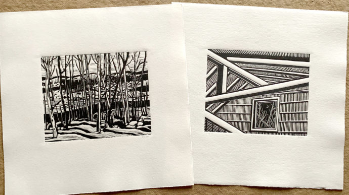
“Architecture of Music” linocuts #XII and #XVI relate to both Gould’s and Berg’s need to isolate in a cabin in the woods.
What did you learn about telling Gould’s story as you worked on the project?
About two years into the project I realized I wasn’t telling Gould’s story so much as telling my own. This accounts for the reduction in blocks. I began weeding out imagery too specific to Gould as to create something more of a phablet, yet keeping some of the personality tropes.
From my portfolio: (left) #II was probably conceived earlier than (right) #VI as the latter has added a way of making tones with parallel lines.
With a project spanning a good 4-5 years, how did your imagery evolve? Was there any change in technique, i.e. in the cutting?
I certainly became more competent as the blocks piled up. The earliest blocks have been destroyed. I was coming out of an eight-year hiatus since having carved my last story. I began by doing a series of charcoal drawings, building up a language for black-and-white graphic space. Come to think of it, charcoal influenced my overlay aesthetic (incorporating tone from a ghost impression) the smoky grey embedded into the paper as a result of continual application and removal of charcoal. What surprised me was the influence carving had on my painting.
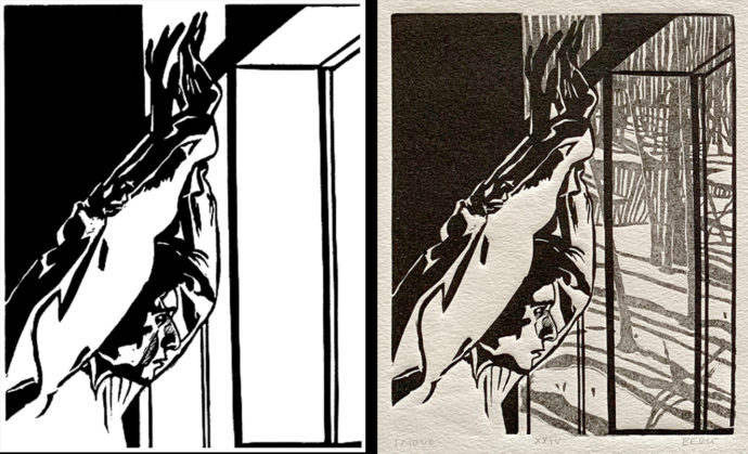
Before the image for #XXIV in my portfolio became an overlay with a ghosted woods scene out the window, it looked as it does on the left.
When did the idea of overprinting occur? An accident? What were you looking for in an overprinting image?
I refer to my prints as “overlays” because two or more blocks are superimposed in varying degrees of value. Multiple-block prints are not uncommon of course. My process only differs in that each block is a stand-alone image not initially designed for layering. The first layer is a ghost impression, with the second overlaid in solid black. It is through the printing process that I find an overlay, often by accident. My interest in printmaking lies in the accident. I am less interested in reproduction and more interested in evolution and experimentation. The overlay.

Berg sent me an image of proof (left) that had an urban scene ghosted out the window, but, when he printed what became #XXVIII in my portfolio, he changed the ghosted scene to a forest.
How do you ink the lighter background image in your overlays?
I create the overlay images by “ghost printing” the first layer (grey) then printing in full the second layer (black). Their is no adjustment in the ink; it’s all in the inking. A ghost print is when you print a second impression off a previously inked block without inking again. Each impression fades in value and can be controlled by removing ink by consecutive ghosting.
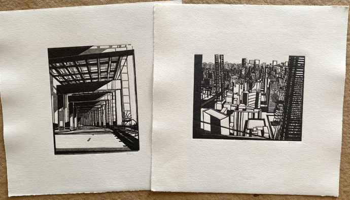
Overlay linocuts #VII and #VIII are both on an architectural theme.
When was the first portfolio done and the last? Each I believe is marked “VE” for variable edition. How much did each portfolio differ from another?
I printed the first four portfolios in November 2018. The following six were printed June 2020. I moved studios in between. I made adjustments to the portfolio the second time, and will continue to do so for the same reason I encourage the reader to rearrange the set as they wish. I like the idea of an open narrative. Two images were substituted during the second printing session, and likely two more will be substituted next summer if I have remaining portfolios.
How will printmaking continue to be part of your oeuvre? Any new series of prints on the horizon?
I have relocated my press to my family’s cottage and will from now on be printing each summer. I have a few larger compositions for linocut, but these pieces are not part of a narrative. The next series I have in mind is a set of 50 dynamic figure compositions derived from the life model. Read in sequence these prints will form a choreographic score, and perhaps one day will be interpreted by a dancer. This project is closer to stop animation than wordless narrative, and the inspiration comes from typography and gymnastics.
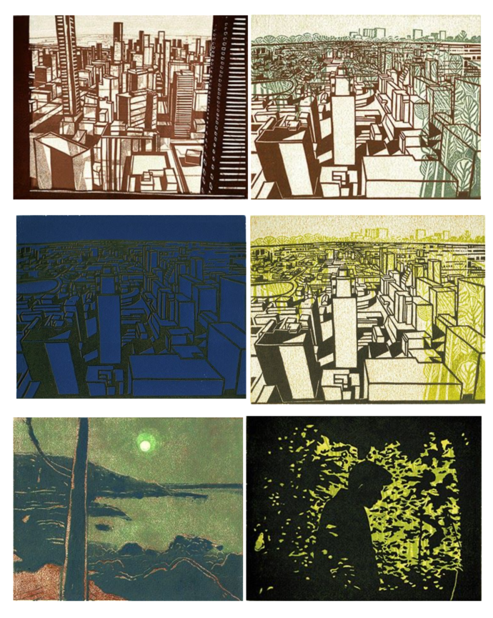
Berg experimented with printed overlays in various colors. He sent me these images of proofs.
Online links
Stefan Berg formally presented his portfolio Architecture of Music at United Contemporary gallery in Toronto from 28 October to 28 November, 2020. His one-person exhibition, entitled Counterpoint, featured paintings–both views of Toronto and domestic interiors–color linocuts (like those above), individual prints from the portfolio, as well as the portfolio itself. (LINK)
A 30-minute youTube video of the United Contemporary exhibition with Berg speaking and musical interludes by a guitarist: LINK
An article on his exhibition at the ARTORONTO website: LINK
In June 2017 he showed 20 linocuts from the portfolio in an exhibition called Silence at the Guelph Arts Council in Geulph, Ontario. The Geulph website has posted an interview with Berg about his Gould project. (LINK)
Of course, Berg displays his recent work at his own website. (LINK) It has a number of photos of Architecture of Music including a brief description of the project. (LINK)
Trackback URL: https://www.scottponemone.com/stefan-berg-architecture-of-music/trackback/
Leave a Reply
-
Accessions: Short Stories Dec 21, 2025

-
The Mike and Scott Show: No Reruns Nov 25, 2025

-
Griffin Chairs: Both naive and refined Oct 04, 2025

-
Circularity: The Pairing of Two Talents Jul 12, 2025

-
Frans Masereel: Workers’ Paradise in 1939 Europe Apr 11, 2025

-
Erich Glas: Through the Night vs. Leilot/Nights Jan 15, 2025

-
Gustav Wolf: His Monster Menagerie Dec 23, 2024

-
Linos: #5 through 15 Nov 01, 2024

-
Gustav Wolf: Confessio Aug 02, 2024

-
Justin Remo’s Big Finale May 21, 2024

-
Accessions: Short Stories Dec 21, 2025
-
The Mike and Scott Show: No Reruns Nov 25, 2025
-
Griffin Chairs: Both naive and refined Oct 04, 2025
-
Circularity: The Pairing of Two Talents Jul 12, 2025
-
Frans Masereel: Workers’ Paradise in 1939 Europe Apr 11, 2025
-
Erich Glas: Through the Night vs. Leilot/Nights Jan 15, 2025
-
Gustav Wolf: His Monster Menagerie Dec 23, 2024
-
Linos: #5 through 15 Nov 01, 2024
-
Gustav Wolf: Confessio Aug 02, 2024
-
Justin Remo’s Big Finale May 21, 2024